Post-Login Navigation: A Two-Part Usability Study
Post-Login Navigation:
A Two-Part Usability Case Study
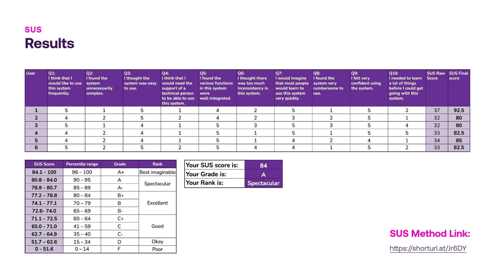
SUS Score: 84, Grade A
A strong baseline across all 6 participants, with 9 specific, addressable friction points surfaced.
From Discovery to Validation
One high-impact finding became a focused, three-way comparative study before it shipped.
My Role
UX Researcher & Designer
Team
4 UX Senior Designers
Sprint
Feb 14 to Feb 25, 2025
Platform
Web (mobile-first), post-login
Overview
Two Rounds of Testing, One Navigation Model
BetAnything’s post-login experience is the hub where logged-in users find their balance, place bets, and move between verticals like Sports, Casino, Lottery, and Horses. Before shipping the redesign, our team ran two rounds of usability testing to validate the navigation model and catch friction before it reached production. The first study cast a wide net across the entire post-login flow and surfaced a specific, high-impact problem in how users browsed casino games. Rather than guess at a fix, we ran a second, focused study that tested three alternative browsing patterns head to head, then iterated the winning design with stakeholder feedback before finalizing it.

Why two studies?
Both studies recruited 6 internal participants from the Marketing department — same company, but not regular or familiar users of the product itself, which gives a reasonably close approximation of a first-time user’s perspective. One exception: the Casino Director, who does have hands-on product familiarity, was involved in reviewing the final design proposal. We treat this as a directional validation, not a substitute for testing with real external customers — see “What’s Next” at the end of this case study.

I contributed to research planning, moderated sessions, affinity mapping, and synthesis of findings into prioritized, actionable recommendations across both studies, and helped translate validated insights into the final annotated design proposal.
The Process Pt.1
Study 1: Post-Login Navigation Discovery
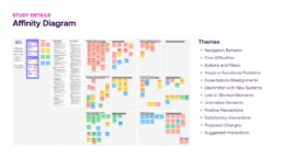
Six internal participants, ages 21 to 51, took part in moderated, in-person, think-aloud sessions of 30 to 40 minutes each, using a Figma prototype of the post-login home page. The study tested navigation exclusively, not individual game mechanics. Affinity mapping the session notes surfaced six recurring themes: what worked (navigation behavior across the home page, side menu, and footer; positive perceptions of filters; easy log-in and vertical switching) and what didn’t (flow difficulties around transactions and profile, confusion between similarly labeled buttons like Log In vs. Join In, and moments of lost or blocked frustration).

The Process Pt.2
Key Insight: The Casino List Problem
Four of six users used the hamburger menu, and five of six used the home page verticals section, confirming the home page as the primary wayfinding tool. But the most consequential finding was different: four of six users struggled to find a specific casino because of how many cards they had to scroll through in a horizontal carousel under “All Casinos.” This single observation became the seed for Study 2. The study closed with a SUS score of 84 out of 100, Grade A, “Spectacular,” a strong baseline with specific, addressable friction points.
The Process Pt.3
Study 2: Testing Three Layouts Head to Head
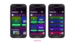
Study 2 existed to answer one question: which casino browsing layout gives users a better experience, and what should it look like in production? Three variants, the original carousel, a grid, and a full list, were prototyped and tested side by side. Grid won out as the primary experience, easy to navigate, clear structure, reduces scrolling, preferred by new users, with List retained for users who want fast access. After stakeholder review, the button label reverted from “View Games” back to “Play Now,” judged clearer and more action-oriented, while the Grid-first structure and simplified filters were preserved.