Overview
Trópica Tica: website design
Space Lab hired me to be a UI consultant for one of their VIP new clients, Trópica Tica — a Costa Rican company offering landscaping services for industrial parks and free zones. The project focused on a responsive website design for a tropical brand that needed a modern, accessible, and digitally aligned presence. Their previous website did not meet WCAG minimum standards, so we set out to update their look and feel while improving usability and compliance with current digital trends.
I undertook a rigorous testing regimen for every color, ensuring as much as possible AA compliance under WCAG guidelines. I curated a color palette that wasn’t just compliant but also visually captivating. By employing well-thought-out color schemes and contrast ratios, I aimed to create a design catering to a broad spectrum of visual needs. This endeavor is a testament to my commitment to marrying aesthetic appeal with inclusivity and user-centric design.
Client: SpaceLab on behalf of Trópica Tica. Users: Trópica Tica's clients. Timeline: Aug 2023 - Nov 2023. My role: UI solo designer. Team: one UI Designer (me), one UX Designer, one SEO Analyst, and two developers. Tool: Figma.
Problem
Tropicatica was losing leads on its website because of its issues in the SEO and accessibility low standards. Space Lab contacted me for my design POV as a UI consultant. After analyzing the site, I noticed a lot of concerns regarding their digital presence since their site's primary color palette wasn't AA compliance.
Solution
I decided to focus my work on improving the accessibility of the site to make it AA-compliant. So, this was translated into an improved UI with a new accessible color palette, better contrast in the images, UX improvement in the form.
the work
Image creation in Midjourney
In creating my website design, I used Midjourney and Photoshop to cut costs and streamline the process. Midjourney’s AI helped generate unique images, eliminating the need for an expensive photographer and subsequent editing. I then used Photoshop to refine these images, ensuring they matched the website’s aesthetic and UX goals, resulting in a cost-effective, visually striking design.


the work
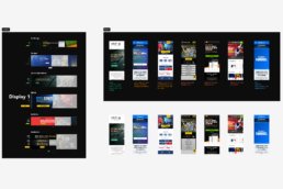
Accessible style guideline
I’ll show some of the work I did in a design style guideline I created to hand off the project to the developer in charge of this. Also, this will help the client to keep consistency with future updates.
- Color palette
- Typography
- Grids
- Spacings
- Buttons
- Shadows
- System feedback
1. Color palette & accessibility
I prioritized accessibility in the Trópica Tica website design. I rigorously tested every color to ensure they met AA compliance under the WCAG guidelines and carefully curated a visually appealing color palette. I employed distinct color schemes and contrast ratios to cater to diverse visual needs. This work showcases my dedication to inclusivity, aesthetic appeal, and user-centric design.


2. Typography
For this project, typography was pivotal in mirroring the leadership in landscaping services. I chose “DM Serif Display” for titles, leveraging its elegance and sophistication typical of serif fonts, creating a compelling visual hierarchy. For body copy, CTAs, and other content, the modern sans-serif “Inter” I used, ensuring readability and a contemporary balance. The careful pairing and sizing of these typefaces across devices provided an accessible and refined user experience.


3. Breakpoints
I ensured a seamless user experience across various devices. I established specific breakpoints tailored for desktops, tablets, and mobiles, optimizing the visual layout and interactions for each. This meticulous planning ensures that the content is both aesthetically pleasing and functionally intuitive on any device or screen size.

3. Grids
I employed a versatile approach tailored to each device type. On desktop, I utilized a 12-column grid, providing ample flexibility for layout configurations and content placement. For tablet views, an 8-column grid was implemented, striking a balance between structure and adaptability. Lastly, for mobile interfaces, a streamlined 4-column grid was chosen to ensure clarity and ease of navigation. This structured grid approach ensures a consistent and harmonious layout across all platforms.


4. Spacings
I adopted a modular approach rooted in a 4px base unit. This foundational unit offered a harmonious rhythm and consistency throughout the design. Whether margins, paddings, or element spacing, everything was scaled and determined using multiples of this 4px unit. This method not only ensured visual cohesiveness but also facilitated predictability and ease in the development phase, promoting a uniform user experience across all elements and sections.

5. Buttons - Carbon Design
In refining the user interface, I have embraced the Carbon Design System for the button design. This choice aligns with the system’s strong reputation for intuitive and visually compelling interfaces. The button now exhibits a refined, modern aesthetic consistent with the established design language. Significantly, I modified the button’s color scheme to harmonize with my unique color palette, ensuring a seamless integration while adhering to Carbon’s standards of accessibility and usability.

6. Shadows
In the design process, shadows were crucial in adding depth and visual interest to the interface elements. I utilized the plugin “Beautiful Shadows.” It allowed me to craft subtle yet impactful shadow treatments, enhancing the overall UI’s depth and making elements more distinguishable. By leveraging this plugin, I ensured the interface had a modern, layered appearance, elevating the overall user experience.

7. System feedback
The system feedback was integral for intuitive user interaction in the design process. For text field inputs, I introduced icons to offer feedback, eliminating sole reliance on colors. This is especially beneficial for users with color vision deficiencies. Additionally, I included notes next to input fields, which appear when issues arise, giving users clear, actionable insights to address any discrepancies.

8. Components
During the design process, I meticulously crafted each component using Figma. Every element, from buttons to galleries, was developed with precision and consistency. I established a style guideline in Figma, which ensured both reusability across the project and a clear framework for potential future iterations. The detailed and organized components in my Figma file underscore the depth and thoroughness of my work.
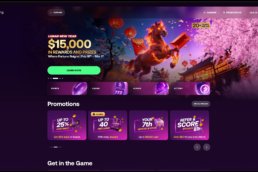
The final design
Tropica Tica design
The handoff to the developer is a critical phase in ensuring the design’s integrity is maintained during the development process. After finalizing the designs in Figma, I prepared a comprehensive package for the developer in charge. This package included all the assets, style guidelines, interactive prototypes, and detailed specifications for each component, including dimensions, colors, typography, and spacing.
Using Figma’s collaboration features, I also set up interactive design views, enabling the developer to inspect elements, retrieve CSS values, and understand animations or transitions I envisioned. Throughout the handoff, I maintained open communication, addressing any queries and providing clarifications to ensure a smooth transition. The goal was to facilitate a seamless design integration into the development environment, minimizing discrepancies and ensuring the final product aligns closely with the original design vision.
Desktop view
The emphasis was on desktop since the data revealed that 77% of the site users come from this type of device. Still, that didn’t mean I missed the other breakpoints, but for purposes of my portfolio, I’m concentrating on this breakpoint.


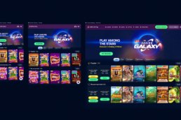
Tablet and mobile
As I mentioned, the primary traffic of the site comes from the desktop breakpoint. Still, I wanted to show here the other 23% with examples. For mobile, it was 19%, and for tablet, 4% for tablet.

The handoff
Design ready for the developer
The handoff to the developer is critical in ensuring the design’s integrity is maintained during the development process. After finalizing the designs in Figma, I prepared a comprehensive package for the developer in charge. This package included all the assets, style guidelines, interactive prototypes, and detailed specifications for each component, including dimensions, colors, typography, and spacing.
Using Figma’s collaboration features, I also set up interactive design views, enabling the developer to inspect elements, retrieve CSS values, and understand animations or transitions I envisioned. Throughout the handoff, I maintained open communication, addressing any queries and providing clarifications to ensure a smooth transition. The goal was to facilitate a seamless design integration into the development environment, minimizing discrepancies and ensuring the final product aligns closely with the original design vision.