Competitive UX Audit Case Study | Pre-Login Strategy
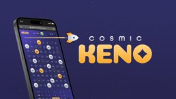
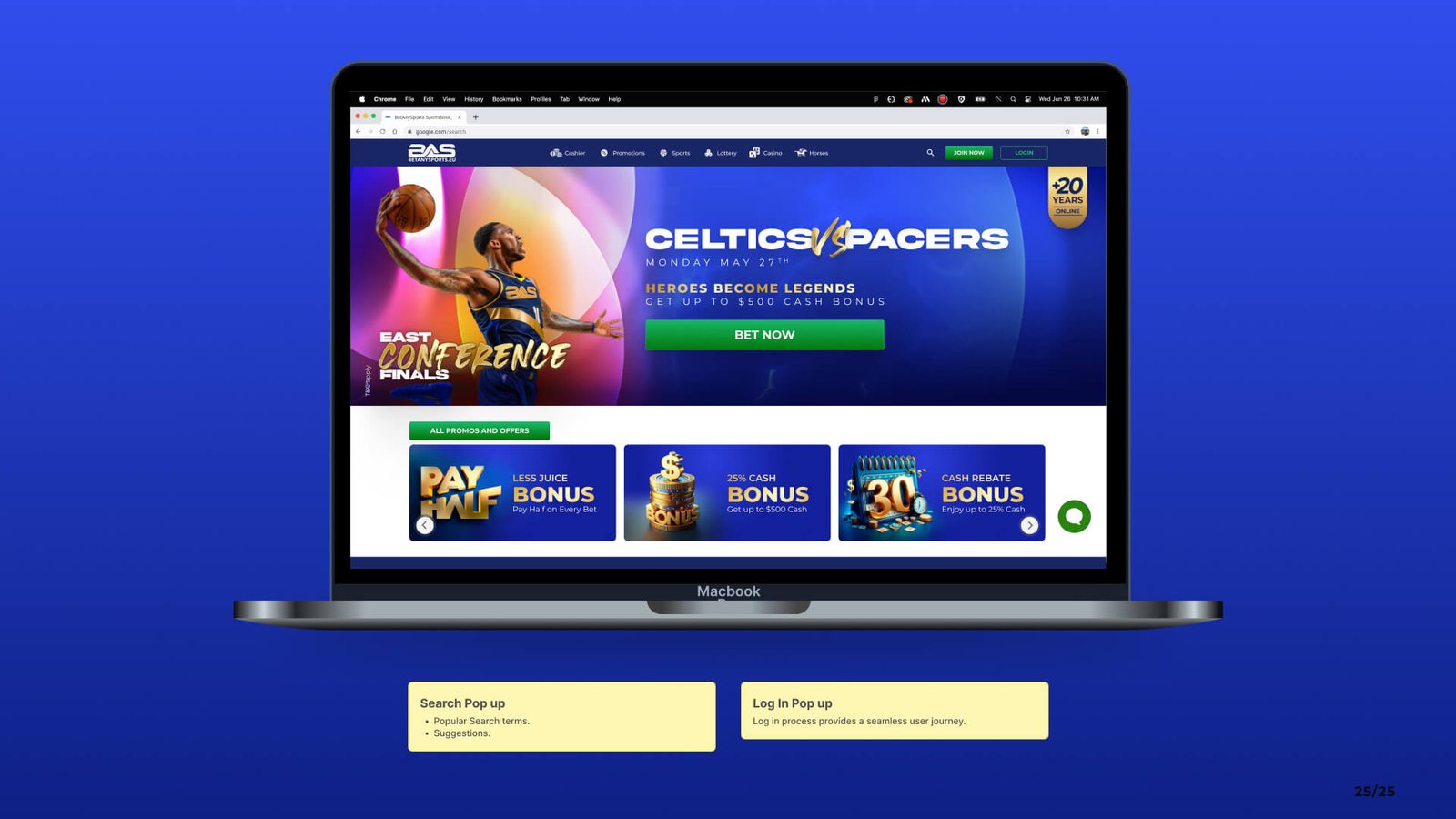
Bet Anything First Steps
Competitive UX Audit Case Study | Pre-Login Strategy
Project Overview
A competitive UX audit was the foundation of this project, created to guide the agency Rocket Air in designing the new pre-login experience for Bet Anything — a strategic entry point to capture user interest and guide them toward account creation.
To evaluate both direct and indirect competitors, identify UX/UI best practices, and deliver a strategic research document that would clearly guide the creative direction of the new platform before users sign up or log in.
The main challenge was to turn a broad set of competitor insights — from betting platforms to lifestyle brands — into a clear, actionable UX strategy. This audit had to guide Rocket Air before any visual design began, aligning business goals with user expectations from day one.
As Lead UX/UI Designer, I:
-
Proposed and structured the audit framework
-
Defined evaluation categories and research methodology
-
Guided the UX direction and decision-making process
-
Oversaw execution by two designers and reviewed their work regularly
-
Consolidated insights into a clear and actionable strategic document
I worked closely with two UX/UI designers — Josué Zeledón and Amanda Coto — who supported the research and data collection. Their efforts were essential to the depth and speed of the audit, while I remained responsible for overall direction, refinement, and outcome.
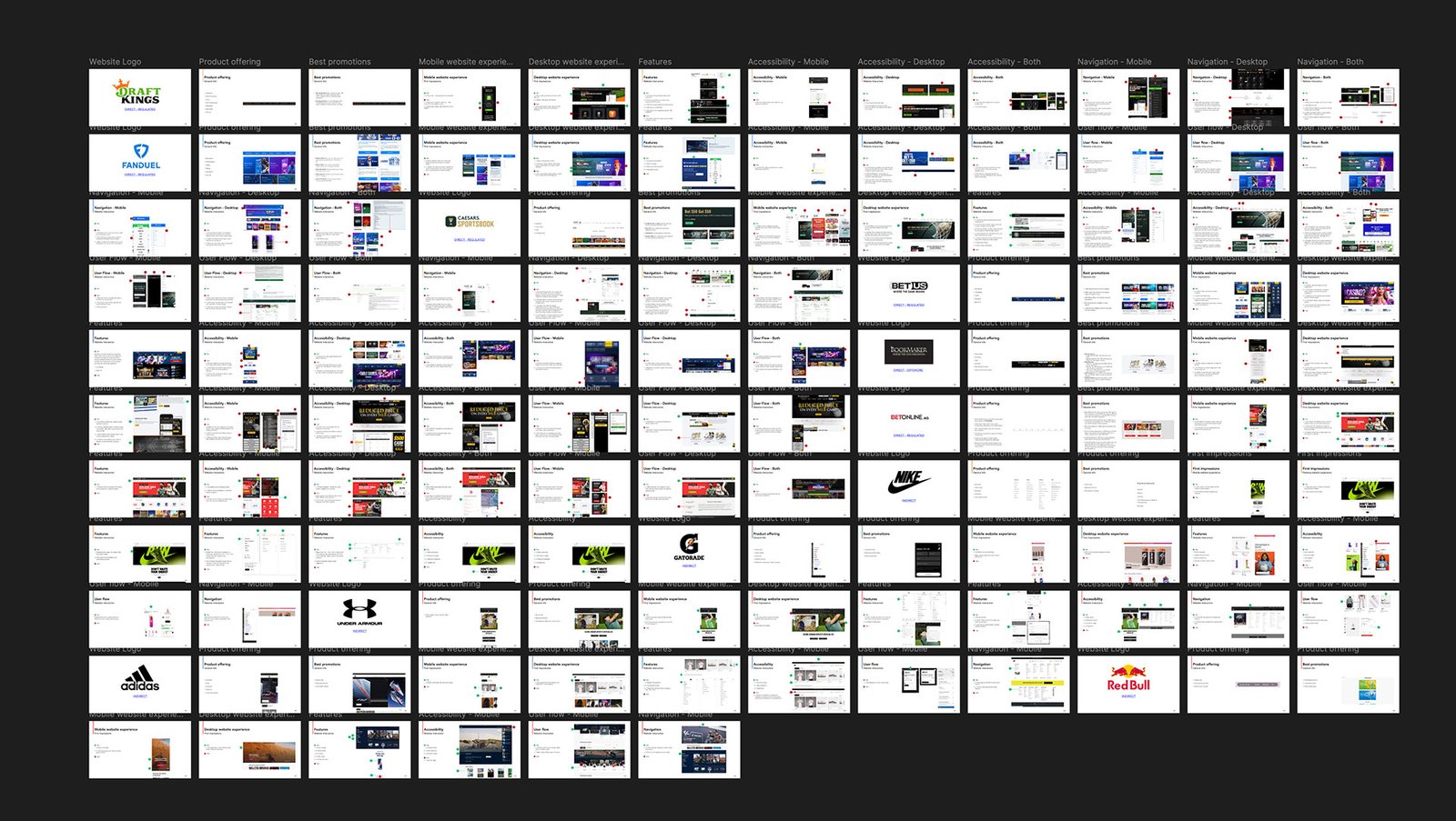
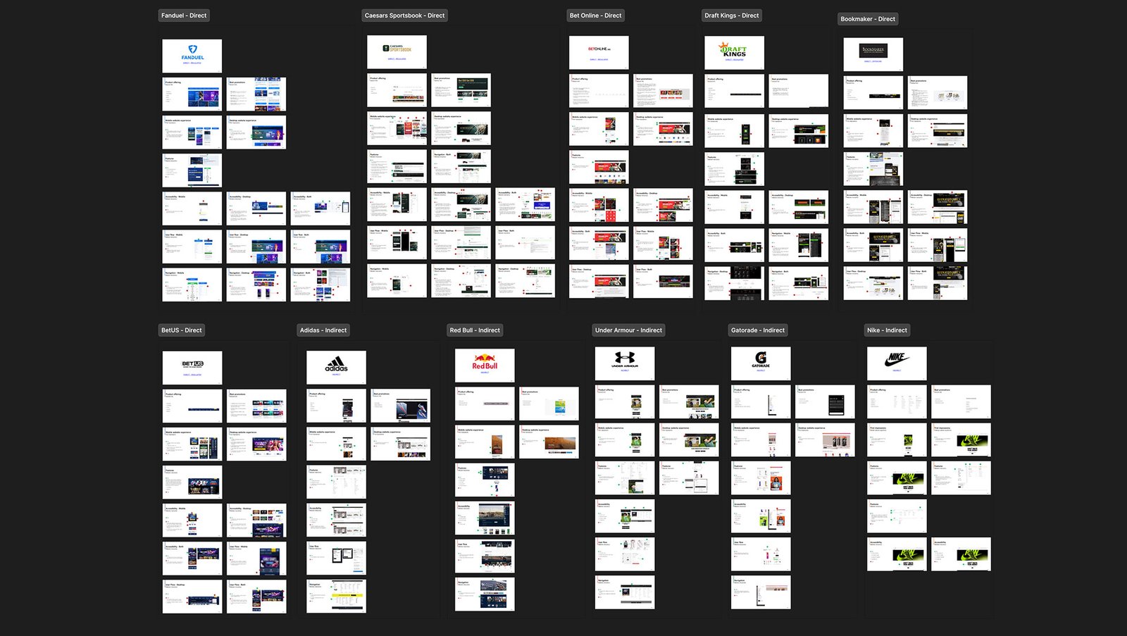
Competitive Landscape
To understand the landscape holistically, we analyzed both direct and indirect competitors — covering betting platforms and global lifestyle brands to explore patterns, positioning, and UX principles.
Direct Competitors
These platforms offer similar sportsbook and betting services and were analyzed for their UI patterns, onboarding flows, feature sets, and overall brand positioning:

FanDuel / Caesars Sportsbook / BetOnline / DraftKings / Bookmaker / BetUS
Indirect Competitors
To go beyond the betting industry and explore how strong consumer brands create emotional and aspirational connections, we also analyzed lifestyle and sports brands with world-class digital presence:

Adidas / Red Bull / Under Armour / Gatorade / Nike
This mix of direct and indirect references allowed us to benchmark not only usability and structural flow, but also brand identity, storytelling, and emotional connection — all key elements in shaping a compelling pre-login experience.
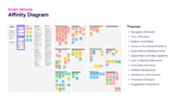
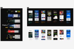
Audit Framework
I created a custom framework to evaluate each competitor to ensure clarity, consistency, and strategic insight. This structure allowed us to capture both high-level brand positioning and detailed UX/UI interaction patterns — translating into actionable design recommendations for Rocket Air.
Business and Brand Criteria
We first analyzed the foundation of each platform to understand its context and strategic focus:
-
🌍 Location & Regulation – Offshore or licensed
-
🎲 Product Offering – Sports, casino, racebook, etc.
-
🎁 Best Promotions – Incentives and signup offers
-
🏢 Business Size – Regional vs. global reach
-
🎯 Target Audience – Who they speak to and how
-
💬 Unique Value Proposition – Key differentiator in their market
UX UI Evaluation Criteria
Then we focused on how each platform engages users through its interface and content:
-
👀 First Impressions – Visual clarity, emotional tone, initial impact
-
🧩 Website Interactions – Chat, support, glossary, multimedia
-
♿ Accessibility – WCAG compliance, color contrast, font legibility
-
🔄 User Flow – Structure, clarity, and efficiency of key actions
-
🧭 Navigation & Hierarchy – Menu structure, affordance, labeling
-
🎨 Brand Identity – Consistency in color, typography, and layout
-
🗣️ Voice & Clarity – Simplicity of content and tone of messaging
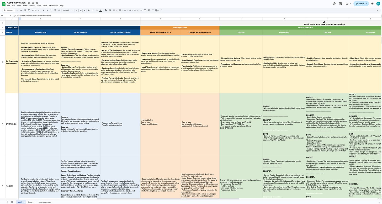
This dual-layered approach enabled us to evaluate each platform holistically — from business positioning to user experience — and ensured Rocket Air would receive a strategic foundation, not just surface-level observations.
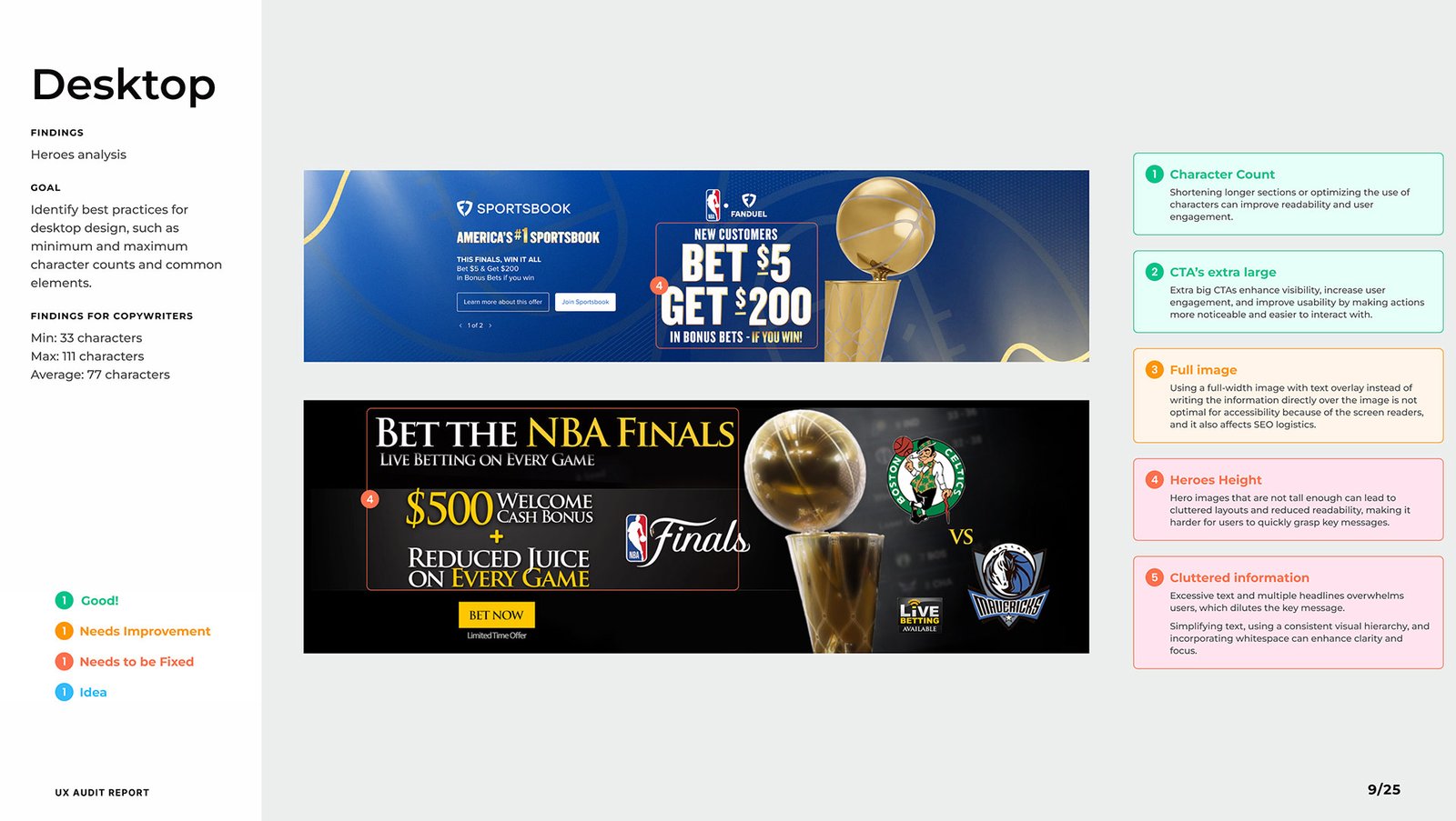
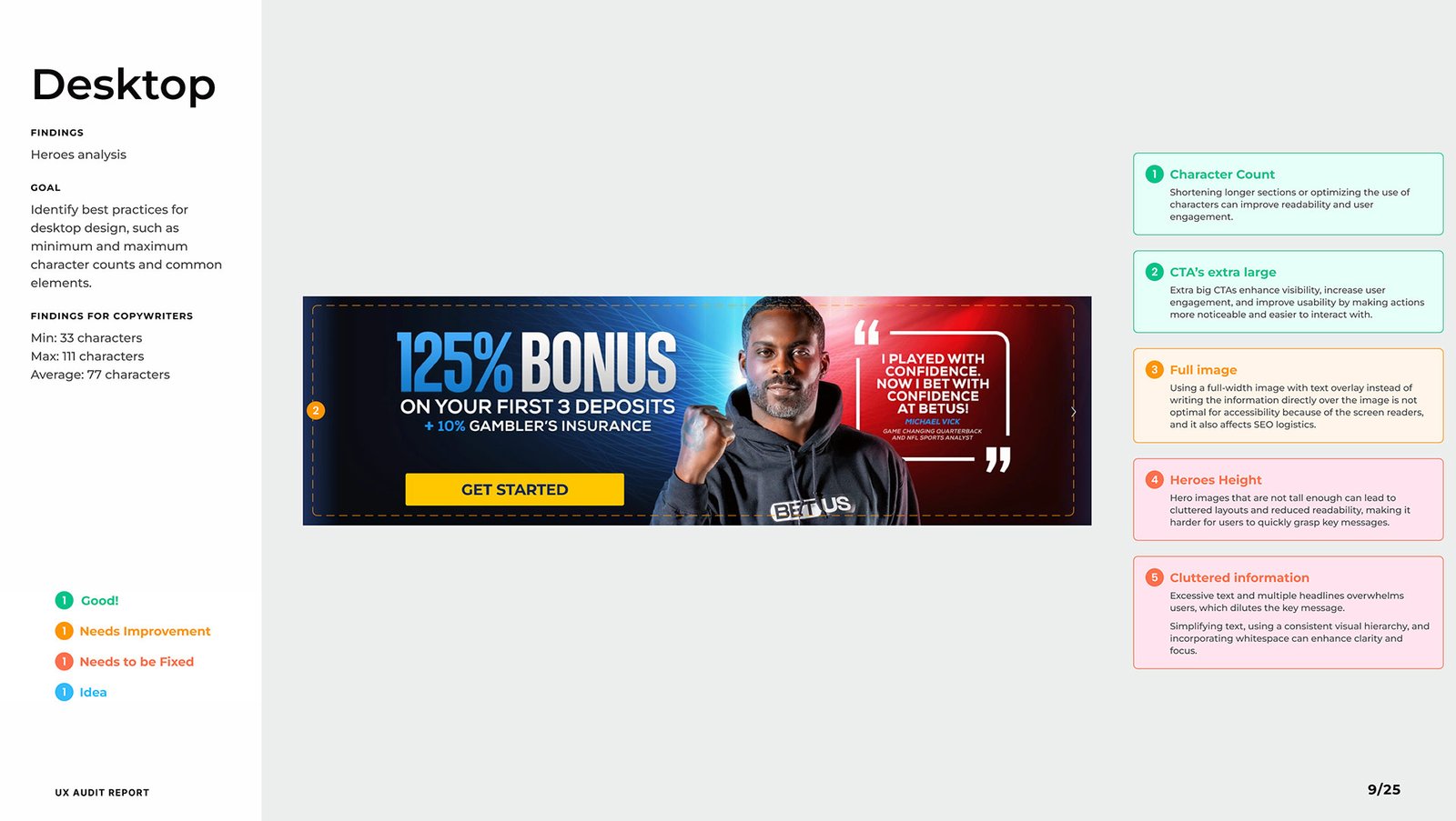
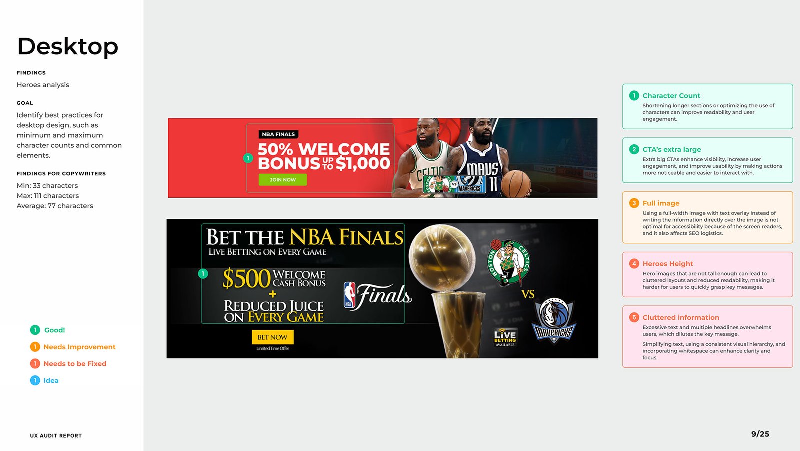
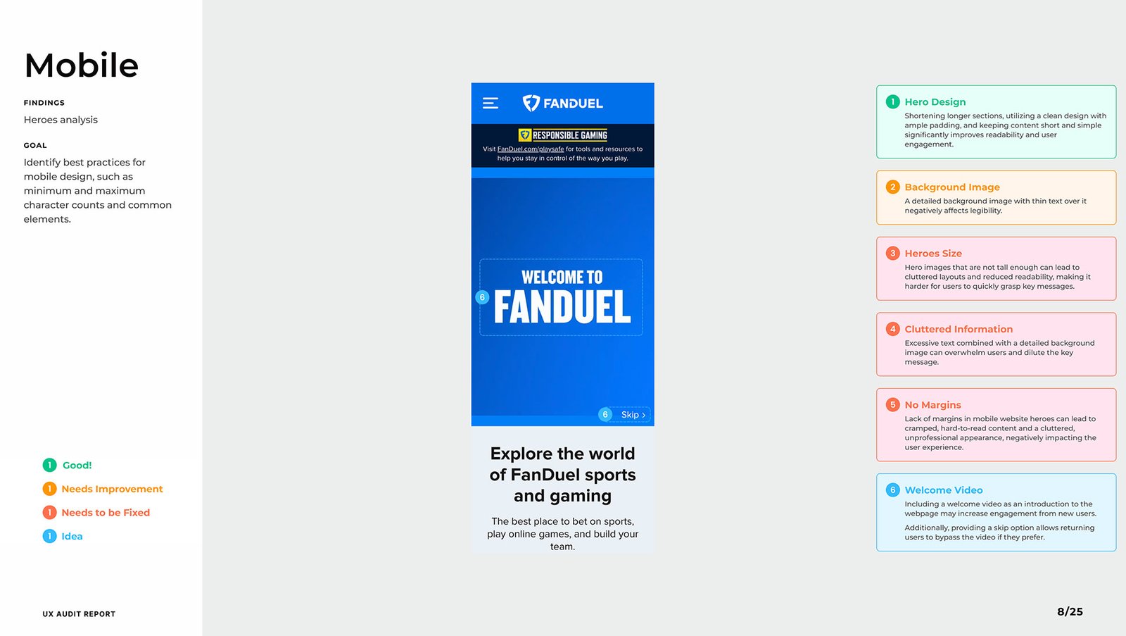
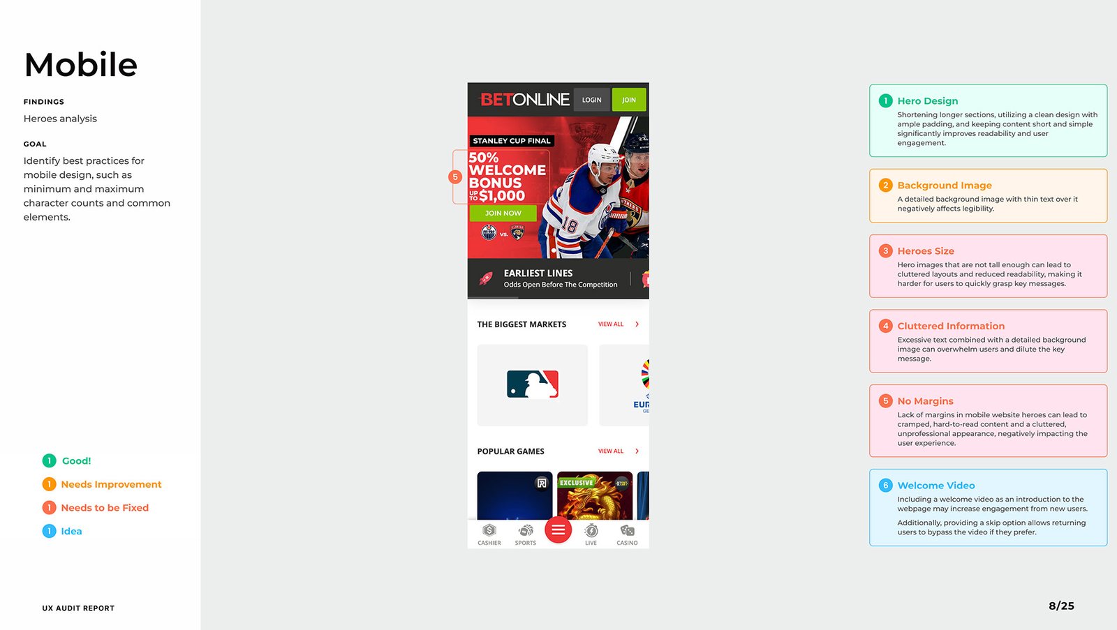
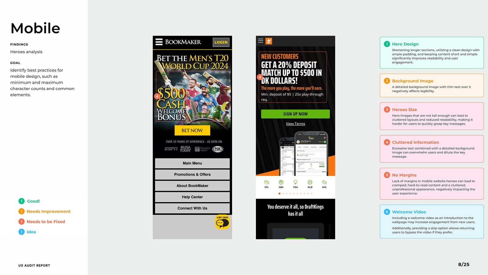
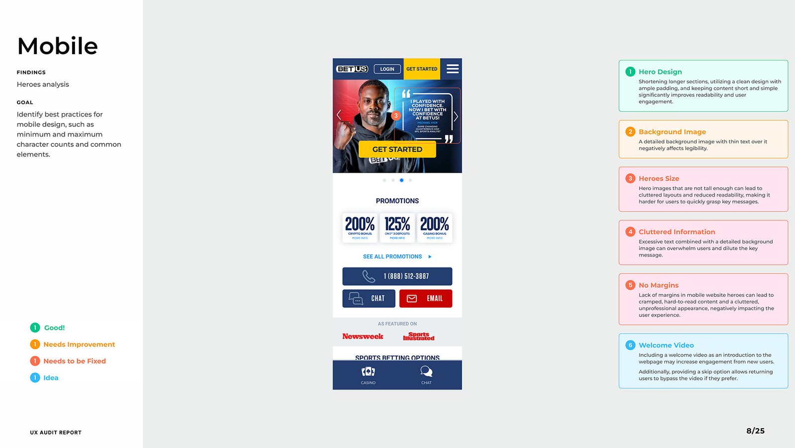
Key Findings
A competitive UX audit was the foundation of this project, created to guide the agency Rocket Air in designing the new pre-login experience for Bet Anything — a strategic entry point to capture user interest and guide them toward account creation.
-
✅ Good: Scrollable, vertically stacked hero layouts with clear messaging and spacing.
-
⚠️ Needs Improvement: Horizontal card scrolling and image clutter hurt usability.
-
❌ Needs to Be Fixed: Inconsistent padding, short height, and visual overload.
💡 Insight:
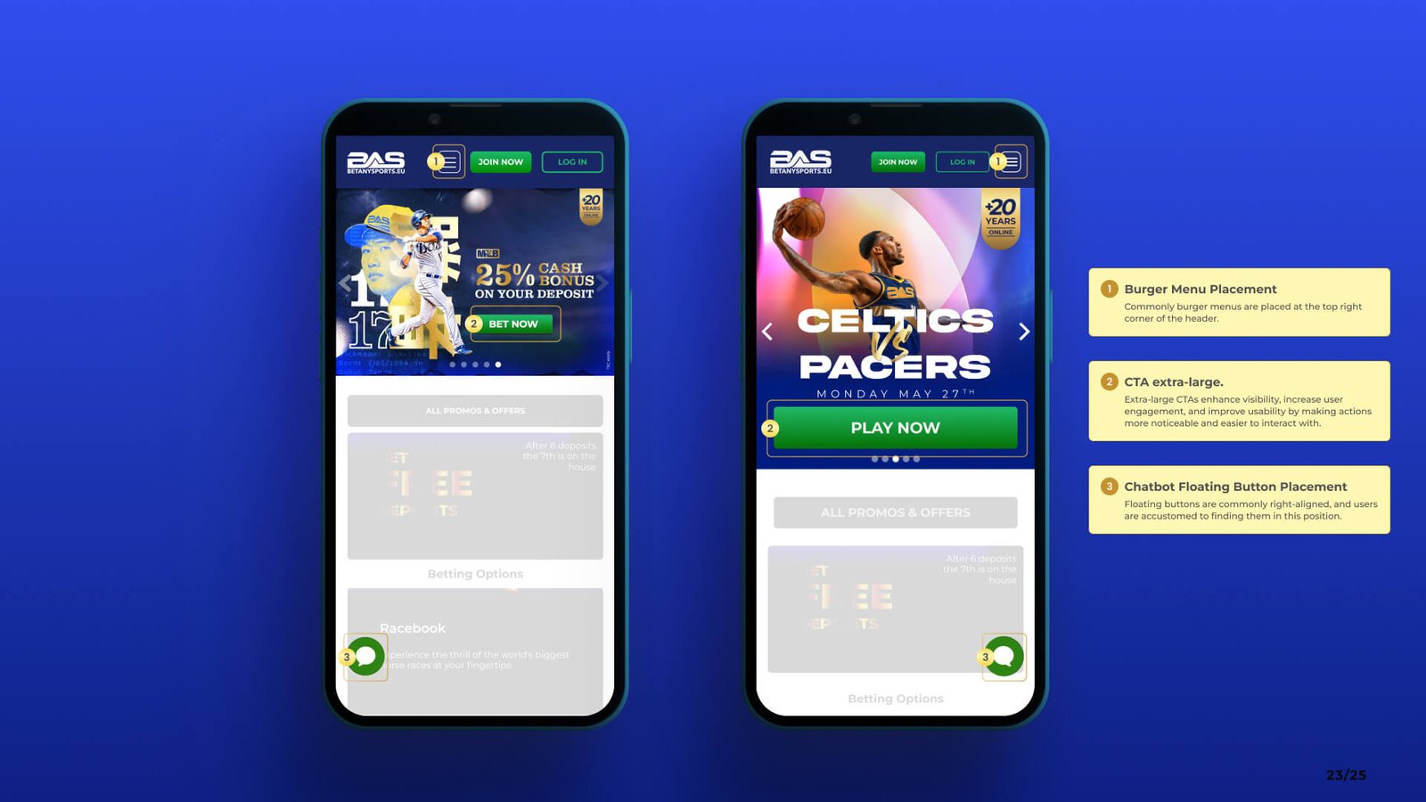
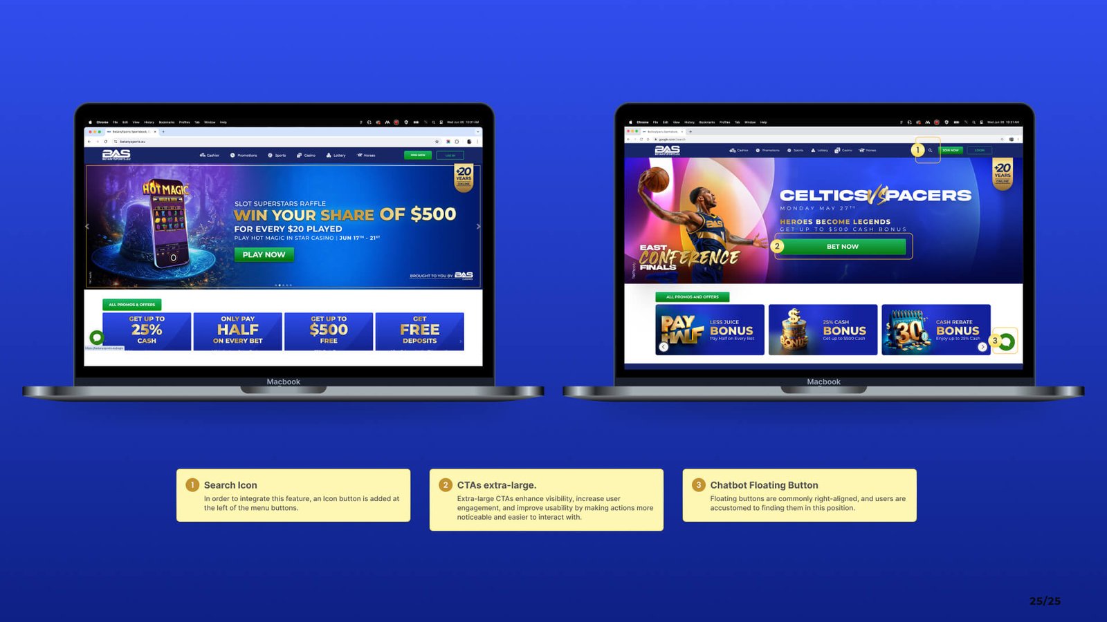
Burger menus worked better on the right side, CTAs performed better as large primary buttons, and welcome videos boosted engagement when paired with a skip option.
-
✅ Good: Hero sections with clean copy, strong contrast, and minimal distractions.
-
⚠️ Needs Improvement: Headlines competing for attention within the same block.
-
❌ Needs to Be Fixed: Background images with low text contrast.
💡 Insight:
The best performers used a strong single message with immediate value and clear hierarchy. Average character count across headlines was around 77.
-
✅ Good: Balanced whitespace and padded components improved readability.
-
⚠️ Needs Improvement: Overlapping text, lack of margin, and noisy imagery.
-
❌ Needs to Be Fixed: Text layered over complex images damaged clarity.
💡 Insight:
Flat-color backgrounds or lightly dimmed overlays made CTAs and headlines far more legible and conversion-friendly.
-
✅ Good: Short, punchy copy with emotional tone and immediate CTAs.
-
⚠️ Needs Improvement: Redundant or vague subheaders diluted impact.
-
❌ Needs to Be Fixed: Inconsistent tone and overwhelming blocks of text.
💡 Insight:
One message per block, with clear emotional/functional benefit, outperformed verbose or segmented copy.
-
✅ Good: Clear menu structure, segmented content, and quick links to main actions.
-
⚠️ Needs Improvement: Menu buttons without affordance, unclear active states.
-
❌ Needs to Be Fixed: Hidden nav elements, overly nested categories.
💡 Insight:
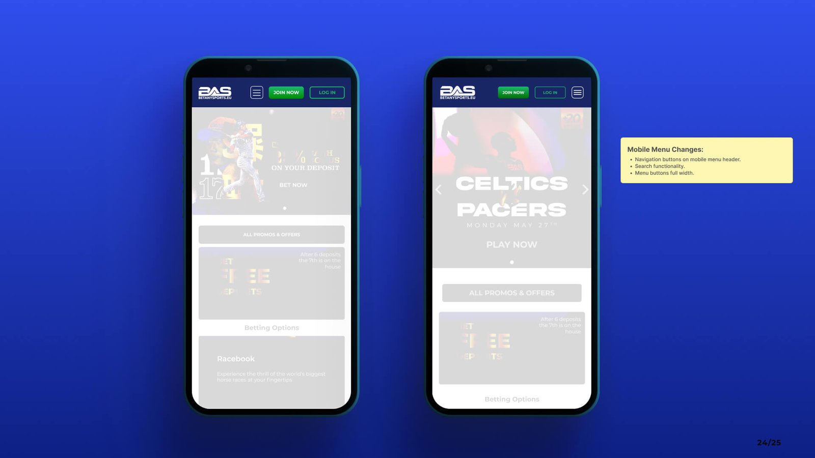
Users favor clarity over minimalism — prioritizing scannability and clarity of path, especially on mobile.
-
✅ Good: Large tap targets, good font sizing, clear buttons.
-
⚠️ Needs Improvement: Missing alt text, unclear interactive elements.
-
❌ Needs to Be Fixed: Low contrast ratios, unreadable overlays, and no visual focus indicators.
💡 Insight:
Designs that considered WCAG basics like contrast, size, and keyboard navigation naturally performed better in user flow and engagement.
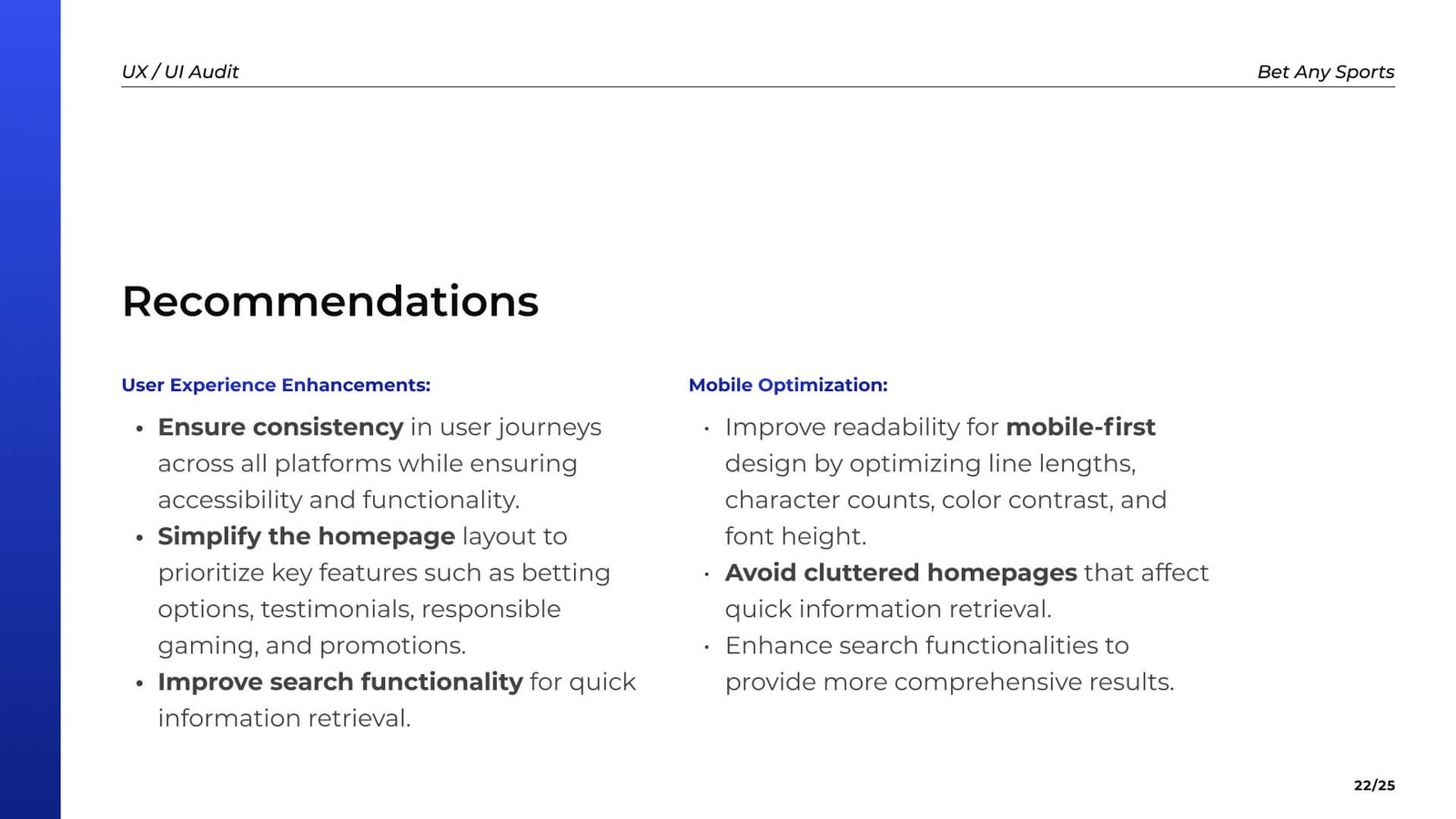
Strategic Actions
This section presents key UX/UI enhancements for BetAnySports, based on competitive insights and current product evaluation.
Deep Dive
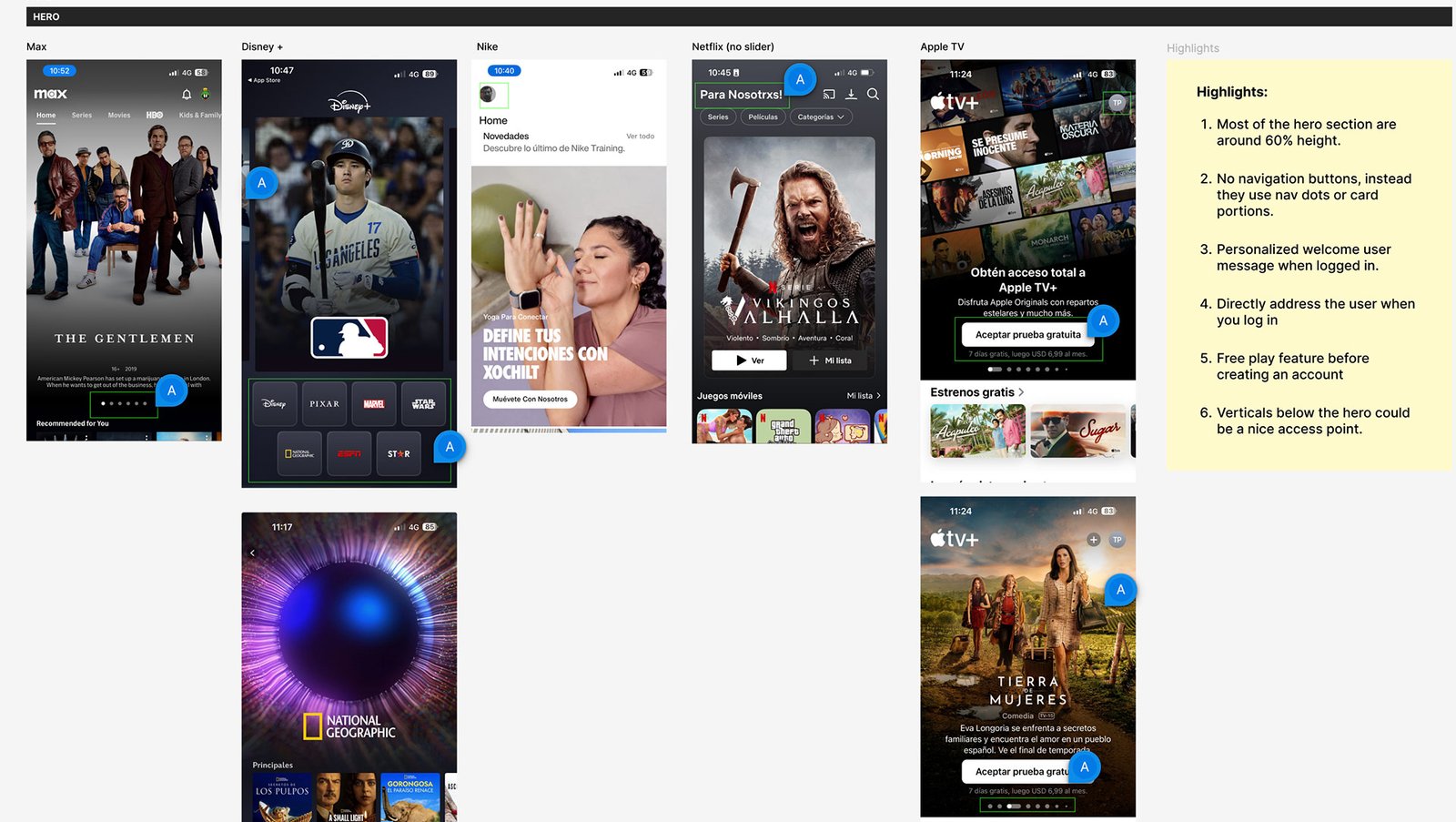
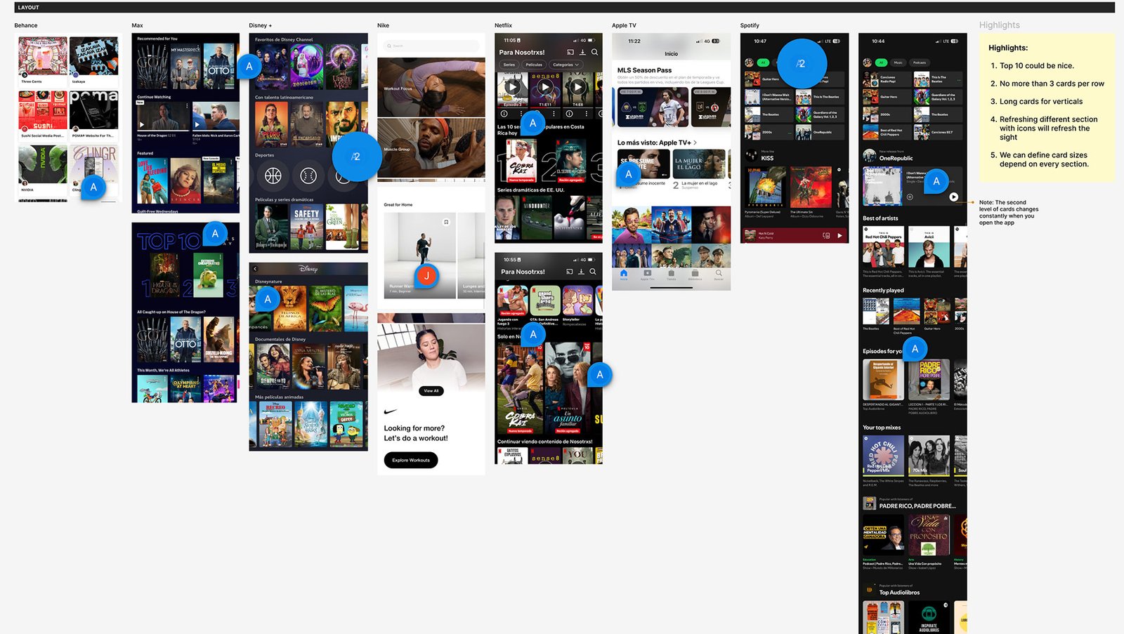
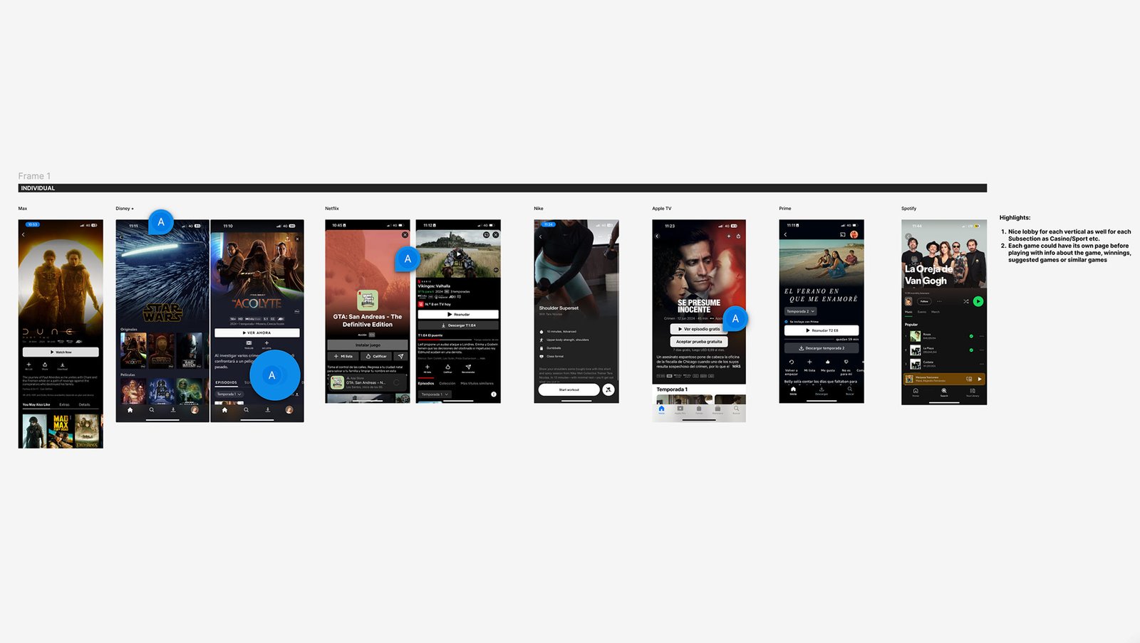
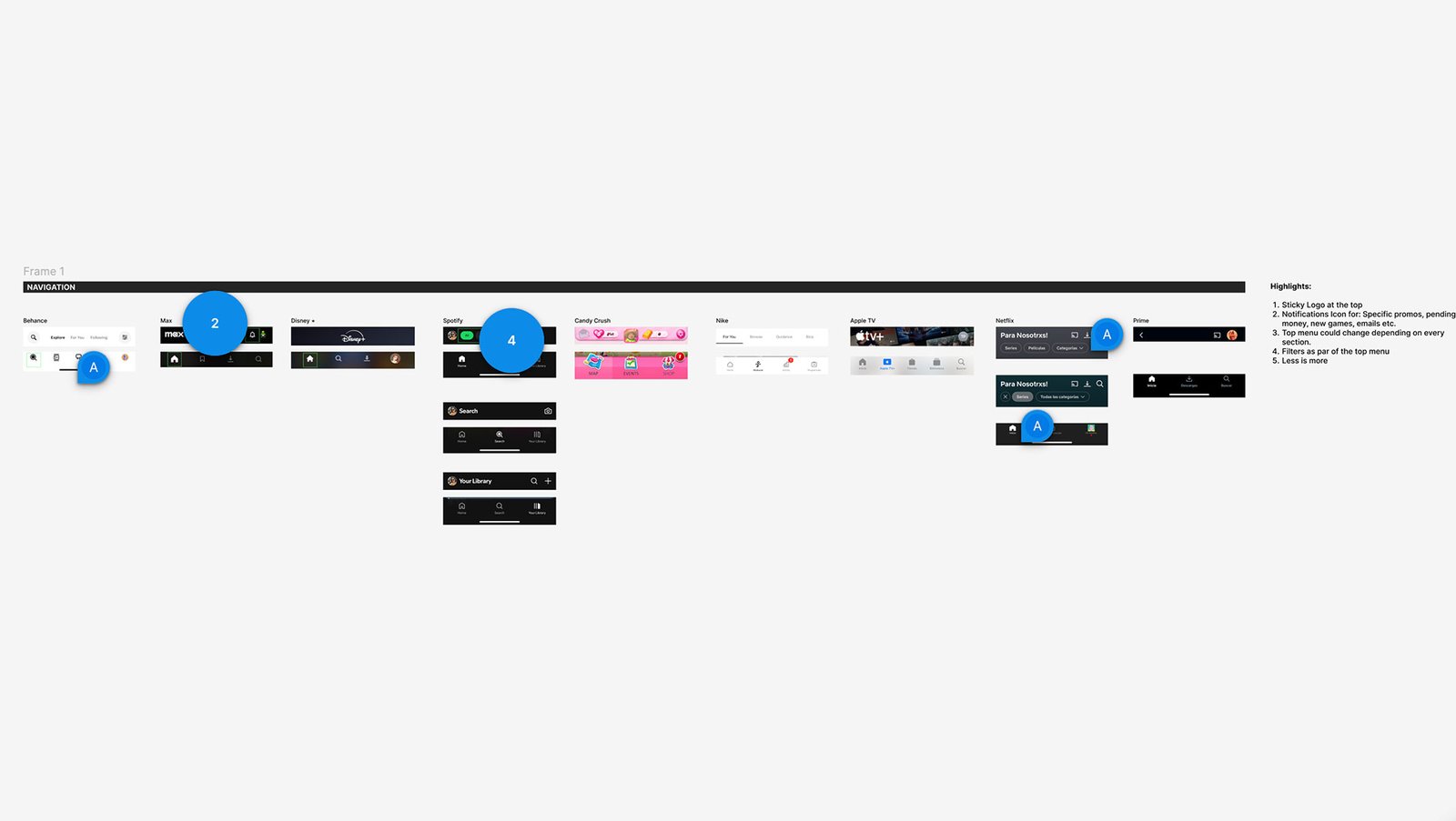
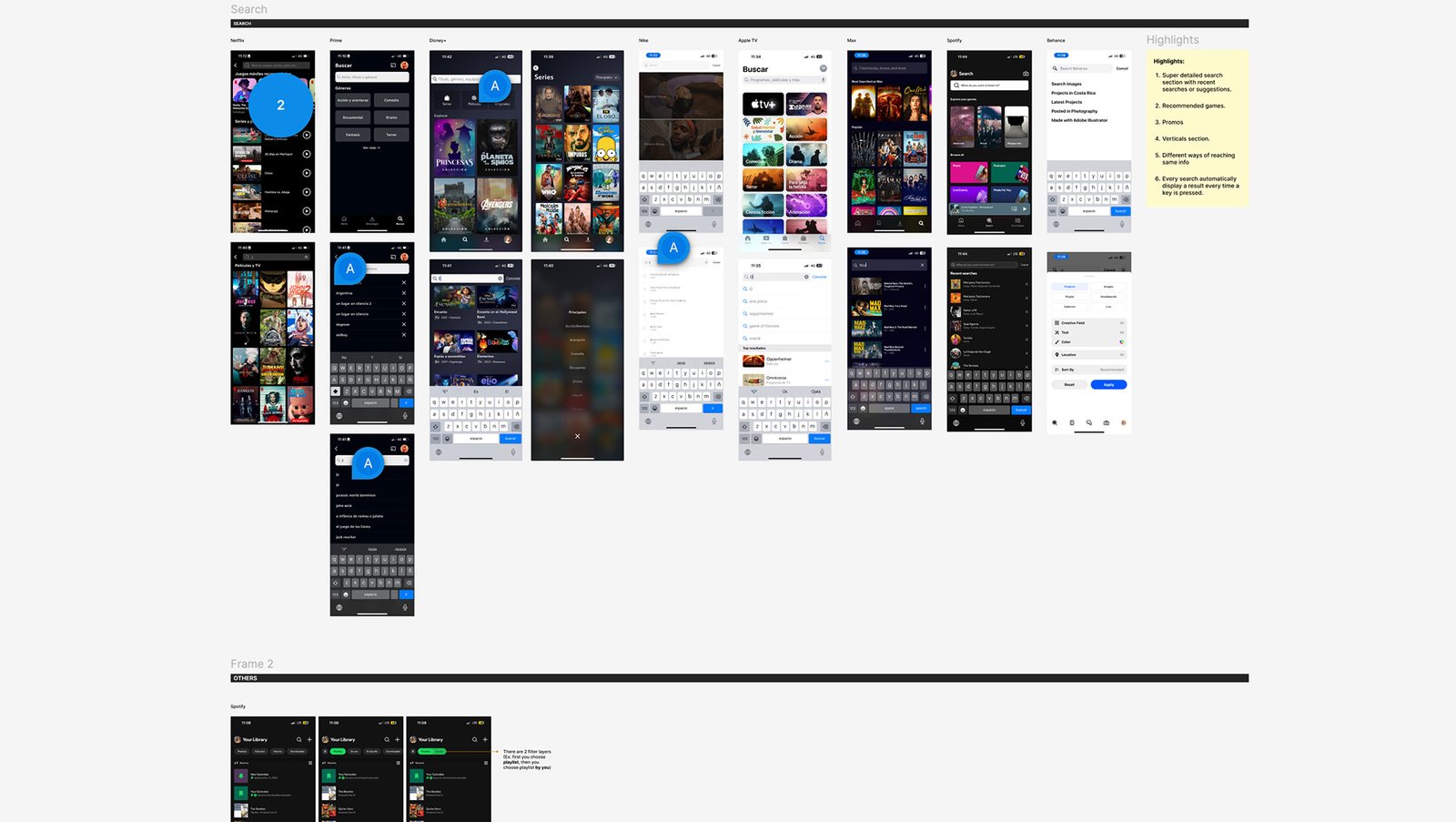
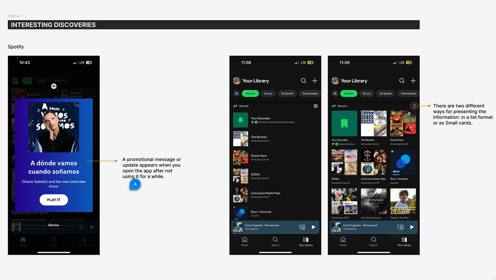
A second round of focused UI research was conducted to go beyond standard audits — exploring high-performing platforms like Netflix, Disney+, and Spotify. This extra layer of insights was aimed at uncovering specific interface patterns, visual behaviors, and interaction trends that could elevate the Bet Anything experience. These findings serve as a tactical resource for Rocket Air to refine the visual and structural strategy moving forward.
Most hero components occupied 60% of screen height and featured minimal navigation, with dot indicators or card layouts. Welcome messages were tailored and some apps allowed feature previews before signing up.
Content is structured using verticals, limited rows, and refreshing icons. Top 10 or featured sections created familiarity. Card size and style varied per section to maintain user interest.
Each item (e.g., show, workout, game) had a dedicated page to build trust, offering summaries, previews, or gameplay info. These pages serve as soft conversion points before engagement.
Navigation was often fixed and simplified. Tabs were consistent, with minimal buttons and sticky headers. Filter functionality was context-aware and adapted by section.
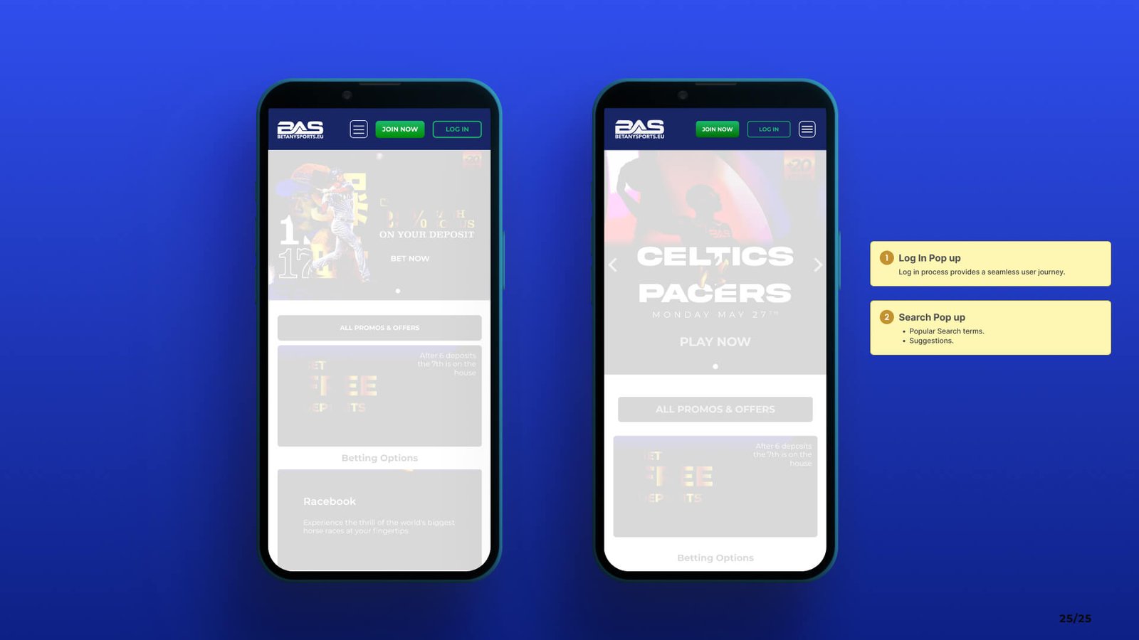
Search interfaces offered live suggestions, recent activity, filters, and vertical-specific results. Auto-search triggered with each keystroke improved immediacy.
Project Reflections
This audit was more than a research exercise — it was a strategic design tool. By combining broad UX benchmarking with a focused second round of UI analysis, I helped define clear opportunities for improving BetAnySports and set a strong foundation for Rocket Air to shape Bet Anything’s future.
I learned to look at UX through multiple lenses: business, user, and visual. Balancing competitor insights with design thinking helped me understand how small decisions—like button size or menu placement—can impact engagement at scale.
This work led to tangible improvements: clearer homepage layout, streamlined mobile journeys, and more intuitive search. It also gave Rocket Air an actionable framework to begin their redesign with confidence and alignment.
Layering different types of audits (UX + UI) created a much richer analysis. Combining structured frameworks with second-round insights ensured depth without losing direction.
Working closely with design partners and devs ensured our recommendations were not just idealistic, but realistic. Open feedback loops and clear documentation kept momentum strong across teams.
This case study challenged me to think bigger, zoom in when needed, and lead with purpose. More than just an audit, it became a launchpad for better, bolder user experiences.
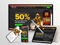
B2B Website Redesign Focused on Conversions
Master Affiliates
A High-Impact UX/UI Overhaul in Just 6 Weeks
Project Overview
B2B Website Redesign Focused on Conversions, a high impact UX/UI Website, Master Affiliates is a performance-driven affiliate marketing platform that connects businesses with top-tier affiliates to maximize revenue through strategic partnerships.
The previous website had a low conversion rate and failed to effectively communicate Master Affiliates’ value proposition to potential partners. The complex and unstructured content made it difficult for users to understand the platform’s benefits, leading to missed opportunities for engagement and sign-ups.
Adding to the challenge, we had only 6 weeks to redesign the entire website.
To increase conversions by implementing a modern UX/UI redesign and a refined content strategy that simplifies information enhances usability, and attracts new clients.
As the Lead UX/UI Designer, I was responsible for:
- Defining the UX strategy to improve user engagement.
- Redesigning the website structure, layout, and content hierarchy.
- Delivering final UI designs for development and ensuring design consistency.
- Leading a team of two UX/UI designers, who:
✅ Developed a UI Kit to ensure visual consistency.
✅ Created custom images and graphics using MidJourney.
✅ Designed mobile and tablet versions of the site. - Overseeing the design-to-development handoff and conducting QA to ensure a pixel-perfect implementation.

Research & Discovery
Receiving 140 visits per month, yet only 15 users clicked the JOIN NOW CTA, resulting in a high bounce rate of 89.3%.
Through Google Analytics data and stakeholder feedback, we uncovered:
✅ High Bounce Rate (89.3%) – Most visitors left without engaging.
✅ Overwhelming Content – Messaging lacked clarity, making it difficult to grasp the program’s value.
✅ Unclear CTAs – The JOIN NOW button was not prominent, leading to low interaction.
✅ Poor Mobile Experience – Navigation was frustrating, causing drop-offs.
These insights confirmed the need for a content-focused UX redesign to simplify navigation, improve messaging, and increase conversions.
To align with business goals, I conducted a Q&A session with the Affiliates Director to understand key pain points and gather insights. Two competitor websites were provided as benchmarks:
Commission Kings and RevMasters stood out for:
✅ Clear, benefit-driven messaging
✅ Simplified sign-up flows
✅ Engaging, easy-to-navigate dashboards
We refined content structure, UI approach, and navigation by analyzing these platforms to position Master Affiliates as a more user-friendly and conversion-focused platform.
With only 1 week for research, we focused on high-impact changes:
✅ Simplifying content to highlight key benefits.
✅ Enhancing CTA visibility for better conversions.
✅ Optimizing navigation to reduce friction.
✅ Ensuring a fully responsive design for seamless cross-device experiences.
By grounding our redesign in real user insights, we ensured a more intuitive and engaging experience.
UX Strategy & Wireframing
The redesign of Master Affiliates wasn’t just about visuals—it was about creating a user experience that was clear, focused, and built for conversion.

Identifying Structural Gaps
The previous website had a flat layout, vague call-to-actions, and a disjointed content flow. With repetitive messaging and unclear visual hierarchy, users often dropped off before understanding what the platform offered.
Navigation was inconsistent and the user journey lacked momentum—there was no clear direction pushing users toward conversion.

Strategic Reorganization: Sitemap Redesign
One of the first tasks was to restructure the site architecture. The original sitemap gave equal weight to primary and secondary content, and lacked a guided flow.
The revised sitemap streamlines navigation, removes redundancy, and introduces a clear flow from landing to conversion. We consolidated sections and moved less critical content (e.g., legal info) into the footer to keep the core experience focused.

UX Flow & Content Prioritization
We reimagined the site to follow a natural scroll-based narrative:
- Attract with a bold offer and strong visuals
- Convince with clear commission structures and benefits
- Reassure with testimonials and supporting content
- Convert with visible, high-impact CTAs placed throughout
Content was reorganized into modular blocks, each with one clear purpose—educate, build trust, or drive action.

Wireframing & Layout Strategy
Given the tight 6-week timeline, we skipped low-fidelity exploration tools and moved straight into structured layout design, starting with hand-drawn wireframes to align priorities quickly.
This early sketch helped define the core content flow:
- A bold hero section highlighting the key value proposition (XX% revenue share)
- A clear, high-contrast CTA placed early to drive conversions
- A visual slot for imagery or product mockups to reinforce the offer
- A dedicated, scannable Commission Structure section to build trust and support decision-making
From this foundation, we moved into responsive layouts in Figma.
UI Design & Implementation
With the UX structure in place, the focus shifted to delivering a bold and modern visual identity that communicated value, trust, and energy.

Visual Direction
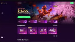
We established a sports-driven visual identity—confident, clean, and energetic. The UI leveraged:
- A dark, high-contrast background for dramatic impact
- Bold typography to highlight the 50% affiliate offer
- Carefully structured sections for visual rhythm
- Custom graphics and imagery that reflected the gaming and sportsbook ecosystem
This look & feel modernized the brand and positioned it competitively within the affiliate space.

Design System
To ensure scalability and speed, we created a modular design system in Figma, which included:
- A reusable UI Kit with buttons, typography, and layout components
- Consistent spacing rules, color styles, and design tokens
- Scalable sections for commission structures, testimonials, and CTAs
This allowed the design team to work in sync while ensuring visual and functional consistency across breakpoints.

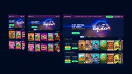
Responsive Execution
Layouts were designed responsively from the beginning. Each screen—desktop, tablet, and mobile—was adapted to maintain usability and clarity. We focused on:
- Adaptive grid behavior
- Tap-friendly touch targets and CTA placements
- Simplified navigation for mobile
- Reflowing commission tables for small screens
The mobile experience was not just a scaled-down version—it was intentionally crafted for performance and clarity.


Team Collaboration & Execution
I led a small but focused team of two UX/UI designers. Together, we:
- Created mobile and tablet versions
- Built and maintained the shared UI Kit
- Developed branded hero imagery and UI assets using MidJourney
I took ownership of the desktop layouts and provided direction and quality checks across all visual touchpoints. We worked in fast iterations with daily reviews to stay aligned and on schedule.

Asset Delivery & QA
Once the visual designs were finalized, I led the full handoff and implementation support process, working closely with developers to ensure everything was built to spec.
This included:
- Delivering fully organized and labeled Figma files
- Exporting all necessary assets and layout specifications
- Supporting the development team with behavior clarifications and responsive behavior notes
- Using Jira to document design tickets, assign tasks, and track progress across features
- Creating an Excel QA tracker to document each QA round, detail issues found across breakpoints, and assign them to specific developers for resolution
This structured and transparent approach helped us ensure consistency, avoid missed details, and streamline collaboration between design and engineering—especially critical under the pressure of a tight 6-week deadline.
Results & Reflection
The Master Affiliates redesign resulted in a streamlined, conversion-focused website delivered in just six weeks — with significant improvements in structure, clarity, and engagement across devices.


Results at a Glance
📊 Heatmaps & Behavioral Insights (via CRO)
- 60% of users focused on the hero section, showing strong engagement with the key value proposition and early CTA — exactly where we aimed to capture attention and drive conversions
- High interaction with the top navigation, especially FAQs and the contact email, suggesting users were actively seeking clarity and preferred direct access
- The contact email in the top-right corner received significant clicks — likely due to its simplicity and immediate reward (aligned with present-focus bias and response efficacy)
- The commission structure section also drew strong attention, confirming its importance as a decision-making anchor
Heatmap analysis showed users engaging with the exact areas we prioritized — hero messaging, commission details, and quick-contact options — validating our UX strategy and layout decisions.


Final Visual Experience
The new Master Affiliates website was crafted to deliver clarity, confidence, and action. Every section was designed with purpose — from the bold hero statement that immediately communicates value, to the commission breakdown and testimonials that build trust.
Strong visual anchors like high-impact photography, structured content blocks, and bold CTAs helped guide user attention and create a professional, persuasive journey. The layout was built responsively to ensure consistency across desktop, tablet, and mobile, supporting accessibility and a seamless user experience.

Cross-Functional Collaboration
This success was made possible through strong coordination with a cross-functional team:
- The CRO provided behavioral insights that influenced the layout of CTA placement and UX writing.
- A copywriter and SEO specialist worked together to shape UX writing aligned with clarity, tone, and search performance.
- Project managers handled Jira task creation and helped manage QA cycles, one PM even participated in testing.
- I worked closely with developers from the start, ensuring feasibility, alignment on interactions, and timely handoff support.
This constant communication across disciplines allowed us to iterate quickly and make confident decisions throughout the process.
Collaboration under Pressure
This project reinforced the value of cross-functional collaboration and staying adaptable under pressure. Leading the design while aligning closely with business needs helped me stay focused on what truly drives user and business impact.
Aligning Design & Development
One key takeaway was around grid alignment. While we used a 12-column design system, the development team implemented layouts using percentage-based Flex and Grid systems, which led to implementation inconsistencies. In future projects, I’ll prioritize early alignment on layout logic to prevent issues and streamline development.
Wireframing for Speed and Clarity
Although the timeline was tight, wireframing early on allowed us to define structure, flow, and hierarchy quickly, enabling fast alignment with stakeholders and smoother transitions into UI design. It proved to be a crucial tool for maintaining momentum without sacrificing clarity.
Despite the challenges, I’m proud we delivered a high-impact, responsive experience—on time, and with a scalable foundation for growth.
Before & After


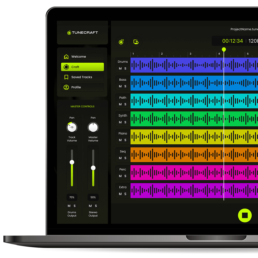
Designing a User-Friendly UI for Music Creation
This case study focuses on the design of a user-friendly music UI for Easy Tunecraft — a platform created to simplify music-making for beginners and casual creators. The challenge was to craft an interface that feels approachable, intuitive, and creatively empowering without sacrificing functionality.
From user flow planning to clean layout decisions, the process emphasized usability, accessibility, and the emotional rhythm of digital music creation.
Overview
Increasing visits by 430% on the new landing page
1500+
With the new design the average of tunes crafted increased significantly.

Timeline
Feb - Oct 2022

Platform
Responsive Webapp

My Role
UI-UX Designer

Tool
Figma
UI Process
From a Moodboard to a Prototype
1. Introduction
TuneCraft was designed with simplicity and user-friendliness. It allows anyone to dive into music composition regardless of musical background. This intuitive platform breaks down the barriers to music creation, making it accessible and enjoyable for all. Users can craft unique, royalty-free tunes perfect for various applications – from digital marketing to personal projects. Here is the UI Process.
We followed WCAG accessibility guidelines to ensure the interface was inclusive and legible across devices.
My Role
I led the design, user testing and development of this project from end to end. I collaborated with one product designer during the early ideation stage, one UX Designer, one Project Manager, and one Developer.
Problem
Agencies in the modern digital landscape face a significant challenge in sourcing royalty-free music for their video productions. The options often involve expensive licensing fees or limited options.
The client previously created an app for mobile but its lack of design and UX process resulted in an abandon rate of 75%.
Goal
I aim to boost user interest in the UI design I’ve developed, showcasing its unique, user-friendly features to enhance their experience with the tool.
2. Impact
Analytics indicated a remarkable 450% increase in visits, totaling 30,000 in the first three months alone. Furthermore, there was a substantial decrease in the abandonment rate, dropping from 75% to 37%. These figures reflect the team’s efforts’ success and underscore the new design’s positive impact on user experience and retention.
3. Early Ideation
Moodboard
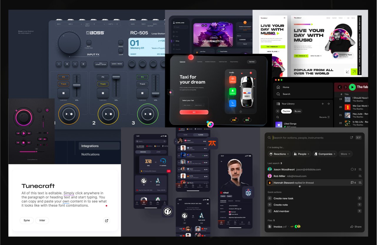
I have carefully curated a collection of images that encapsulate my vision for the app’s look and feel. This moodboard harmoniously blends sleek interfaces, intuitive layouts, and a color palette that reflects TuneCraft’s innovative and user-friendly ethos.
Low Fidelity Wireframe
This sketch is a first glance at the user interface design, mapping out the essential elements and their interaction. At this stage, the focus is on functionality and layout rather than visual details.

Medium Fidelity Wireframe
I developed a medium-fidelity wireframe, a vital step in the UI design process. This wireframe balances basic structure and more detailed elements, providing a clearer view of the layout and user interaction without the intricacies of high-fidelity designs.
4. Style Guidelines
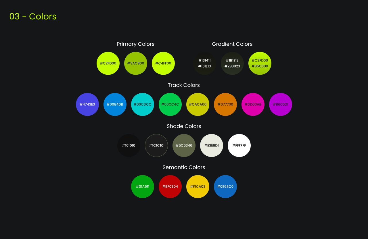
In crafting the style guidelines for TuneCraft, accessibility stands at the forefront of our design ethos. We strive to create an inclusive environment where all users can navigate and interact with the app comfortably and effectively. Our color palette is chosen to appeal aesthetically and accommodate various forms of color vision deficiencies. We ensure sufficient contrast between elements and backgrounds to aid readability and ease of use.
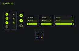
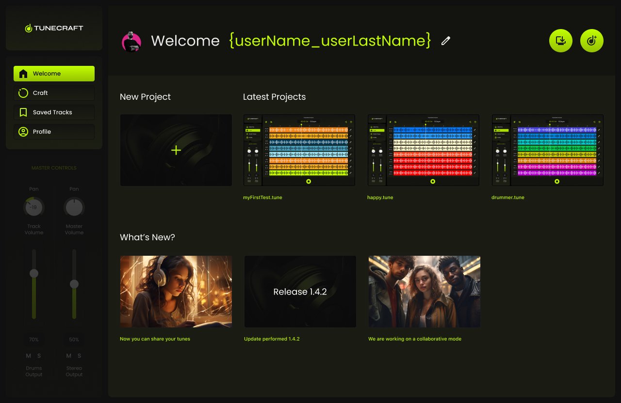
5. Final Designs
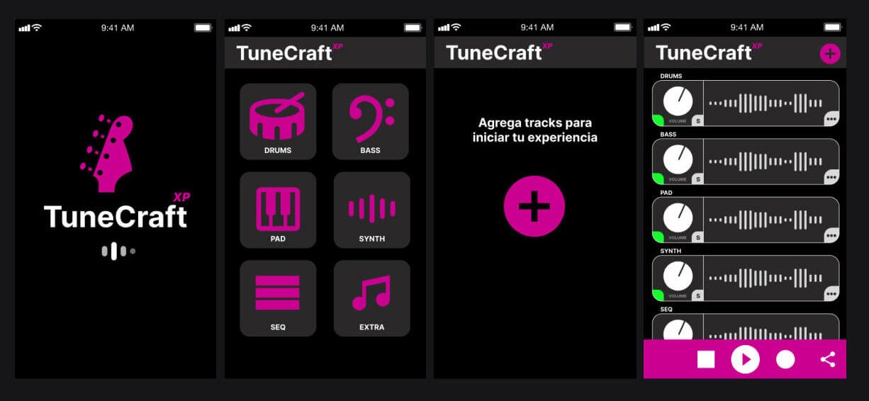
The previous design, primarily centered on mobile, fell short in adhering to design best practices. This oversight led to a visually unappealing interface that failed to resonate effectively with users. The design’s aesthetic appeal and functionality limitations highlighted the need for a more thoughtful and user-friendly approach.
Before
After
Loading Page
We wanted an elegant and clean landing page.

Welcome Page
On the Welcome Page, we created options in order to let the user create a new project or load the latest.
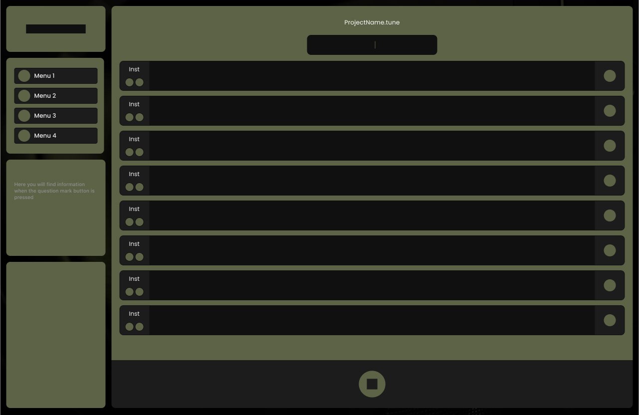
Adding First Track
Adding a track was designed as an easy process.
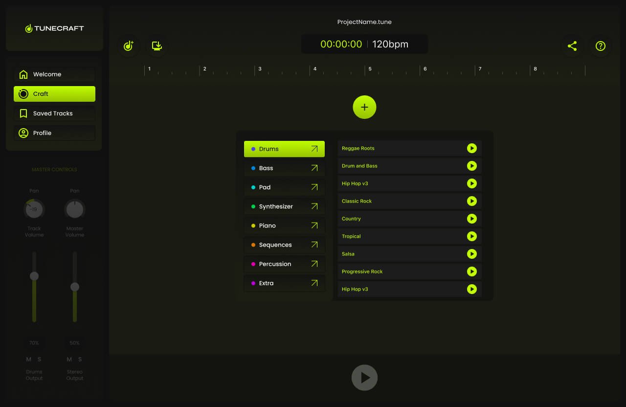
All tracks added
All the tracks were successfully added.
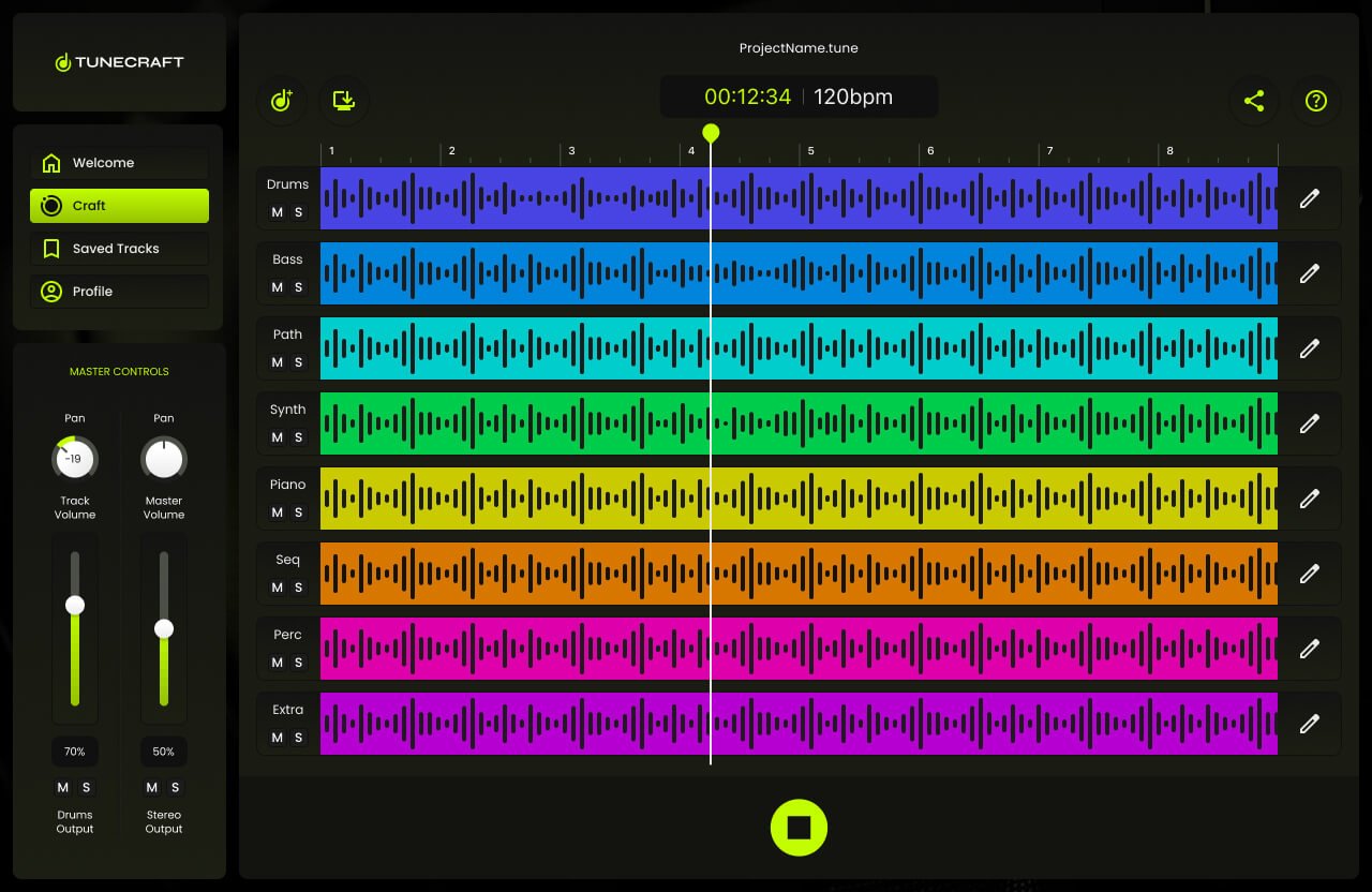
6. Prototype
This prototype brings the wire flow to life, showcasing a dynamic and interactive representation of the user journey within TuneCraft. It illustrates the process from the landing page to a fully layered session, allowing users to actively engage with the interface by adding tracks. This interactive model is key to understanding the practicality and responsiveness of TuneCraft’s design, providing a real-world feel for the user experience.
7. Testing
Four tests were conducted on-site, and four were carried out virtually. Each session was meticulously screen-recorded while participants employed the think-aloud protocol, verbalizing their thoughts as they navigated through the app.
The on-site tests provided me with a direct observation opportunity, enabling immediate engagement with the participants. Conversely, the virtual tests offered insights into how users interacted with the app in their natural environment. The combination of both testing environments, complemented by the think-aloud commentary, granted me a comprehensive understanding of the user experience. The feedback collected is now a cornerstone for iterative design enhancements, ensuring that TuneCraft is tailored to meet the users’ needs with precision and empathy.
8. Tunes
To optimize TuneCraft’s user experience, I spearheaded a series of rigorous testing sessions—four conducted on-site and four carried out virtually. Each session was meticulously screen-recorded while participants employed the think-aloud protocol, verbalizing their thoughts as they navigated through the app. This method yielded deep insights into user behavior, preferences, and usability challenges encountered during their interaction with TuneCraft.