POM - Website
UI / UX - Digital Product
Overview
A collection company
Its offer is backed by an extensive track record, providing solutions in credit portfolio management, which streamline cash recovery processes and strengthen corporate finances.
Client: POM. Users: POM's clients. Timeline: May 2023 - September 2023. My role: UX and UI solo designer. Team: solo project. Tool: Figma.
Problem
POM needs to grow in the collection market in Costa Rica and win over their competitors. The problem was they needed a solid digital presence to gain potential customer trust.
Solution
Creation of an attractive, user-friendly, and accessible website so that they could earn their potential customers’ trust. Also, a brand refreshment.

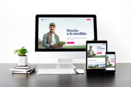
Responsive
All of my websites use responsive web design principles. This ensures your online presence remains stunning and user-friendly across all devices, from desktops to smartphones. With fluid layouts, flexible images, and tailored styling, your website will captivate audiences seamlessly, providing an optimal experience on every screen size.
CMS
I exclusively leverage WordPress, empowering clients to edit their websites using a user-friendly content management system effortlessly. Your website remains controlled, ensuring easy updates and content management without technical hassle.
SEO
I consistently integrate fundamental SEO parameters, granting my clients access to essential metrics through Google Analytics. This empowers them to analyze detailed reports, make informed decisions, and rapidly enhance their website's traffic.
Mobile
Explore the mobile view of our website design in action. Witness how our design seamlessly adapts to mobile devices, ensuring a captivating and user-friendly experience.

Tagline
Analyzing Competitors:
I conducted five user interviews with some clients they currently have. My idea was to catch what these customers thought about the competitors. I wanted to get insights into what the clients felt the competitors were doing well, what they thought they would need in a site like this, and what could have been improved.
Here are a couple of examples of POM’s main competitors, with the feedback I got from the interviews:
Gesel:


- It needs to be clarified what applies to Costa Rica.
- They dislike that everything is on one page.
- The colors look like the “INS” Costarrican institution.
- There is overlapping text at the top right navigation bar.
- White texts are not legible with a light green background.
- Some texts are cut in ways impossible to read such as: “Distingu – e”
- There are modules with a lot of info in it making them difficult to read.
Gestionadora de crédito:


- It looks outdated.
- The content feels boring.
- It doesn’t give them confidence in a site like that. It seems like a scam.
The Work
Based on the insights gathered from the user interviews, I decided to create an easy-to-use site with a modern look.
Step 1
Sitemap
First, I started with a quick sitemap to have a better understanding of the sections it should have.


Step 2
Userflow
Then, focusing on the user contacting POM for their services, I created this user flow to see the logic behind that scenario.
Step 3
Low-fidelity wireframes
I made this to have a quick reference for the client. The problem was that the client needed to understand this purpose and started to be concerned because it was vague since they weren’t designers.


Step 4
Style Guideline
Since the client needed a high-fidelity prototype to understand the design, I created these styles to make the final UI easier and better organized. Since I’m also a graphic designer, I also did a refreshment of their logo.
Step 5
High-fidelity wireframes
To help the client understand the look and feel, I created this prototype. This also helped me test my design and think about developing the site.

From Low Fidelity to High Fidelity


Logo before and after
Conclusion and lessons learned:
It’s crucial to consistently reflect on past experiences and lessons as a UI/UX designer to ensure continuous growth.
Effective communication
You need to understand your clients to help them comprehend your vision. The idea is to adapt to change and their design level so you can create the best design solution for them.
Accessibility
Accessibility is the key for UI designers. That's why I focused my design on AA compliance. A challenge was to convince the client to let me change things to reach this, but it was a win in the end.