Overview
Conexart: An artist app design
In my role on the Conexart project, I was integral in developing a user-centric prototype for job applications within the app. My tasks involved deep user research, designing wireframes and interactive prototypes, and collaborating closely with developers and new designers to ensure a cohesive and intuitive design. I actively engaged with stakeholders, incorporating their feedback to align the product with user needs and business goals. Post-launch, I refined the app based on user feedback and performance metrics, ensuring it met the project owner’s vision and real-world demands.
Client: Conexart. Users: Artists (musicians, painters, cosplayers, poets, dancers, actors, sculptors. photographers, writers, illustrators, digital artists, etc.) Timeline: March 2023 - June 2023. My role: UX designer. Team: One UX lead, two Product Designers (I was one), a research team, one Senior Project Manager, and two Senior Developers. Tool: Figma, Optimal Workshop, DALL·E 3, Photoshop Beta.
Problem
Due to the pandemic’s unprecedented impact, most artists have lost employment opportunities. In the aftermath, these artists face significant challenges in securing new job opportunities.
Solution
We developed an app designed to offer job opportunities. Its simple and intuitive interface ensures artists can effortlessly apply and find suitable roles.
the process
Phase one
In the content below, I’ll only list the deliverables I was in charge of working on
- Research and interview with the Product Owner.
- Personas.
- Benchmark
- Desired Information Architecture (alpha)
1. Research & Interview with the Product Owner
We interviewed the product owner, capturing crucial insights and comprehending their vision. Additionally, our research team conducted a study on the pandemic’s impact, yielding several alarming results.
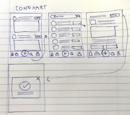
After posing several strategic questions to the product owner via Teams call, I understood the product better, distinguishing between essential and desired features. This insight allowed me to craft an initial paper prototype with sections including home, jobs, publish, calendar, profile, notifications, and search.
I developed a swift paper prototype to present to the client, ensuring it was straightforward to comprehend. This approach was instrumental in demonstrating that we were on the right track, providing a clear and tangible representation of our progress.
Pandemic
Findings
Our research team conducted a study on the pandemic's impact, yielding several alarming results
Event cancellations
Live events canceled or postponed and 70% of art venues closing temporarily in 2020..
Economic Hardship
Freelancers experiencing contract disruptions
Mental health
Reporting increased anxiety and stress
I conducted in-depth interviews with 15 artists to understand their unique circumstances and needs comprehensively. This valuable insight enabled me to create well-defined user personas, reflecting the diverse experiences and preferences within the artist community.
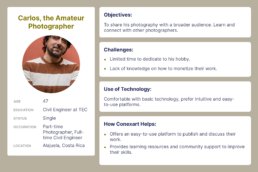
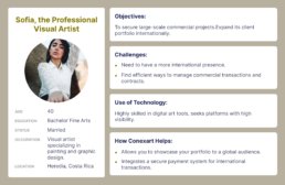
2. User personas
To thoroughly understand the diverse needs of our users, I crafted three distinct user personas. This process involved analyzing various user characteristics, preferences, and behaviors. Each persona represented a unique segment of our target audience, providing valuable insights into their requirements and expectations.
Conclusions
User Collaboration is a Gap
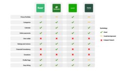
Fiverr and Upwork, despite being major platforms, lack features for user collaboration, suggesting a potential area for differentiation. Providing robust tools for user collaboration could fill this market gap and offer a competitive advantage.
Financial Consultancy is Rarely Offered
None of the platforms, except for Fiverr, offer financial consultancy services. This presents an opportunity to provide unique value by integrating financial guidance for freelancers and gig workers, which could be a strong selling point for the platform.
Opportunity for Enhanced Hiring Processes:
While most platforms have a functional hiring process, there's an indication that this feature could be improved, especially with the "Helping Partner" platform. Streamlining the hiring process and making it more user-friendly could significantly improve user satisfaction and platform usability.
4. Desired Information Architecture (alpha)
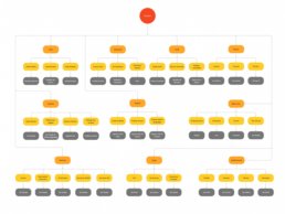
We meticulously crafted a complete information architecture by Drawing on the insights from in-depth research, strategic interviews with the product owner, and detailed benchmark analysis. This architecture was enriched with all the desired features, ensuring a robust foundation tailored to fulfill our users’ comprehensive needs and preferences.
5. Conversation with the development team.
Before working on the wireframes, we checked the IA with the dev team. They talked about their concerns regarding the amount of content, and it would take a lot of money and budget, so the content in phase two was scratched, so we had to redo and simplify the project.

the process
Phase two
- Card Sorting & New Information architecture (beta)
- Userflows
- Wireframes
- Prototype
- Testing and refining
- Lessons learned
1. Card Sorting & New Information Architecture (beta)
In this phase, I developed an initial information architecture “alpha” using insights from the interview. Subsequently, I conducted card sorting via the Optical Workshop tool. The results informed refinements, creating the “beta” version of the information architecture.
Card Sorting Matrix Results
Utilizing the card sorting technique, we gathered valuable insights from participants, helping us discern patterns and preferences. This methodological approach facilitated the identification of a potential initial structure, providing a foundational blueprint for our content organization and user navigation.
New IA
After talking with the dev team, they told us a lot of features listed on the phase one desired IA weren’t possible, so we updated it to this final one.
2. Userflows
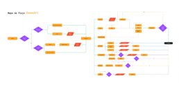
This initial user flow depicts a comprehensive navigational blueprint, allowing seamless access to all areas of the app through the newly structured information architecture.
This second user flow is tailored for job-seeking users. It guides them from utilizing the search bar to discover opportunities to apply for positions that pique their interest with a streamlined, intuitive process.
3. Medium Fidelity Wireframes
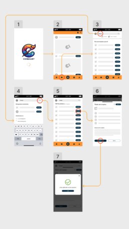
The wireframes I designed are the blueprint for our digital interface, capturing every user interaction and visual layout. As our design’s skeletal structure, they detail the user’s journey, ensuring intuitive navigation. Each screen is thoughtfully laid out, balancing aesthetics with functionality. Through feedback and iterations, these wireframes were refined to prioritize user needs, acting as a strategic guide for an engaging and seamless user experience.
4. The Prototype
The initial prototype was crafted to serve as a clear demonstration of the user’s journey. It outlines the intuitive steps and interactions a user would experience while searching for a job, emphasizing a straightforward and user-friendly flow.
5. Testing and Refining
5
Remote tests over a zoom call
4
In-person sessions
Objective
Measure the success rate of the flow to find a job.
User
I performed these tests in real future users such as musicians and artists in general.
Think aloud
Testers were required to speak during the test.
Process recorded
I've recorded the video calls and I took notes on the on-site tests.
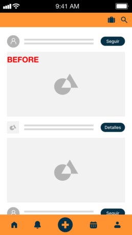
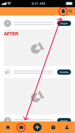
A recurrent pattern emerged: many users initially sought a job application feature on the bottom bar. However, the jobs icon was placed on the top bar, leading to confusion and hesitancy.
Armed with this insight, I made a strategic design decision: I relocated the jobs icon to a more intuitive position, placing it as the second option on the bottom bar. The results were palpable. In a subsequent round of testing, this tweak alone bolstered the success rate by a significant 30%.
6. Lessons Learned
Balancing Comprehensive Features with Simplicity
Striking a balance between a comprehensive feature set and a simple, user-friendly design is vital, especially under tight deadlines.
Iterative Design and Rapid Prototyping
Embracing an agile approach and being open to iterative improvements based on feedback can significantly enhance the development process.
Market Gaps
onducting thorough market research and identifying unmet needs can provide a competitive edge and create unique selling points.
Lessons learned
1. Understanding User Needs is Crucial
- Insight: Deep user research and interviews were essential in understanding the challenges artists faced during the pandemic, such as job losses and mental health issues.
- Lesson: Prioritizing user needs and understanding their unique challenges can lead to more effective and empathetic product design.
2. Flexibility in Design and Business Model
- Insight: Adjusting the payment and registration model to lower upfront costs led to a significant increase in user registration.
- Lesson: Being adaptable in both design and business strategy is key to meeting user expectations and improving engagement.
3. The Importance of Collaborative Teamwork
- Insight: Collaboration across different roles, including UX designers, developers, and project managers, was fundamental for the consistent and intuitive design of Conexart.
- Lesson: Effective teamwork and leveraging diverse expertise contribute to the success of complex projects.
4. Balancing Comprehensive Features with Simplicity
- Insight: While the app aimed to be feature-rich, there was also a need to simplify the MVP to meet tight deadlines.
- Lesson: Striking a balance between a comprehensive feature set and a simple, user-friendly design is vital, especially under tight deadlines.
5. Iterative Design and Rapid Prototyping
- Insight: The team used agile methodologies and iterative feedback loops for quick prototyping.
- Lesson: Embracing an agile approach and being open to iterative improvements based on feedback can significantly enhance the development process.
6. Identifying and Filling Market Gaps
- Insight: The benchmarking process revealed gaps in the market, such as the need for financial consultancy for artists and user collaboration features.
- Lesson: Conducting thorough market research and identifying unmet needs can provide a competitive edge and create unique selling points.
7. Prioritizing User Safety and Trust
- Insight: The importance of a fortified payment system was recognized as crucial for user trust.
- Lesson: Ensuring user safety, especially in online transactions, is essential in building trust and credibility.
Extra: Promo video for sponsorship
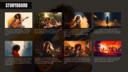
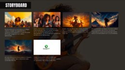
To resonate with the audience, the client entrusted me with crafting a video that narrates an artist’s journey. Given full creative freedom, I centered the story around the challenges faced by artists during the pandemic, many of whom lost their livelihoods. The narrative highlights how the Conexart app emerges as a beacon of hope for these artists, offering them new opportunities.
I diligently crafted all assets using Midjourney for this video, ensuring character consistency throughout. I lent my voice to the narration and expertly composed the accompanying music using Logic Pro.
