Bet Anything First Steps
Competitive UX Audit Case Study | Pre-Login Strategy
Project Overview
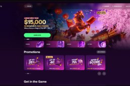
A competitive UX audit was the foundation of this project, created to guide the agency Rocket Air in designing the new pre-login experience for Bet Anything — a strategic entry point to capture user interest and guide them toward account creation.
To evaluate both direct and indirect competitors, identify UX/UI best practices, and deliver a strategic research document that would clearly guide the creative direction of the new platform before users sign up or log in.
The main challenge was to turn a broad set of competitor insights — from betting platforms to lifestyle brands — into a clear, actionable UX strategy. This audit had to guide Rocket Air before any visual design began, aligning business goals with user expectations from day one.
As Lead UX/UI Designer, I:
-
Proposed and structured the audit framework
-
Defined evaluation categories and research methodology
-
Guided the UX direction and decision-making process
-
Oversaw execution by two designers and reviewed their work regularly
-
Consolidated insights into a clear and actionable strategic document
I worked closely with two UX/UI designers — Josué Zeledón and Amanda Coto — who supported the research and data collection. Their efforts were essential to the depth and speed of the audit, while I remained responsible for overall direction, refinement, and outcome.
Competitive Landscape
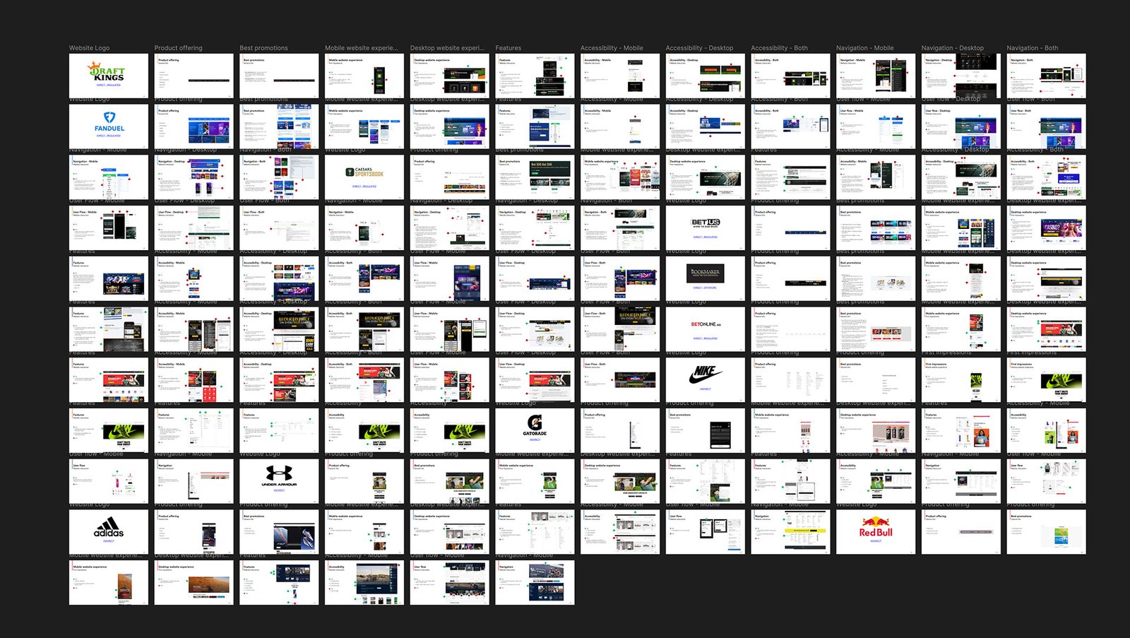
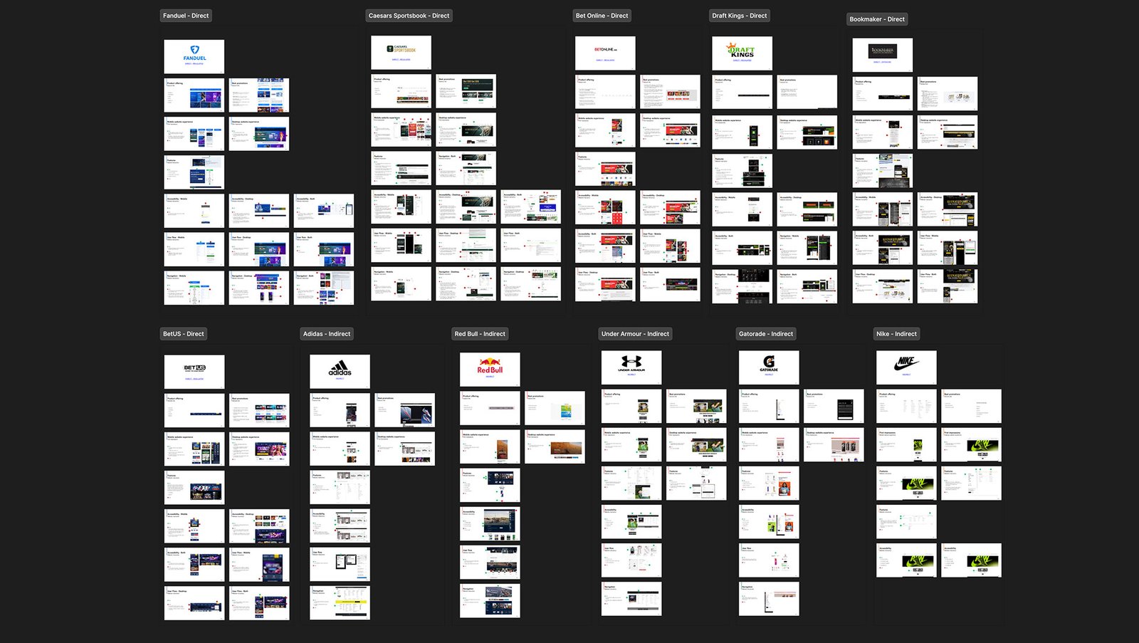
To understand the landscape holistically, we analyzed both direct and indirect competitors — covering betting platforms and global lifestyle brands to explore patterns, positioning, and UX principles.
Direct Competitors
These platforms offer similar sportsbook and betting services and were analyzed for their UI patterns, onboarding flows, feature sets, and overall brand positioning:

FanDuel / Caesars Sportsbook / BetOnline / DraftKings / Bookmaker / BetUS
Indirect Competitors
To go beyond the betting industry and explore how strong consumer brands create emotional and aspirational connections, we also analyzed lifestyle and sports brands with world-class digital presence:

Adidas / Red Bull / Under Armour / Gatorade / Nike
This mix of direct and indirect references allowed us to benchmark not only usability and structural flow, but also brand identity, storytelling, and emotional connection — all key elements in shaping a compelling pre-login experience.
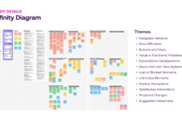
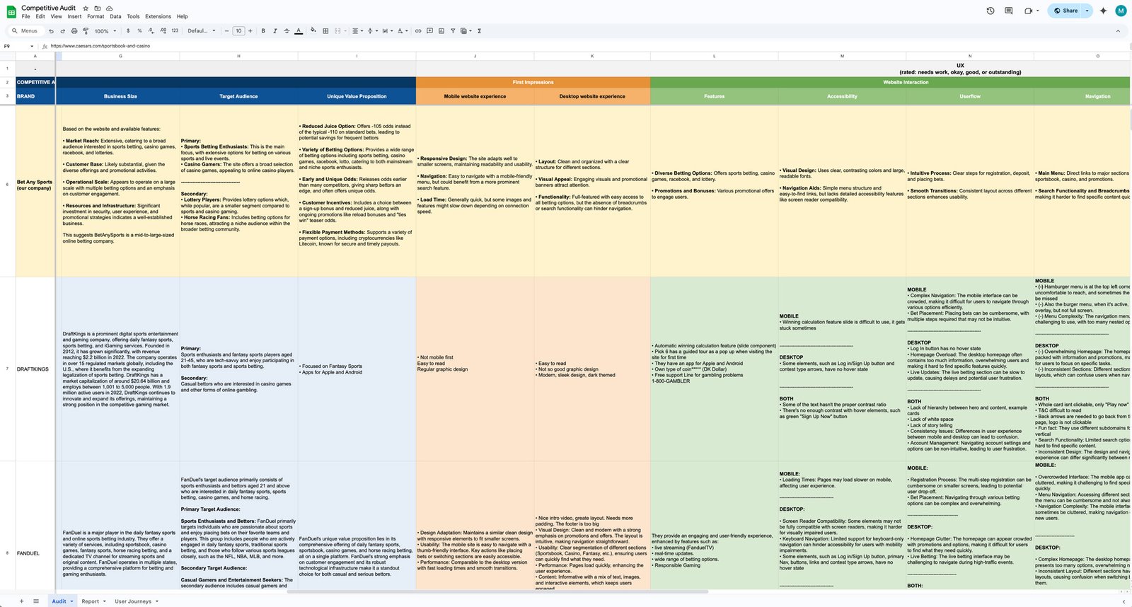
Audit Framework
I created a custom framework to evaluate each competitor to ensure clarity, consistency, and strategic insight. This structure allowed us to capture both high-level brand positioning and detailed UX/UI interaction patterns — translating into actionable design recommendations for Rocket Air.
Business and Brand Criteria
We first analyzed the foundation of each platform to understand its context and strategic focus:
-
🌍 Location & Regulation – Offshore or licensed
-
🎲 Product Offering – Sports, casino, racebook, etc.
-
🎁 Best Promotions – Incentives and signup offers
-
🏢 Business Size – Regional vs. global reach
-
🎯 Target Audience – Who they speak to and how
-
💬 Unique Value Proposition – Key differentiator in their market
UX UI Evaluation Criteria
Then we focused on how each platform engages users through its interface and content:
-
👀 First Impressions – Visual clarity, emotional tone, initial impact
-
🧩 Website Interactions – Chat, support, glossary, multimedia
-
♿ Accessibility – WCAG compliance, color contrast, font legibility
-
🔄 User Flow – Structure, clarity, and efficiency of key actions
-
🧭 Navigation & Hierarchy – Menu structure, affordance, labeling
-
🎨 Brand Identity – Consistency in color, typography, and layout
-
🗣️ Voice & Clarity – Simplicity of content and tone of messaging
This dual-layered approach enabled us to evaluate each platform holistically — from business positioning to user experience — and ensured Rocket Air would receive a strategic foundation, not just surface-level observations.
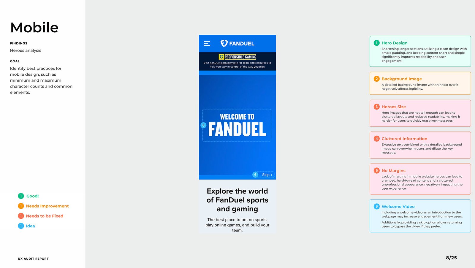
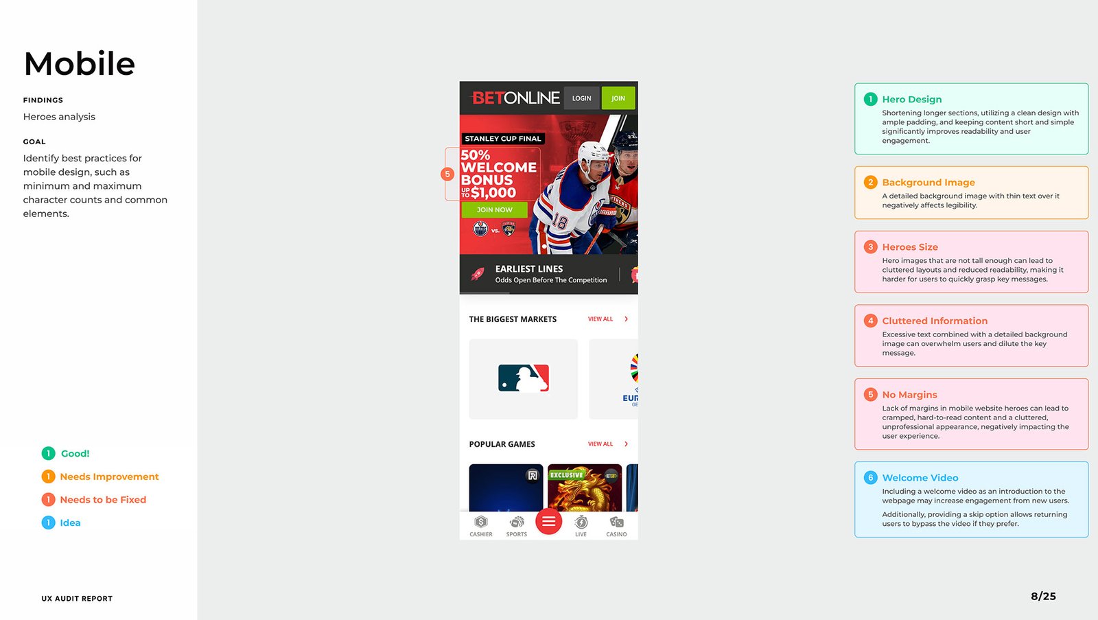
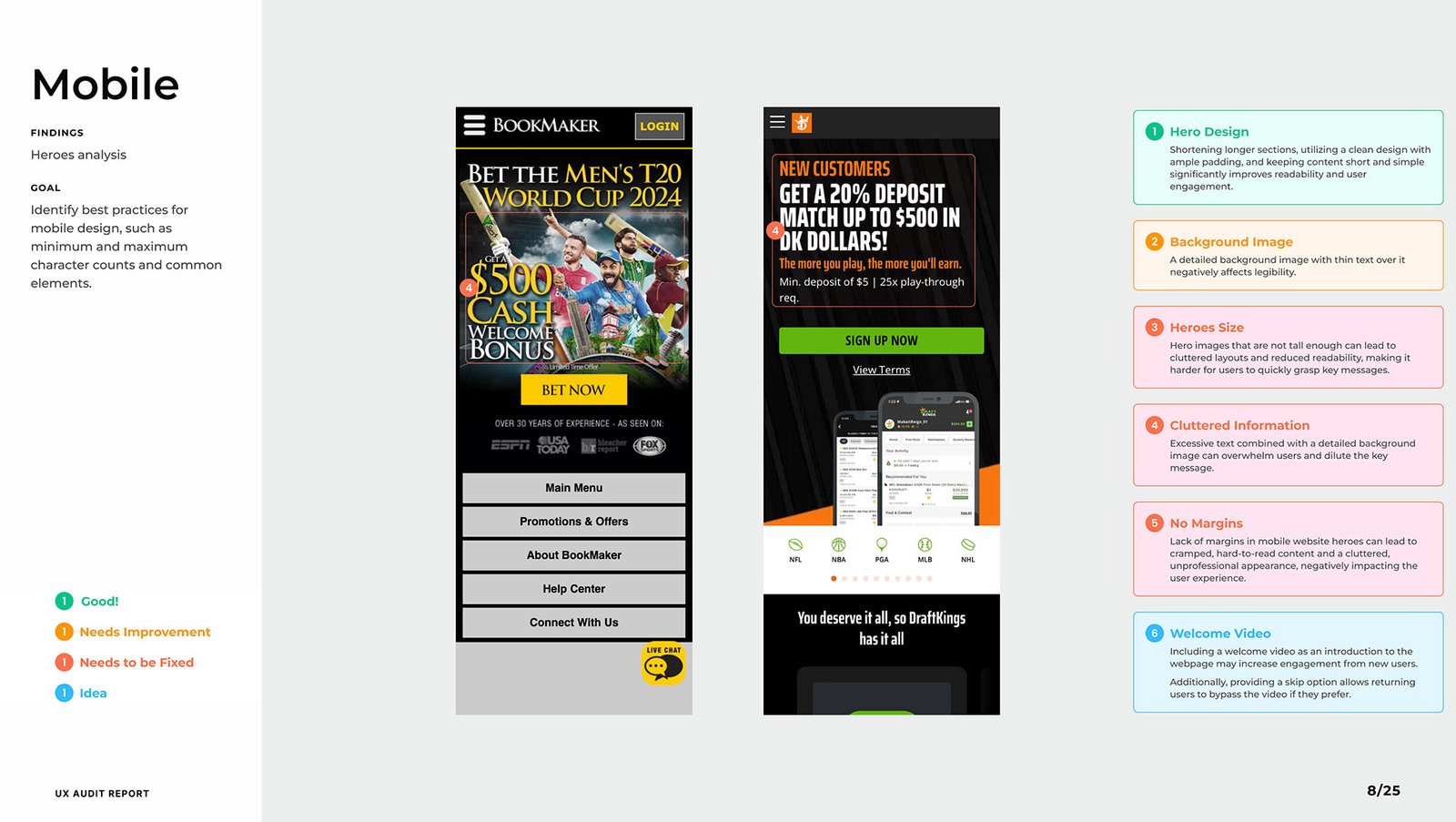
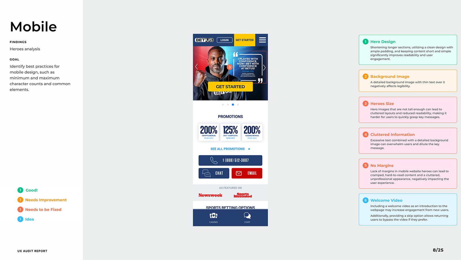
Key Findings
A competitive UX audit was the foundation of this project, created to guide the agency Rocket Air in designing the new pre-login experience for Bet Anything — a strategic entry point to capture user interest and guide them toward account creation.
-
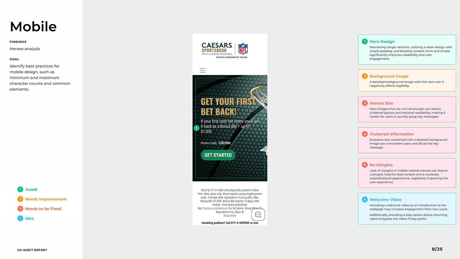
✅ Good: Scrollable, vertically stacked hero layouts with clear messaging and spacing.
-
⚠️ Needs Improvement: Horizontal card scrolling and image clutter hurt usability.
-
❌ Needs to Be Fixed: Inconsistent padding, short height, and visual overload.
💡 Insight:
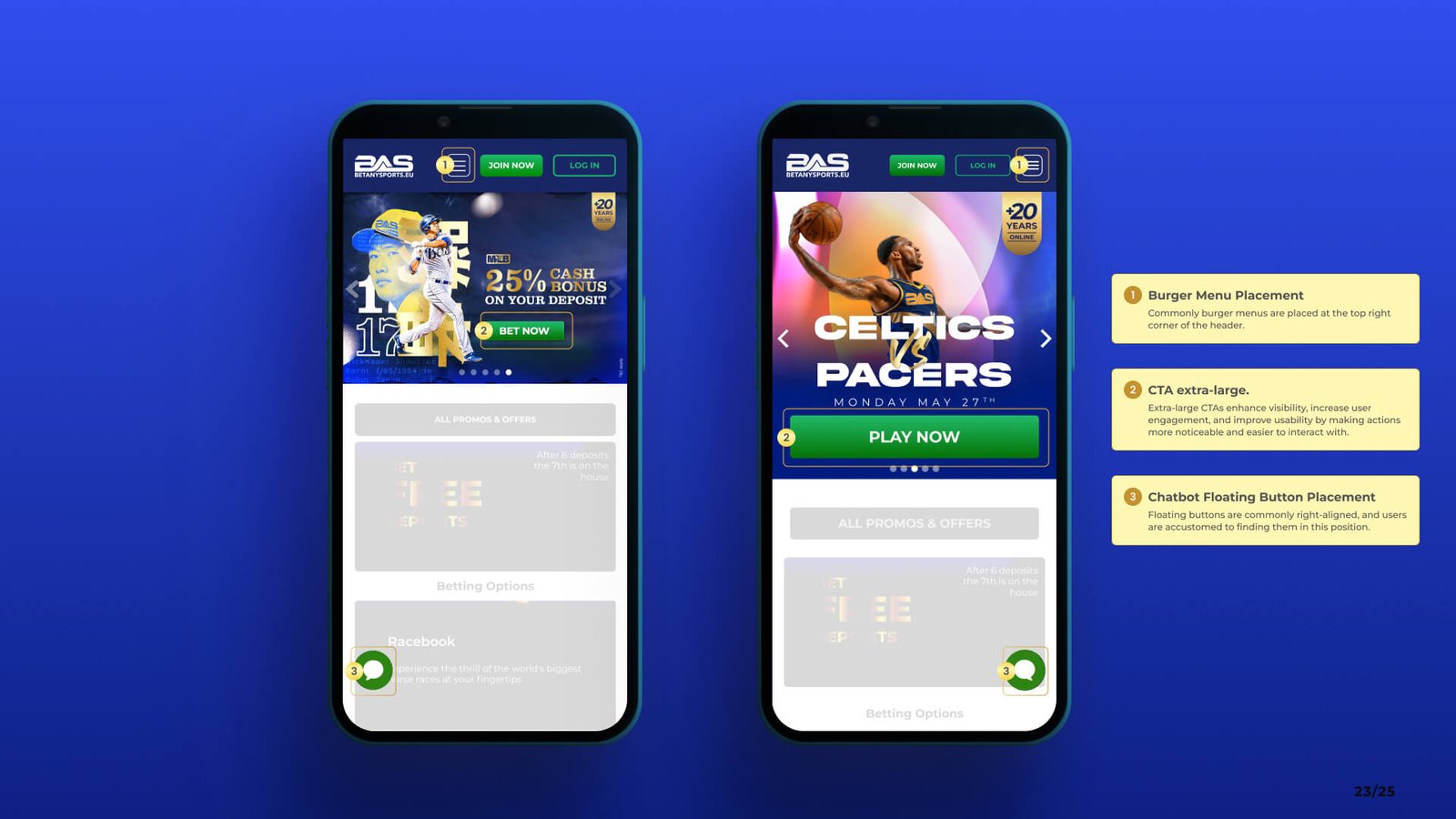
Burger menus worked better on the right side, CTAs performed better as large primary buttons, and welcome videos boosted engagement when paired with a skip option.
-
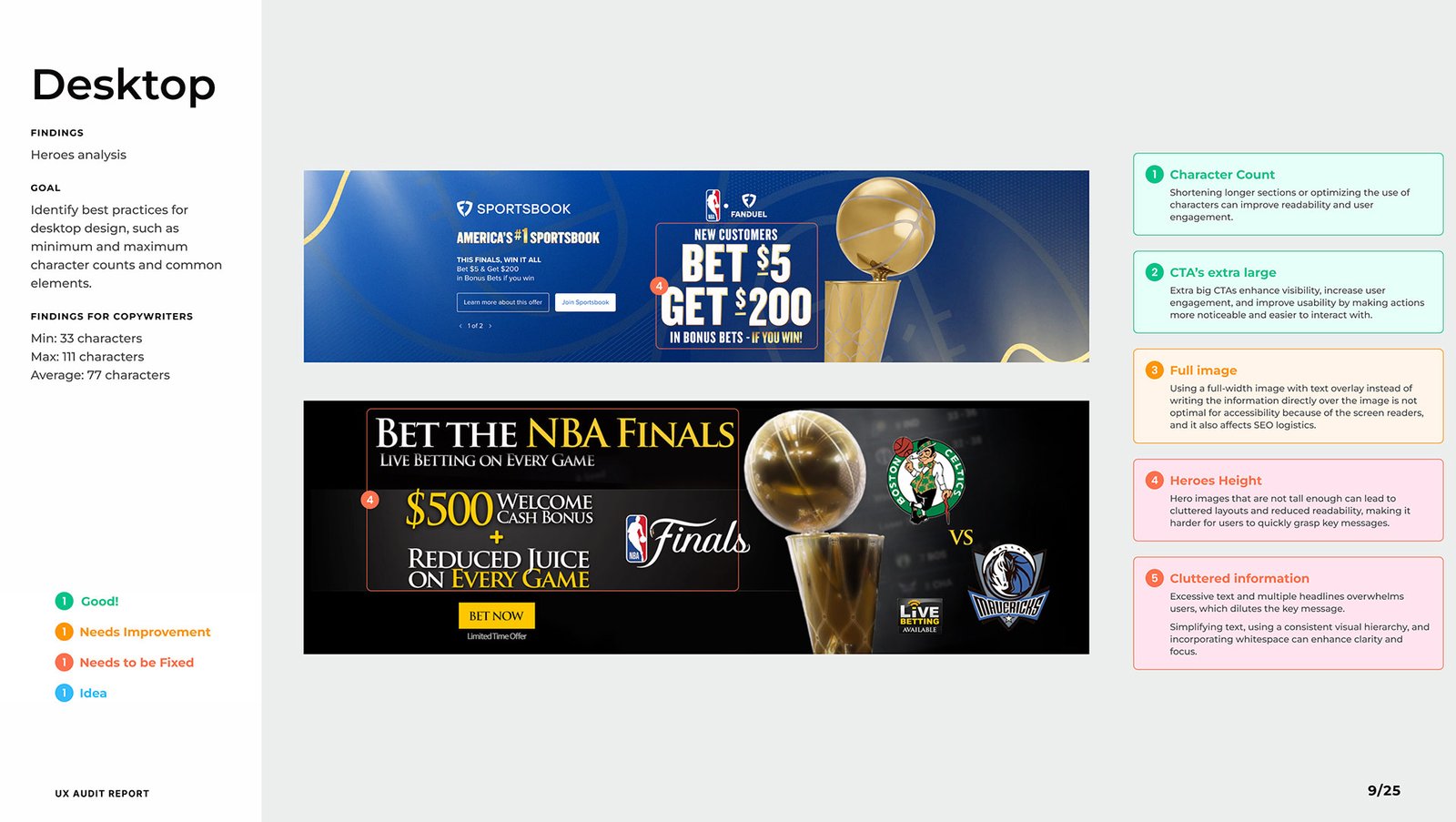
✅ Good: Hero sections with clean copy, strong contrast, and minimal distractions.
-
⚠️ Needs Improvement: Headlines competing for attention within the same block.
-
❌ Needs to Be Fixed: Background images with low text contrast.
💡 Insight:
The best performers used a strong single message with immediate value and clear hierarchy. Average character count across headlines was around 77.
-
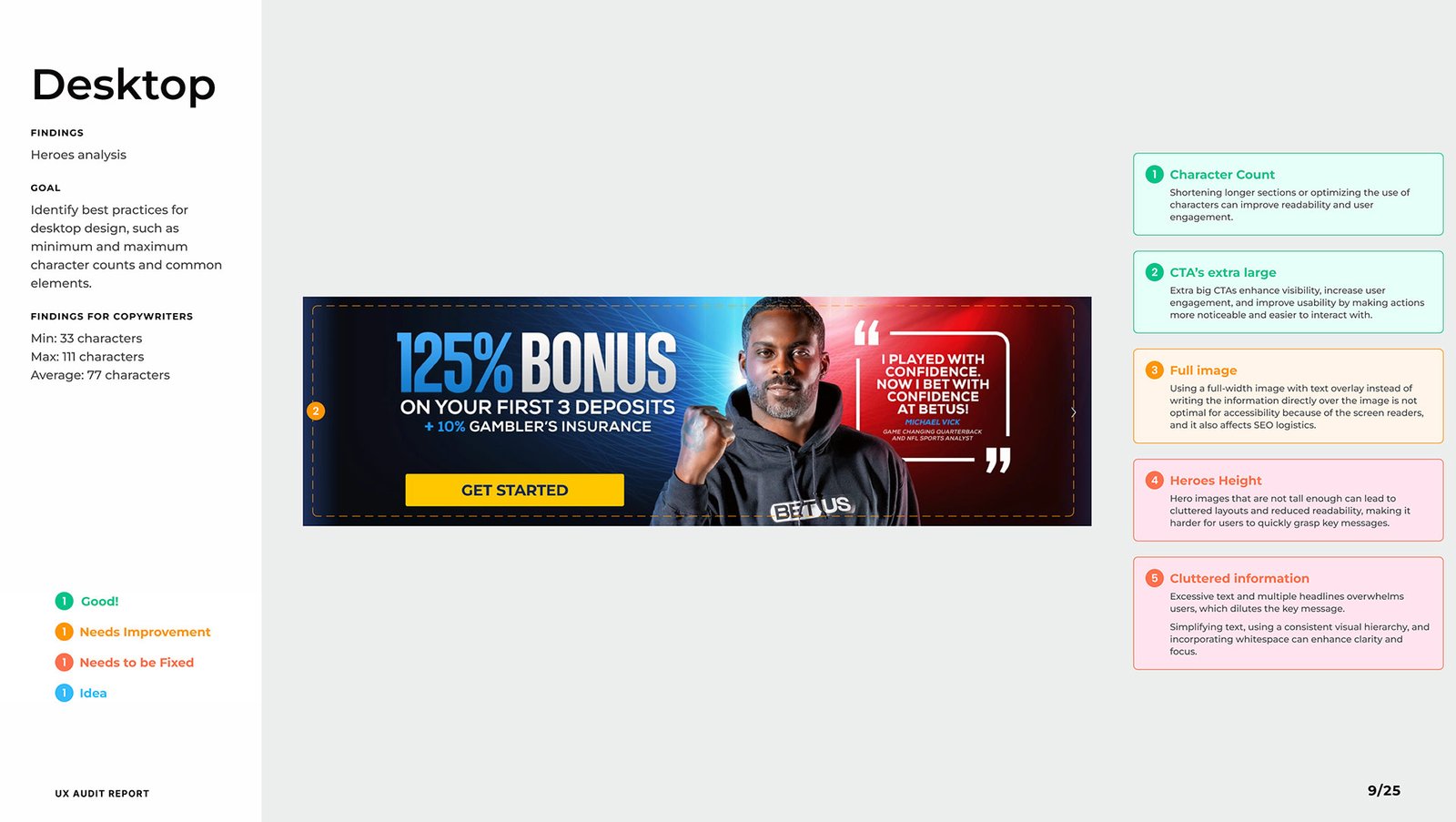
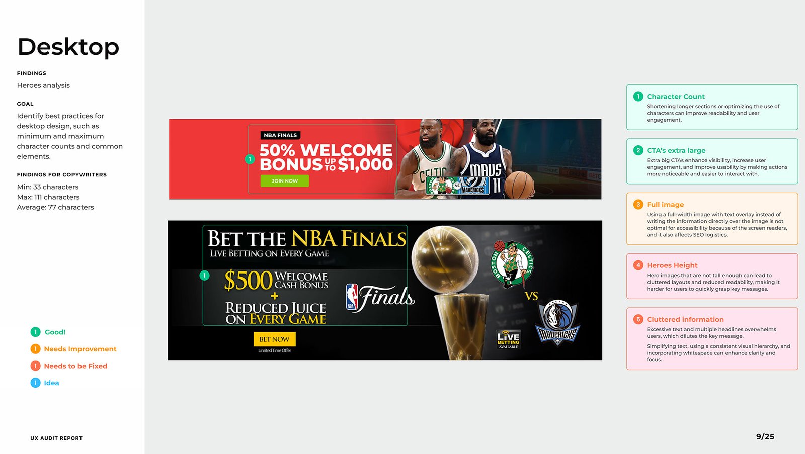
✅ Good: Balanced whitespace and padded components improved readability.
-
⚠️ Needs Improvement: Overlapping text, lack of margin, and noisy imagery.
-
❌ Needs to Be Fixed: Text layered over complex images damaged clarity.
💡 Insight:
Flat-color backgrounds or lightly dimmed overlays made CTAs and headlines far more legible and conversion-friendly.
-
✅ Good: Short, punchy copy with emotional tone and immediate CTAs.
-
⚠️ Needs Improvement: Redundant or vague subheaders diluted impact.
-
❌ Needs to Be Fixed: Inconsistent tone and overwhelming blocks of text.
💡 Insight:
One message per block, with clear emotional/functional benefit, outperformed verbose or segmented copy.
-
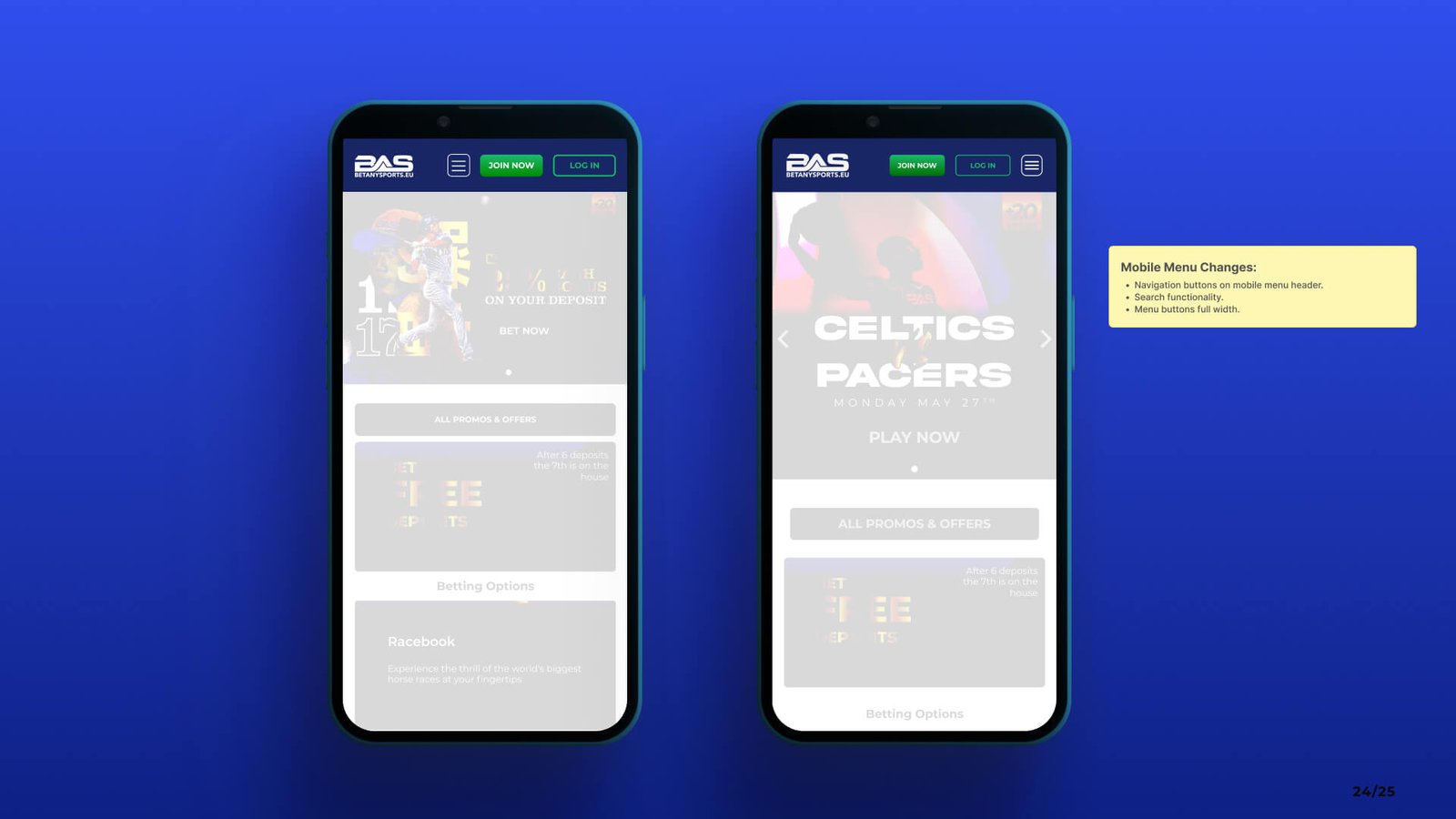
✅ Good: Clear menu structure, segmented content, and quick links to main actions.
-
⚠️ Needs Improvement: Menu buttons without affordance, unclear active states.
-
❌ Needs to Be Fixed: Hidden nav elements, overly nested categories.
💡 Insight:
Users favor clarity over minimalism — prioritizing scannability and clarity of path, especially on mobile.
-
✅ Good: Large tap targets, good font sizing, clear buttons.
-
⚠️ Needs Improvement: Missing alt text, unclear interactive elements.
-
❌ Needs to Be Fixed: Low contrast ratios, unreadable overlays, and no visual focus indicators.
💡 Insight:
Designs that considered WCAG basics like contrast, size, and keyboard navigation naturally performed better in user flow and engagement.
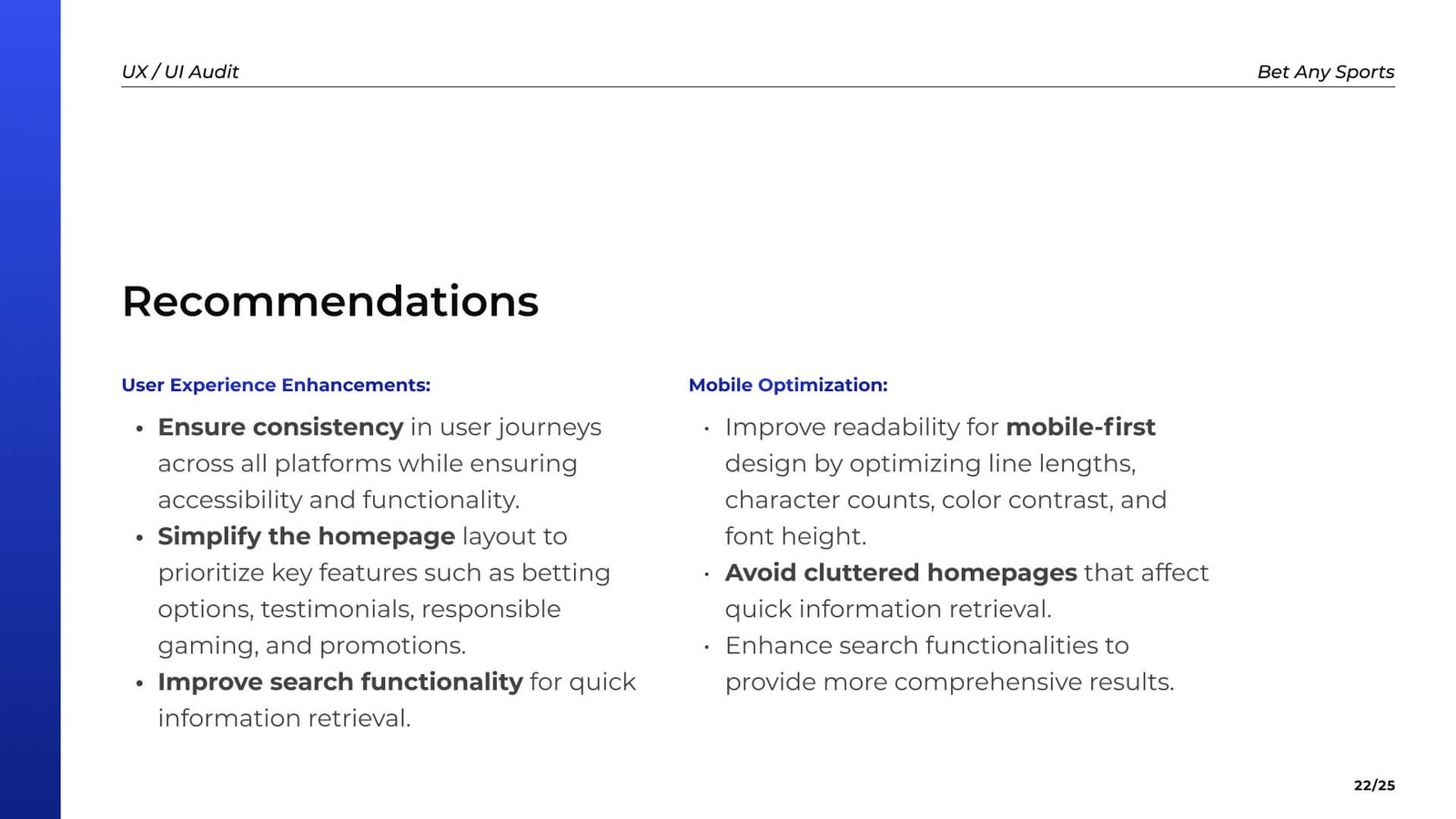
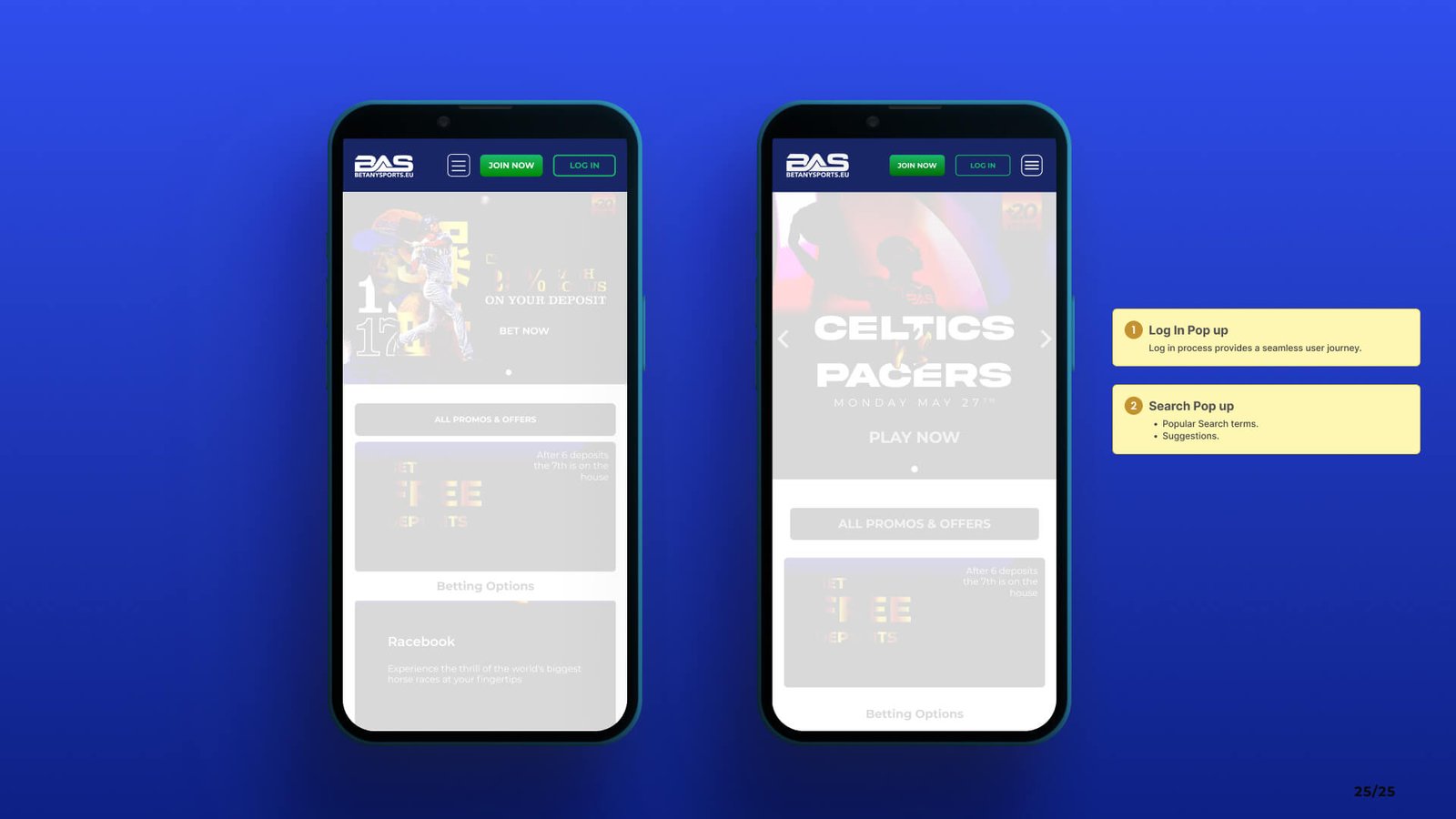
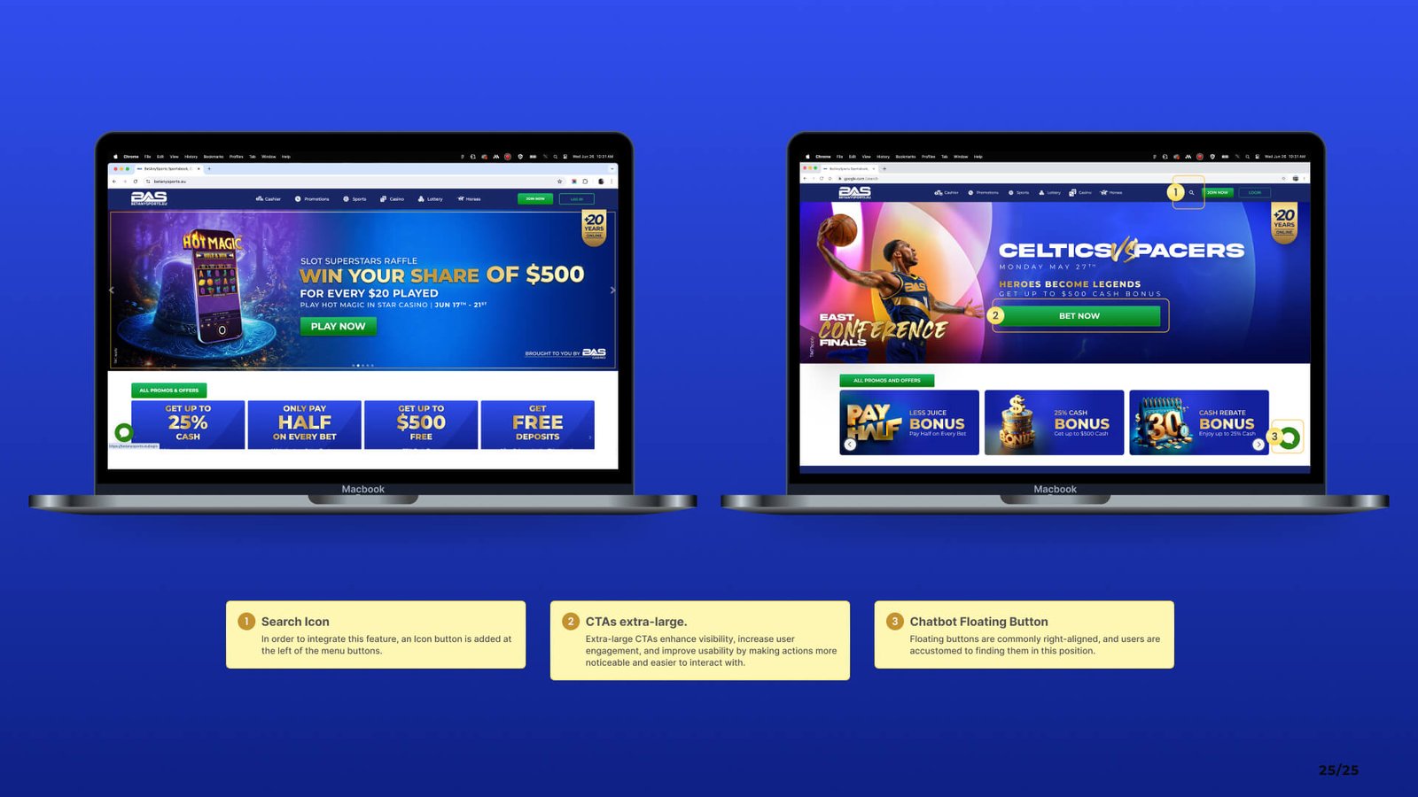
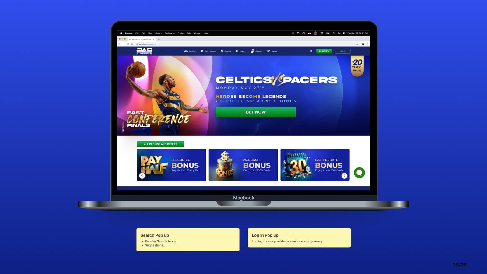
Strategic Actions
This section presents key UX/UI enhancements for BetAnySports, based on competitive insights and current product evaluation.
Deep Dive
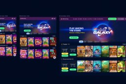
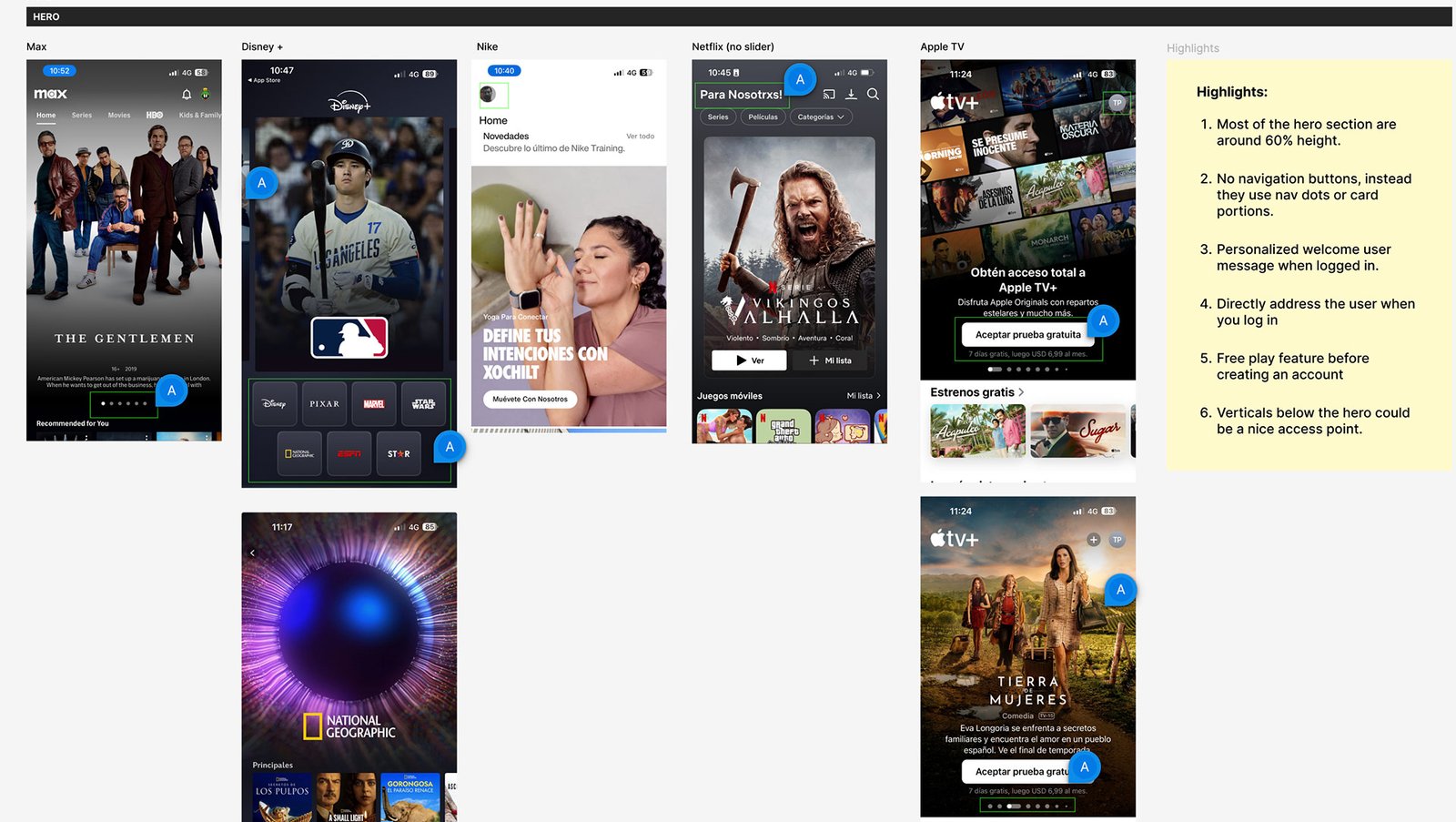
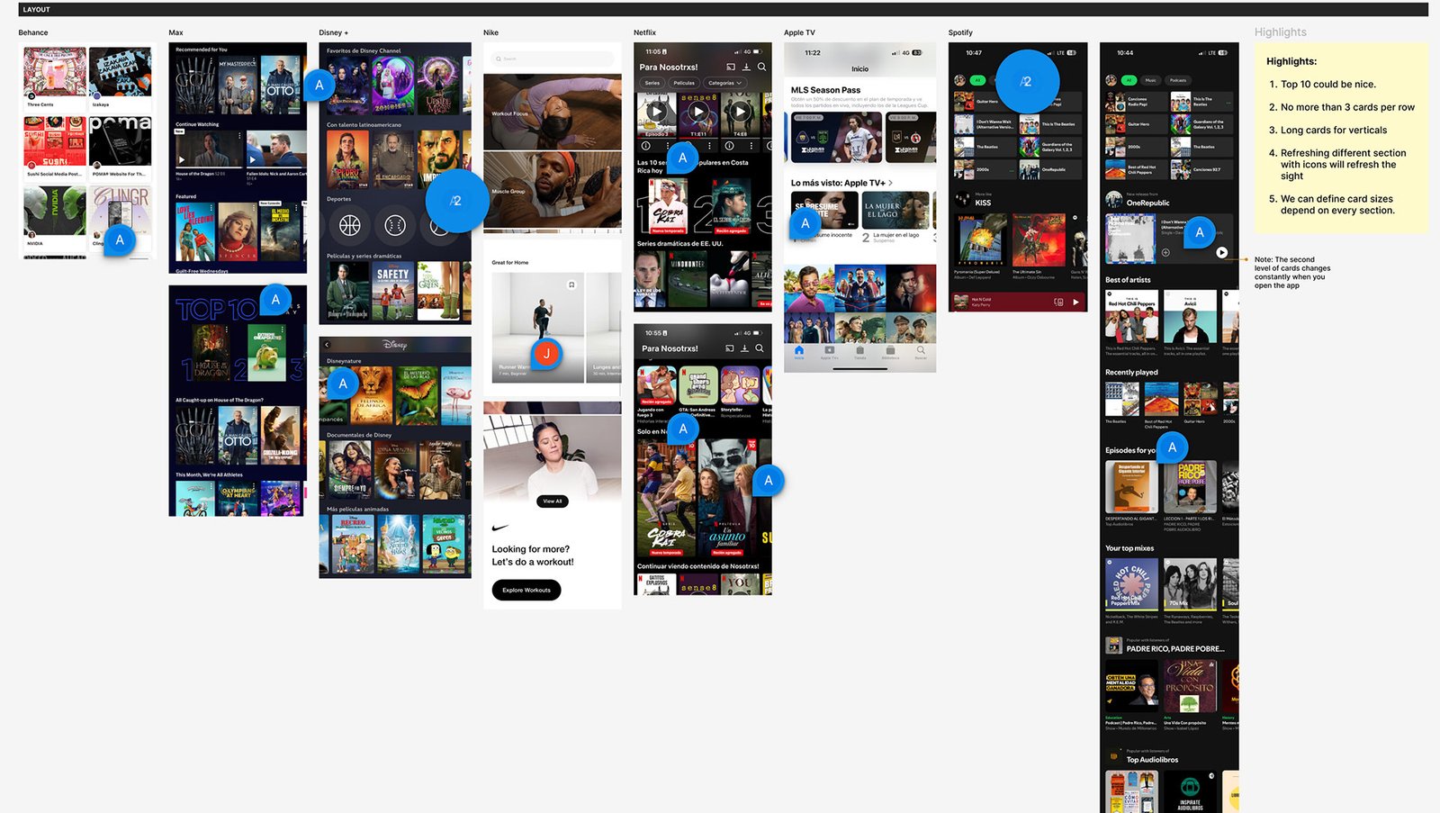
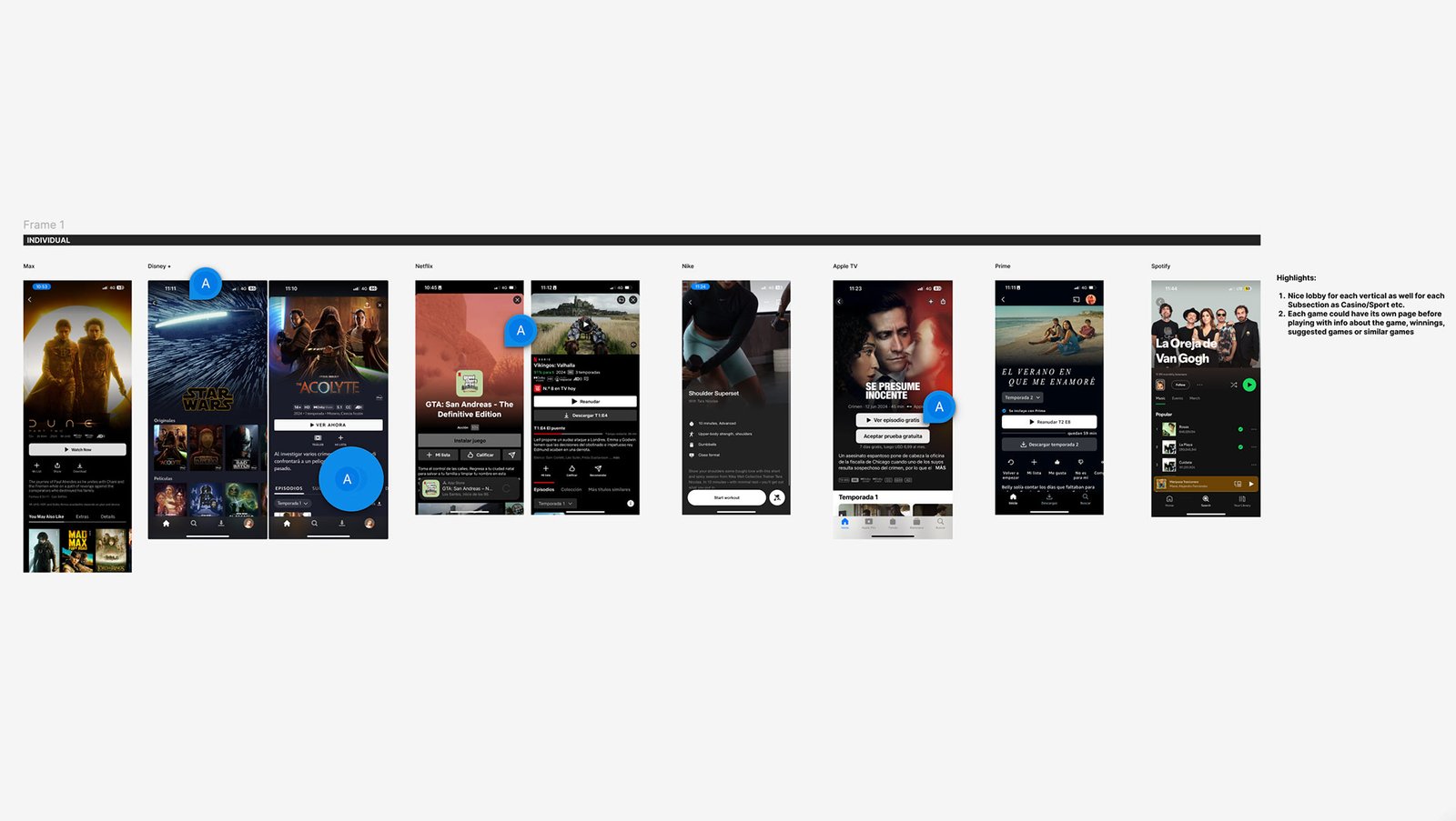
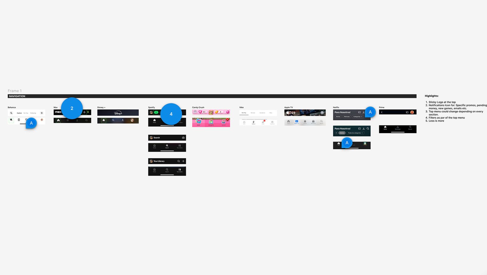
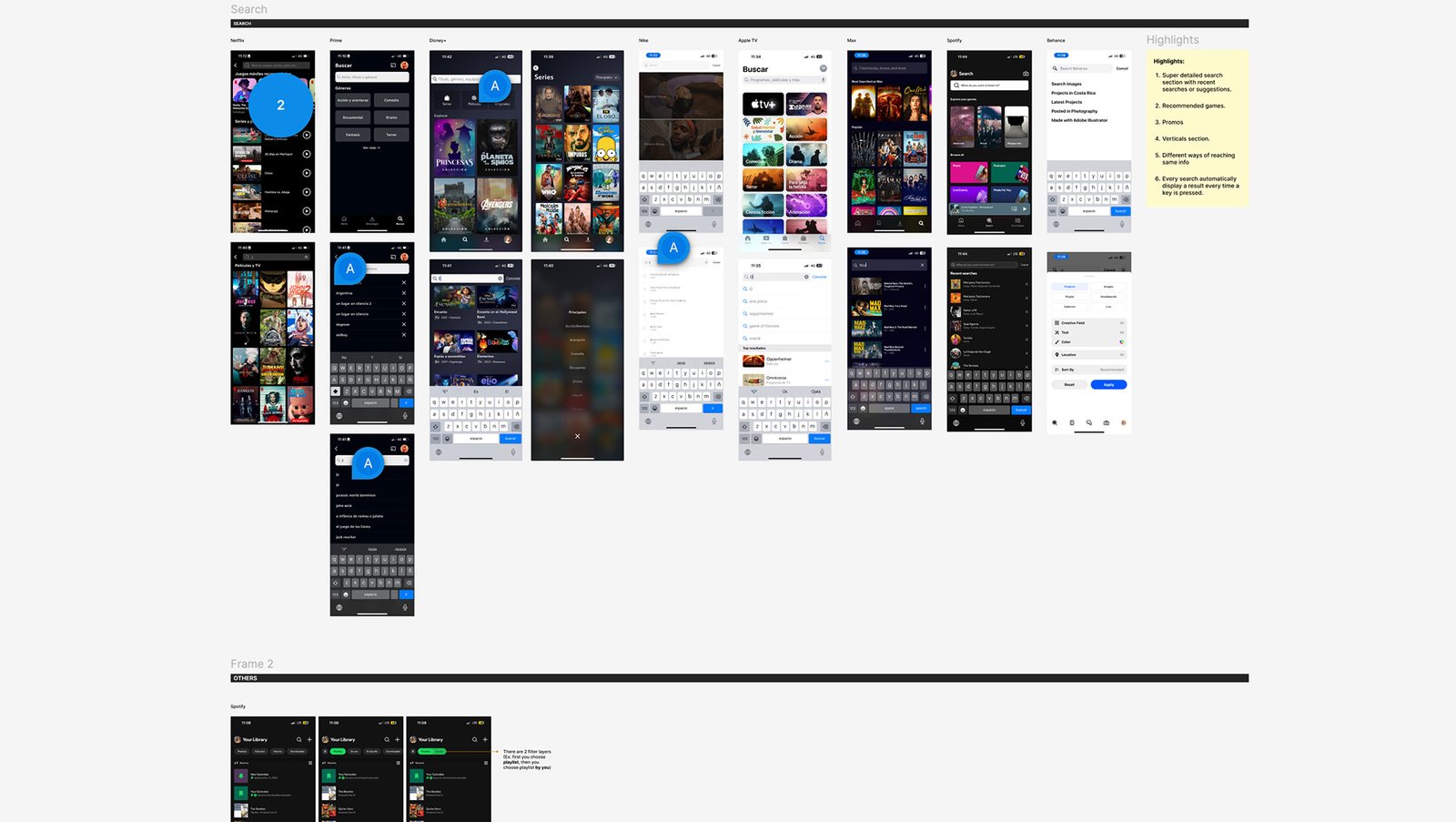
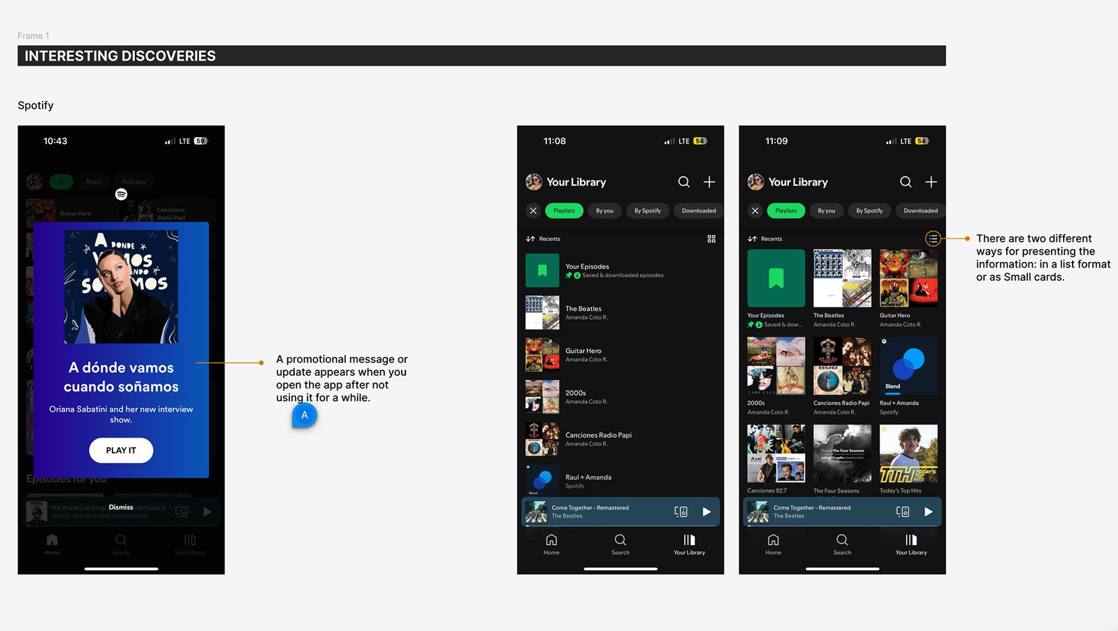
A second round of focused UI research was conducted to go beyond standard audits — exploring high-performing platforms like Netflix, Disney+, and Spotify. This extra layer of insights was aimed at uncovering specific interface patterns, visual behaviors, and interaction trends that could elevate the Bet Anything experience. These findings serve as a tactical resource for Rocket Air to refine the visual and structural strategy moving forward.
Most hero components occupied 60% of screen height and featured minimal navigation, with dot indicators or card layouts. Welcome messages were tailored and some apps allowed feature previews before signing up.
Content is structured using verticals, limited rows, and refreshing icons. Top 10 or featured sections created familiarity. Card size and style varied per section to maintain user interest.
Each item (e.g., show, workout, game) had a dedicated page to build trust, offering summaries, previews, or gameplay info. These pages serve as soft conversion points before engagement.
Navigation was often fixed and simplified. Tabs were consistent, with minimal buttons and sticky headers. Filter functionality was context-aware and adapted by section.
Search interfaces offered live suggestions, recent activity, filters, and vertical-specific results. Auto-search triggered with each keystroke improved immediacy.
Project Reflections
This audit was more than a research exercise — it was a strategic design tool. By combining broad UX benchmarking with a focused second round of UI analysis, I helped define clear opportunities for improving BetAnySports and set a strong foundation for Rocket Air to shape Bet Anything’s future.
I learned to look at UX through multiple lenses: business, user, and visual. Balancing competitor insights with design thinking helped me understand how small decisions—like button size or menu placement—can impact engagement at scale.
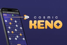
This work led to tangible improvements: clearer homepage layout, streamlined mobile journeys, and more intuitive search. It also gave Rocket Air an actionable framework to begin their redesign with confidence and alignment.
Layering different types of audits (UX + UI) created a much richer analysis. Combining structured frameworks with second-round insights ensured depth without losing direction.
Working closely with design partners and devs ensured our recommendations were not just idealistic, but realistic. Open feedback loops and clear documentation kept momentum strong across teams.
This case study challenged me to think bigger, zoom in when needed, and lead with purpose. More than just an audit, it became a launchpad for better, bolder user experiences.