Post-Login Navigation: A Two-Part Usability Study
Post-Login Navigation:
A Two-Part Usability Case Study
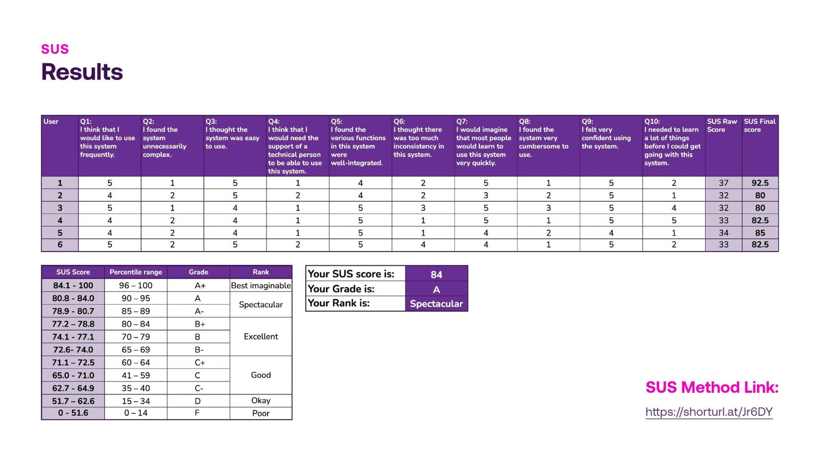
SUS Score: 84, Grade A
A strong baseline across all 6 participants, with 9 specific, addressable friction points surfaced.
From Discovery to Validation
One high-impact finding became a focused, three-way comparative study before it shipped.
My Role
UX Researcher & Designer
Team
4 UX Senior Designers
Sprint
Feb 14 to Feb 25, 2025
Platform
Web (mobile-first), post-login
Overview
Two Rounds of Testing, One Navigation Model
BetAnything’s post-login experience is the hub where logged-in users find their balance, place bets, and move between verticals like Sports, Casino, Lottery, and Horses. Before shipping the redesign, our team ran two rounds of usability testing to validate the navigation model and catch friction before it reached production. The first study cast a wide net across the entire post-login flow and surfaced a specific, high-impact problem in how users browsed casino games. Rather than guess at a fix, we ran a second, focused study that tested three alternative browsing patterns head to head, then iterated the winning design with stakeholder feedback before finalizing it.

Why two studies?
Both studies recruited 6 internal participants from the Marketing department — same company, but not regular or familiar users of the product itself, which gives a reasonably close approximation of a first-time user’s perspective. One exception: the Casino Director, who does have hands-on product familiarity, was involved in reviewing the final design proposal. We treat this as a directional validation, not a substitute for testing with real external customers — see “What’s Next” at the end of this case study.

I contributed to research planning, moderated sessions, affinity mapping, and synthesis of findings into prioritized, actionable recommendations across both studies, and helped translate validated insights into the final annotated design proposal.
The Process Pt.1
Study 1: Post-Login Navigation Discovery
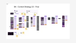
Six internal participants, ages 21 to 51, took part in moderated, in-person, think-aloud sessions of 30 to 40 minutes each, using a Figma prototype of the post-login home page. The study tested navigation exclusively, not individual game mechanics. Affinity mapping the session notes surfaced six recurring themes: what worked (navigation behavior across the home page, side menu, and footer; positive perceptions of filters; easy log-in and vertical switching) and what didn’t (flow difficulties around transactions and profile, confusion between similarly labeled buttons like Log In vs. Join In, and moments of lost or blocked frustration).

The Process Pt.2
Key Insight: The Casino List Problem
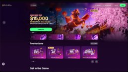
Four of six users used the hamburger menu, and five of six used the home page verticals section, confirming the home page as the primary wayfinding tool. But the most consequential finding was different: four of six users struggled to find a specific casino because of how many cards they had to scroll through in a horizontal carousel under “All Casinos.” This single observation became the seed for Study 2. The study closed with a SUS score of 84 out of 100, Grade A, “Spectacular,” a strong baseline with specific, addressable friction points.
The Process Pt.3
Study 2: Testing Three Layouts Head to Head
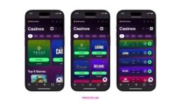
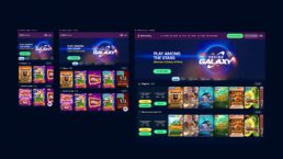
Study 2 existed to answer one question: which casino browsing layout gives users a better experience, and what should it look like in production? Three variants, the original carousel, a grid, and a full list, were prototyped and tested side by side. Grid won out as the primary experience, easy to navigate, clear structure, reduces scrolling, preferred by new users, with List retained for users who want fast access. After stakeholder review, the button label reverted from “View Games” back to “Play Now,” judged clearer and more action-oriented, while the Grid-first structure and simplified filters were preserved.


Designing a User-Friendly UI for Music Creation
This case study focuses on the design of a user-friendly music UI for Easy Tunecraft — a platform created to simplify music-making for beginners and casual creators. The challenge was to craft an interface that feels approachable, intuitive, and creatively empowering without sacrificing functionality.
From user flow planning to clean layout decisions, the process emphasized usability, accessibility, and the emotional rhythm of digital music creation.
Overview
Increasing visits by 430% on the new landing page
1500+
With the new design the average of tunes crafted increased significantly.

Timeline
Feb - Oct 2022

Platform
Responsive Webapp

My Role
UI-UX Designer

Tool
Figma
UI Process
From a Moodboard to a Prototype
1. Introduction
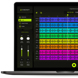
TuneCraft was designed with simplicity and user-friendliness. It allows anyone to dive into music composition regardless of musical background. This intuitive platform breaks down the barriers to music creation, making it accessible and enjoyable for all. Users can craft unique, royalty-free tunes perfect for various applications – from digital marketing to personal projects. Here is the UI Process.
We followed WCAG accessibility guidelines to ensure the interface was inclusive and legible across devices.
My Role
I led the design, user testing and development of this project from end to end. I collaborated with one product designer during the early ideation stage, one UX Designer, one Project Manager, and one Developer.
Problem
Agencies in the modern digital landscape face a significant challenge in sourcing royalty-free music for their video productions. The options often involve expensive licensing fees or limited options.
The client previously created an app for mobile but its lack of design and UX process resulted in an abandon rate of 75%.
Goal
I aim to boost user interest in the UI design I’ve developed, showcasing its unique, user-friendly features to enhance their experience with the tool.
2. Impact
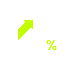
Analytics indicated a remarkable 450% increase in visits, totaling 30,000 in the first three months alone. Furthermore, there was a substantial decrease in the abandonment rate, dropping from 75% to 37%. These figures reflect the team’s efforts’ success and underscore the new design’s positive impact on user experience and retention.
3. Early Ideation
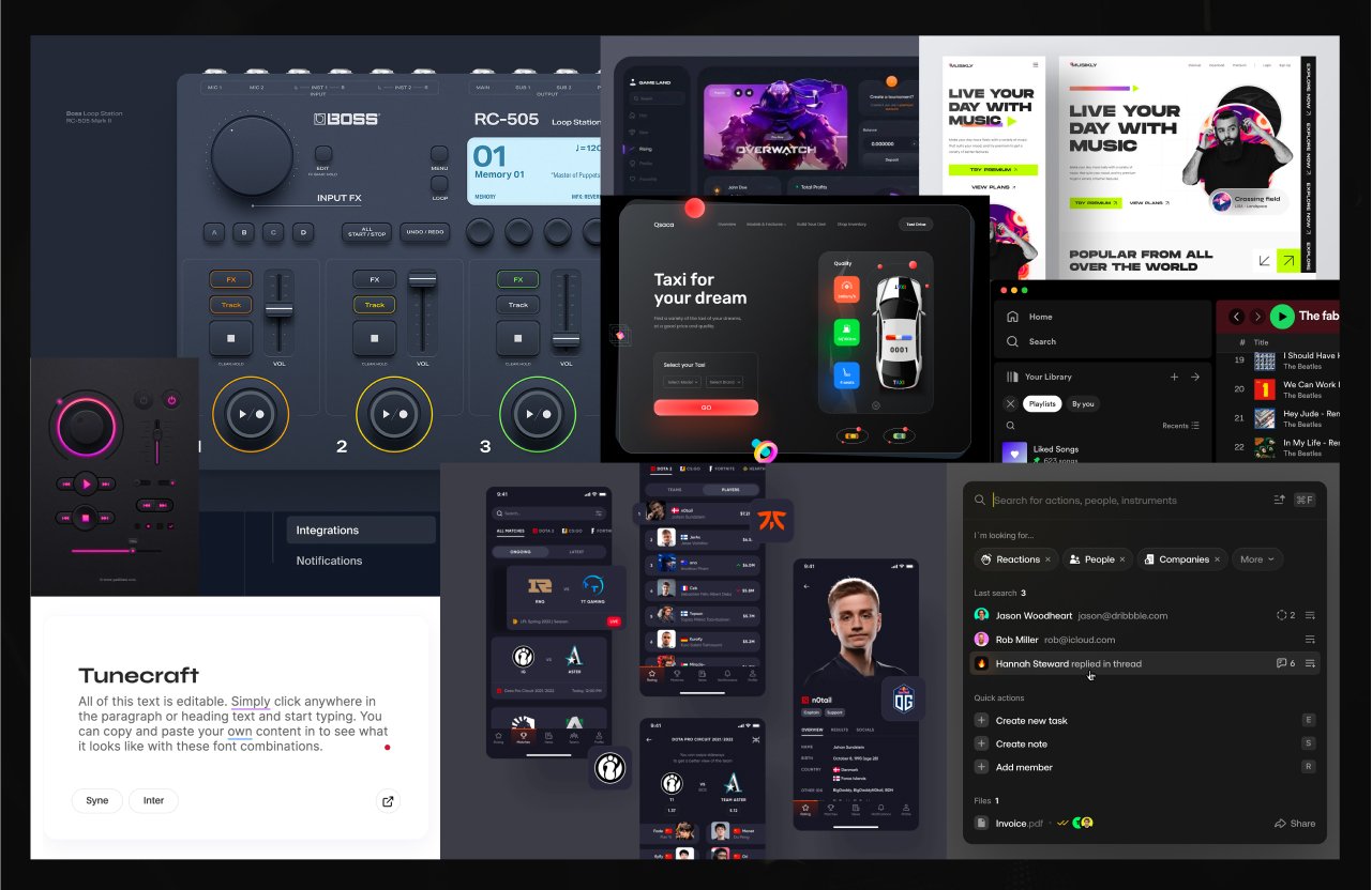
Moodboard
I have carefully curated a collection of images that encapsulate my vision for the app’s look and feel. This moodboard harmoniously blends sleek interfaces, intuitive layouts, and a color palette that reflects TuneCraft’s innovative and user-friendly ethos.
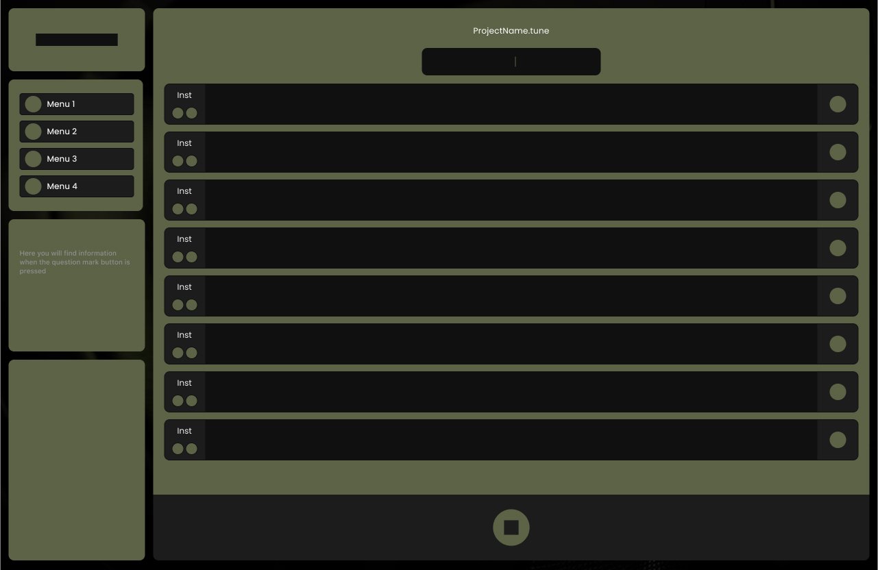
Low Fidelity Wireframe
This sketch is a first glance at the user interface design, mapping out the essential elements and their interaction. At this stage, the focus is on functionality and layout rather than visual details.

Medium Fidelity Wireframe
I developed a medium-fidelity wireframe, a vital step in the UI design process. This wireframe balances basic structure and more detailed elements, providing a clearer view of the layout and user interaction without the intricacies of high-fidelity designs.
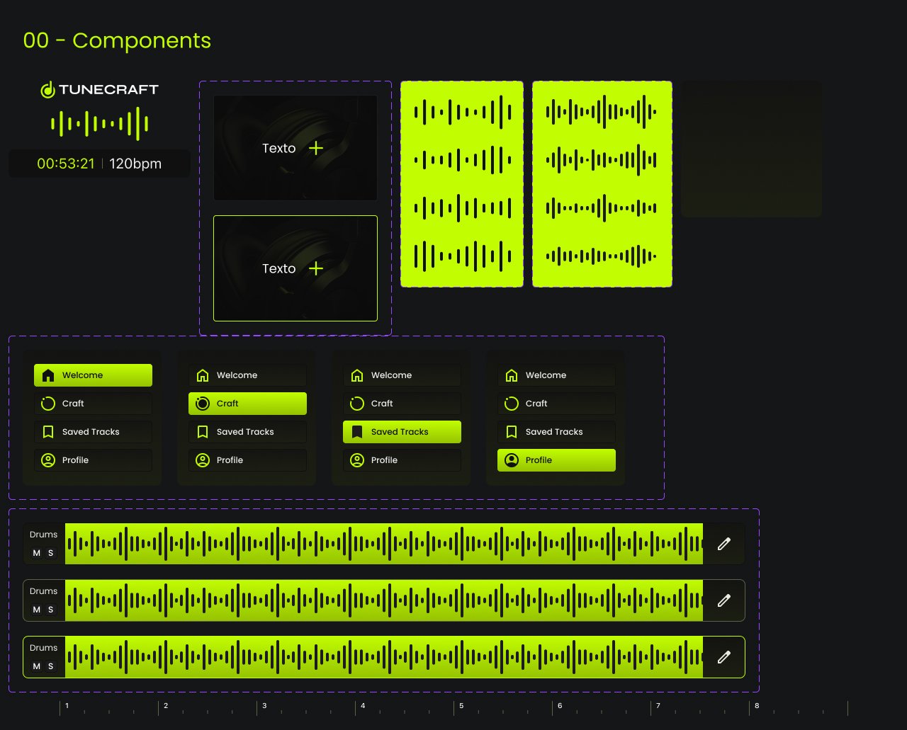
4. Style Guidelines
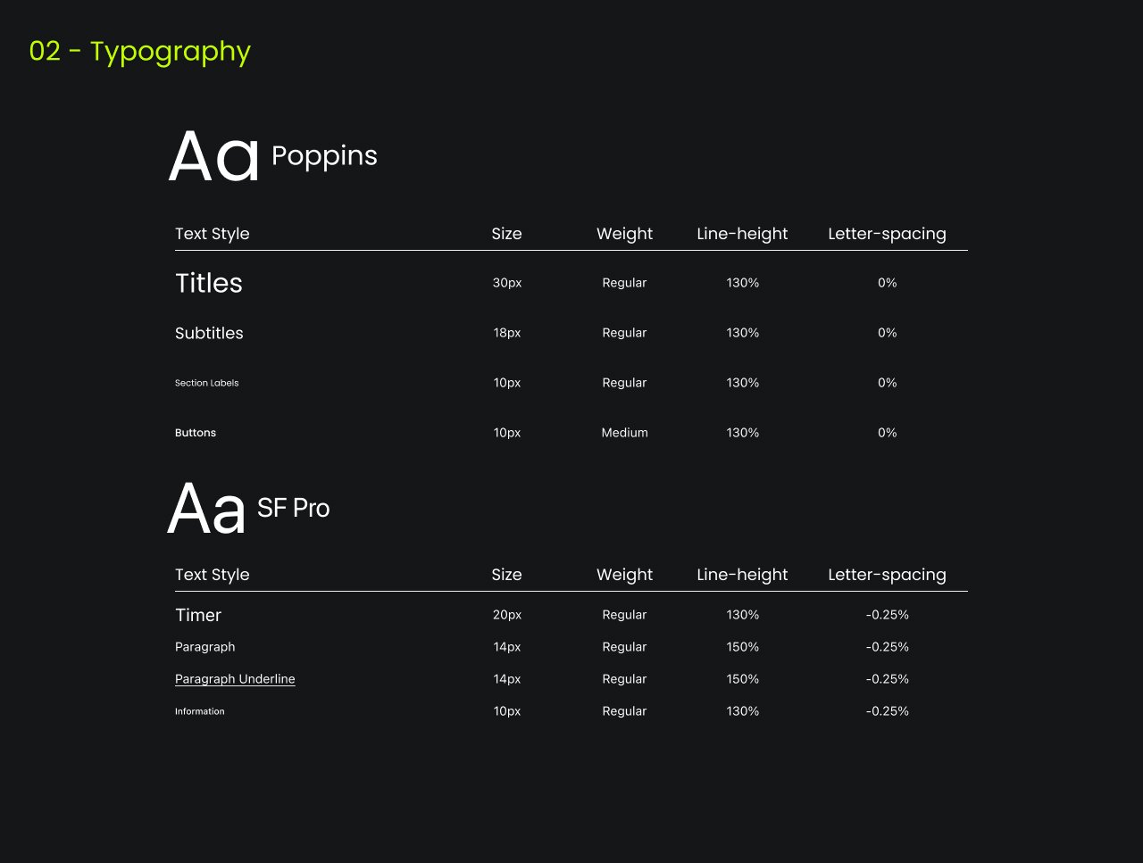
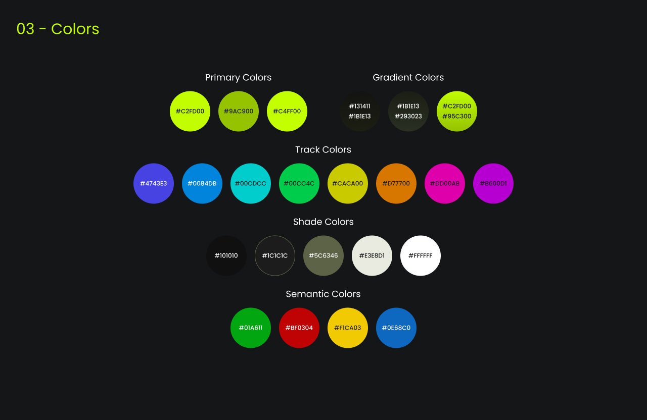
In crafting the style guidelines for TuneCraft, accessibility stands at the forefront of our design ethos. We strive to create an inclusive environment where all users can navigate and interact with the app comfortably and effectively. Our color palette is chosen to appeal aesthetically and accommodate various forms of color vision deficiencies. We ensure sufficient contrast between elements and backgrounds to aid readability and ease of use.
5. Final Designs
The previous design, primarily centered on mobile, fell short in adhering to design best practices. This oversight led to a visually unappealing interface that failed to resonate effectively with users. The design’s aesthetic appeal and functionality limitations highlighted the need for a more thoughtful and user-friendly approach.
Before
After
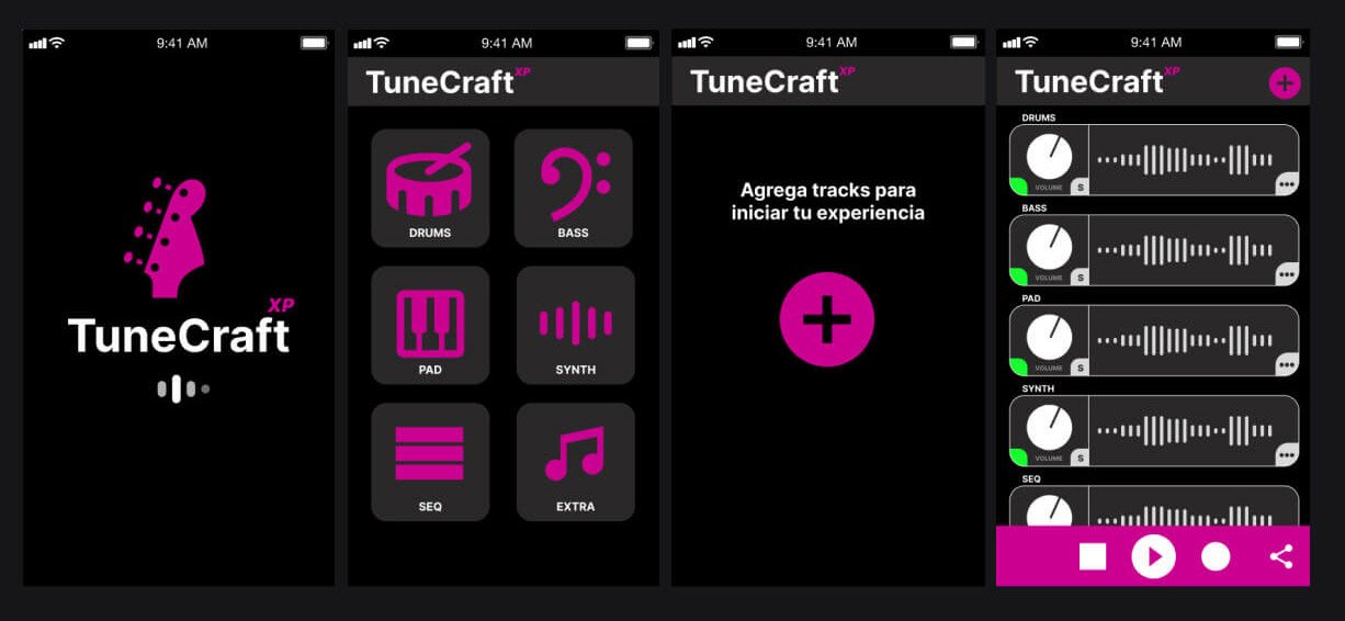
Loading Page
We wanted an elegant and clean landing page.

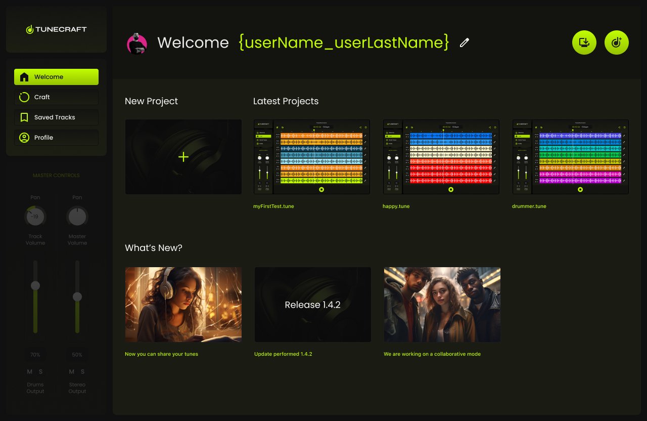
Welcome Page
On the Welcome Page, we created options in order to let the user create a new project or load the latest.
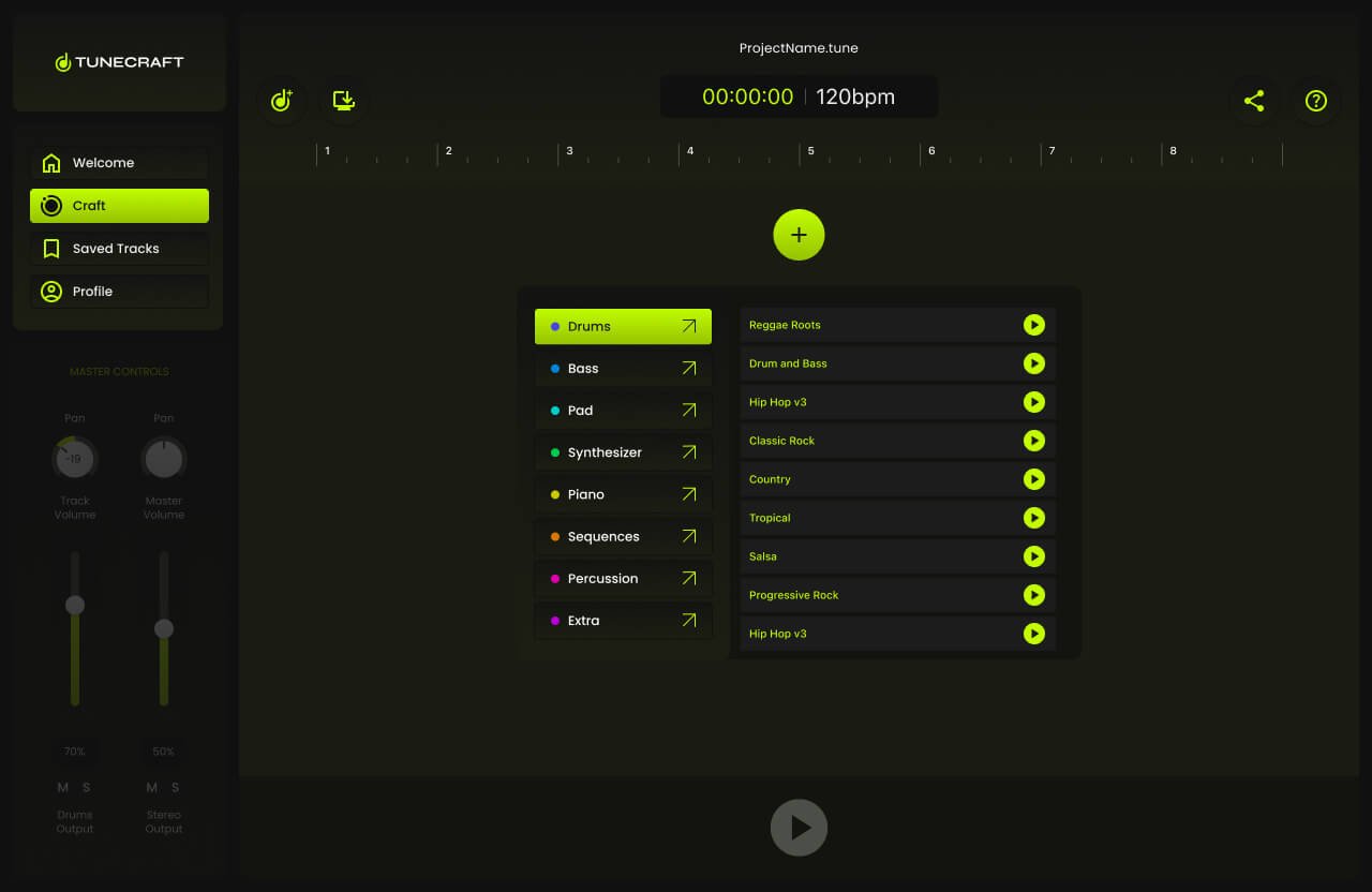
Adding First Track
Adding a track was designed as an easy process.
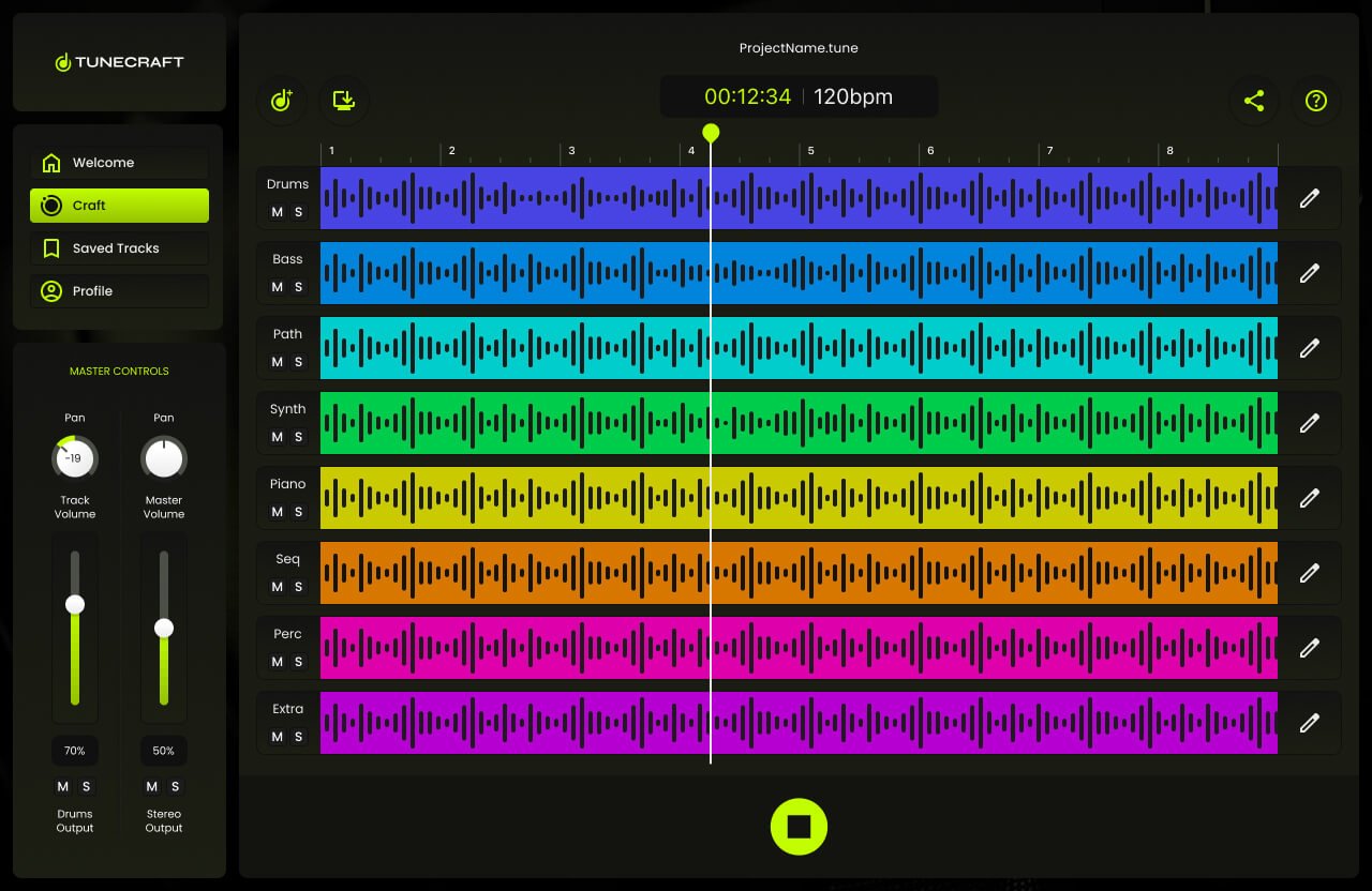
All tracks added
All the tracks were successfully added.
6. Prototype
This prototype brings the wire flow to life, showcasing a dynamic and interactive representation of the user journey within TuneCraft. It illustrates the process from the landing page to a fully layered session, allowing users to actively engage with the interface by adding tracks. This interactive model is key to understanding the practicality and responsiveness of TuneCraft’s design, providing a real-world feel for the user experience.
7. Testing
Four tests were conducted on-site, and four were carried out virtually. Each session was meticulously screen-recorded while participants employed the think-aloud protocol, verbalizing their thoughts as they navigated through the app.
The on-site tests provided me with a direct observation opportunity, enabling immediate engagement with the participants. Conversely, the virtual tests offered insights into how users interacted with the app in their natural environment. The combination of both testing environments, complemented by the think-aloud commentary, granted me a comprehensive understanding of the user experience. The feedback collected is now a cornerstone for iterative design enhancements, ensuring that TuneCraft is tailored to meet the users’ needs with precision and empathy.
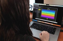
8. Tunes
To optimize TuneCraft’s user experience, I spearheaded a series of rigorous testing sessions—four conducted on-site and four carried out virtually. Each session was meticulously screen-recorded while participants employed the think-aloud protocol, verbalizing their thoughts as they navigated through the app. This method yielded deep insights into user behavior, preferences, and usability challenges encountered during their interaction with TuneCraft.

Artist App UX Design Case Study | Conexart
Overview
Conexart: An artist app design
In my role on the Conexart project, I was integral in developing a user-centric prototype for job applications within the app. My tasks involved deep user research, designing wireframes and interactive prototypes, and collaborating closely with developers and new designers to ensure a cohesive and intuitive design. I actively engaged with stakeholders, incorporating their feedback to align the product with user needs and business goals. Post-launch, I refined the app based on user feedback and performance metrics, ensuring it met the project owner’s vision and real-world demands.
Client: Conexart. Users: Artists (musicians, painters, cosplayers, poets, dancers, actors, sculptors. photographers, writers, illustrators, digital artists, etc.) Timeline: March 2023 - June 2023. My role: UX designer. Team: One UX lead, two Product Designers (I was one), a research team, one Senior Project Manager, and two Senior Developers. Tool: Figma, Optimal Workshop, DALL·E 3, Photoshop Beta.
Problem
Due to the pandemic’s unprecedented impact, most artists have lost employment opportunities. In the aftermath, these artists face significant challenges in securing new job opportunities.
Solution
We developed an app designed to offer job opportunities. Its simple and intuitive interface ensures artists can effortlessly apply and find suitable roles.
the process
Phase one
In the content below, I’ll only list the deliverables I was in charge of working on
- Research and interview with the Product Owner.
- Personas.
- Benchmark
- Desired Information Architecture (alpha)
1. Research & Interview with the Product Owner
We interviewed the product owner, capturing crucial insights and comprehending their vision. Additionally, our research team conducted a study on the pandemic’s impact, yielding several alarming results.
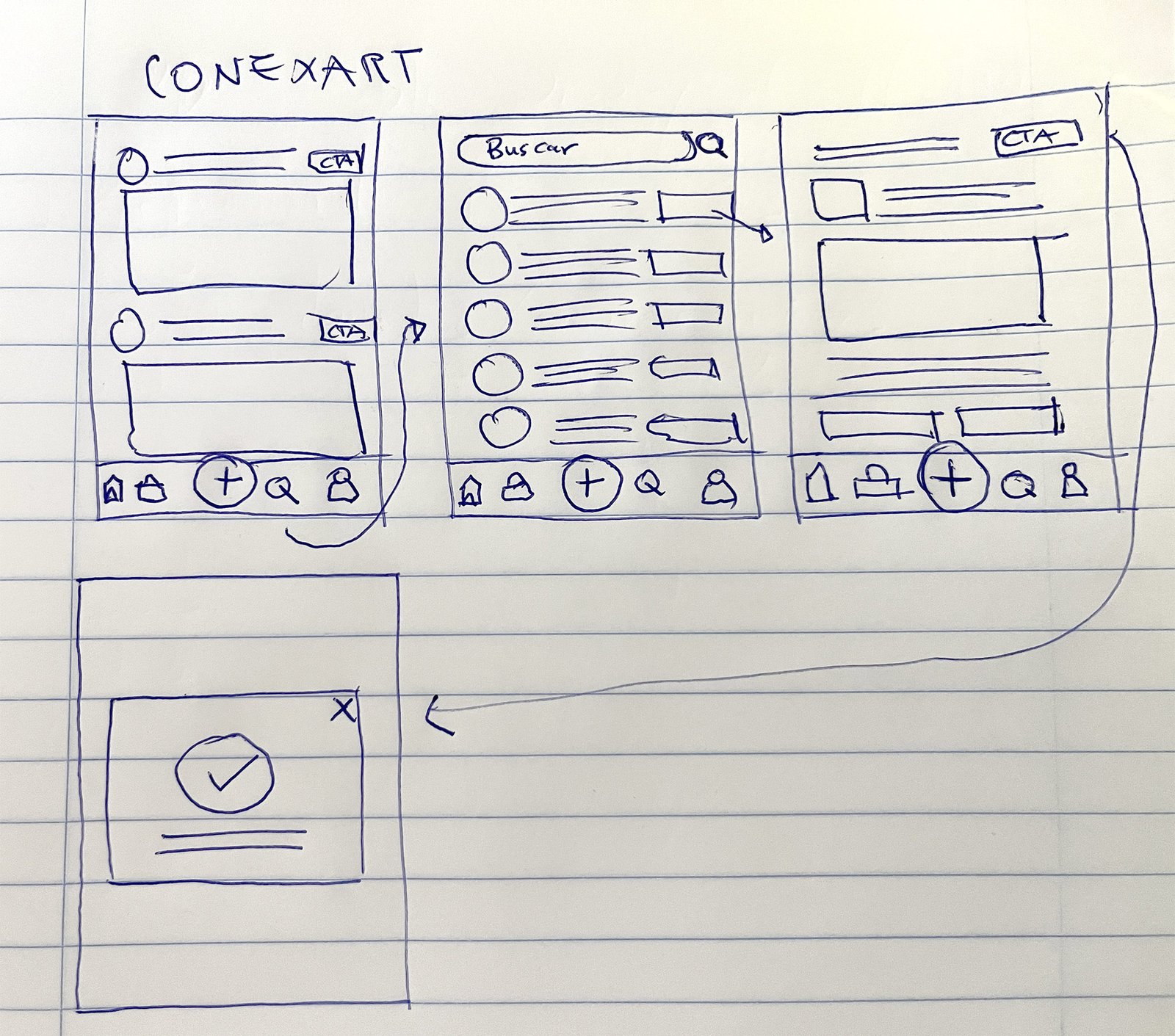
After posing several strategic questions to the product owner via Teams call, I understood the product better, distinguishing between essential and desired features. This insight allowed me to craft an initial paper prototype with sections including home, jobs, publish, calendar, profile, notifications, and search.
I developed a swift paper prototype to present to the client, ensuring it was straightforward to comprehend. This approach was instrumental in demonstrating that we were on the right track, providing a clear and tangible representation of our progress.
Pandemic
Findings
Our research team conducted a study on the pandemic's impact, yielding several alarming results
Event cancellations
Live events canceled or postponed and 70% of art venues closing temporarily in 2020..
Economic Hardship
Freelancers experiencing contract disruptions
Mental health
Reporting increased anxiety and stress
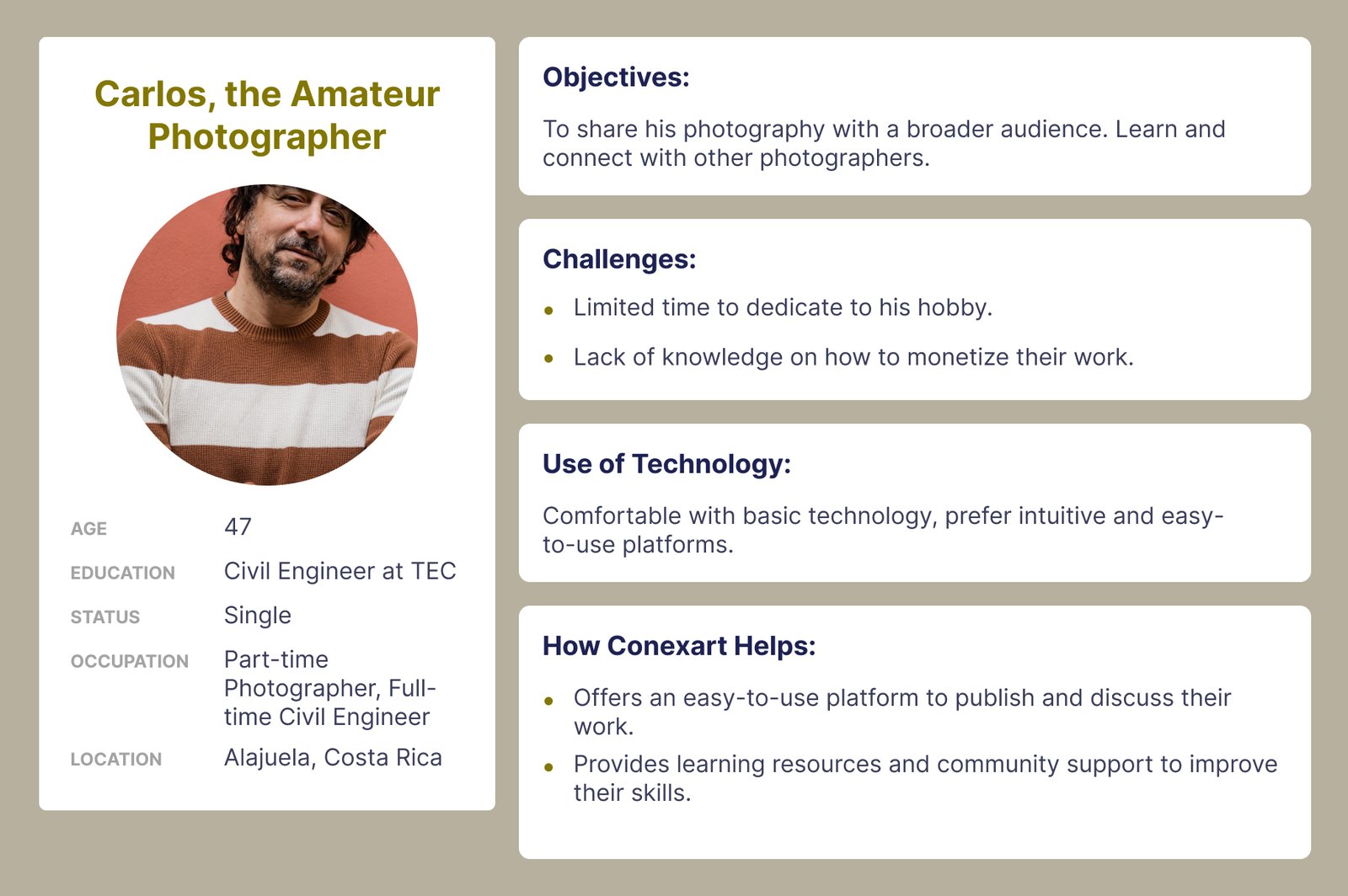
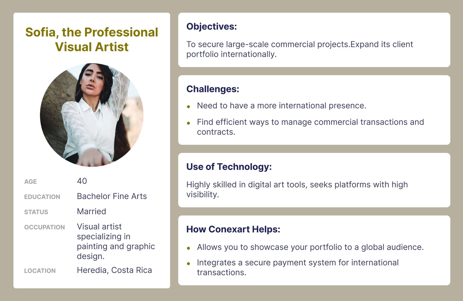
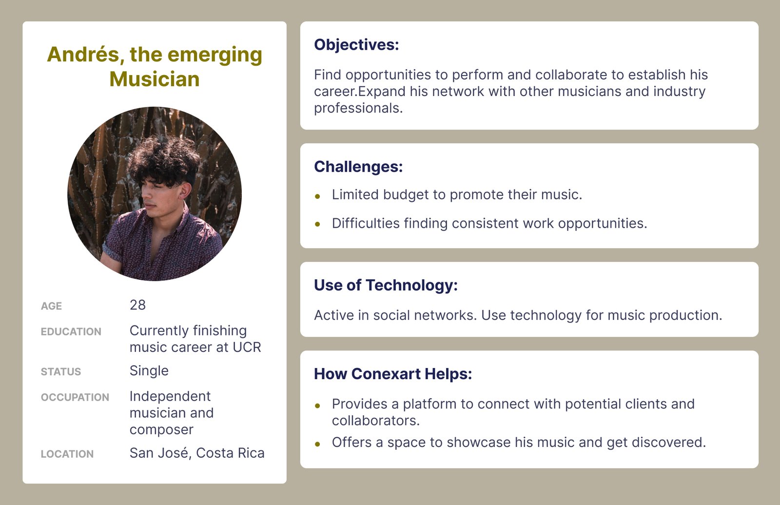
I conducted in-depth interviews with 15 artists to understand their unique circumstances and needs comprehensively. This valuable insight enabled me to create well-defined user personas, reflecting the diverse experiences and preferences within the artist community.
2. User personas
To thoroughly understand the diverse needs of our users, I crafted three distinct user personas. This process involved analyzing various user characteristics, preferences, and behaviors. Each persona represented a unique segment of our target audience, providing valuable insights into their requirements and expectations.
3. Benchmark
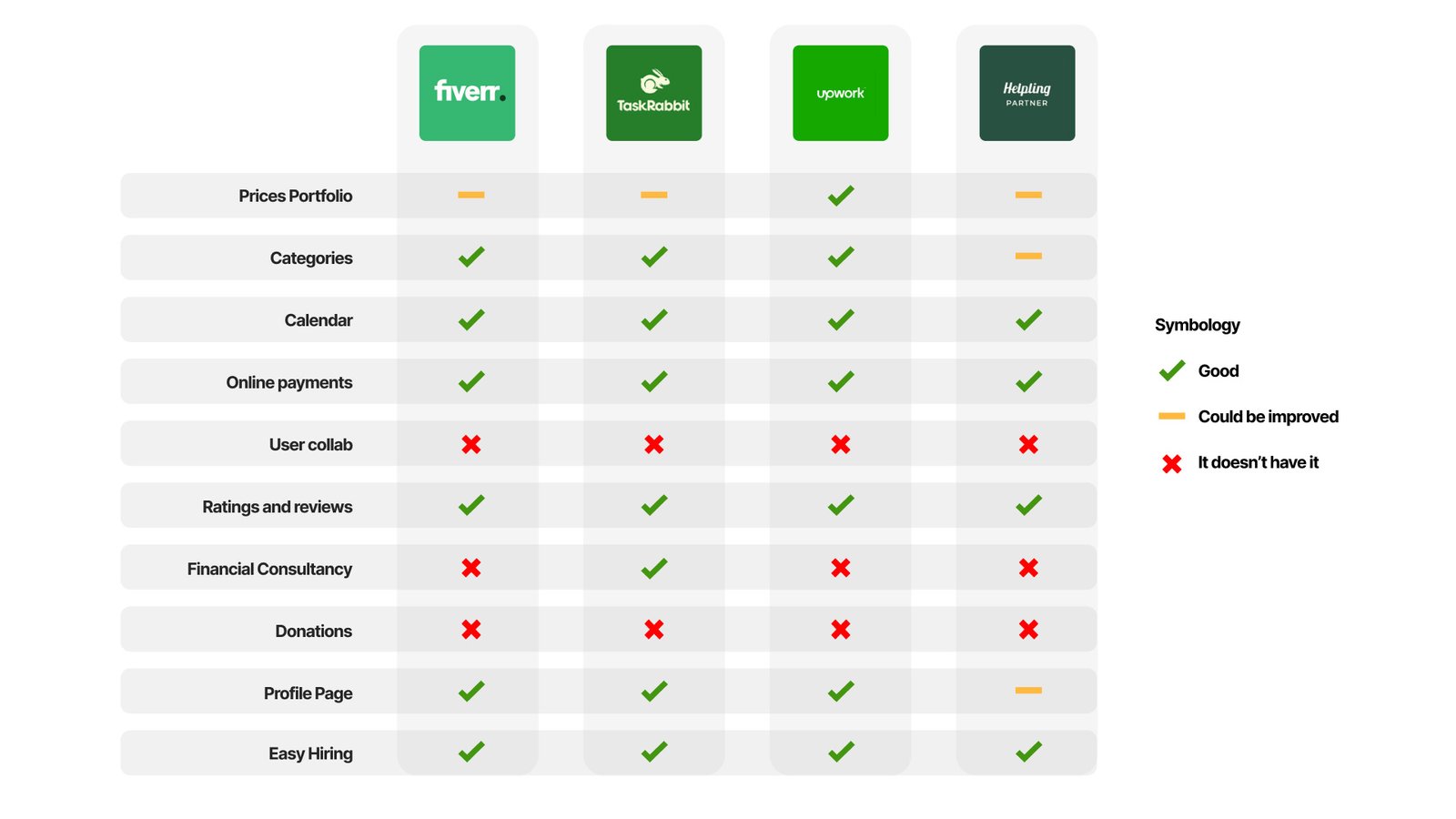
The client requested a competitive analysis segmented by features.
Conclusions
User Collaboration is a Gap
Fiverr and Upwork, despite being major platforms, lack features for user collaboration, suggesting a potential area for differentiation. Providing robust tools for user collaboration could fill this market gap and offer a competitive advantage.
Financial Consultancy is Rarely Offered
None of the platforms, except for Fiverr, offer financial consultancy services. This presents an opportunity to provide unique value by integrating financial guidance for freelancers and gig workers, which could be a strong selling point for the platform.
Opportunity for Enhanced Hiring Processes:
While most platforms have a functional hiring process, there's an indication that this feature could be improved, especially with the "Helping Partner" platform. Streamlining the hiring process and making it more user-friendly could significantly improve user satisfaction and platform usability.
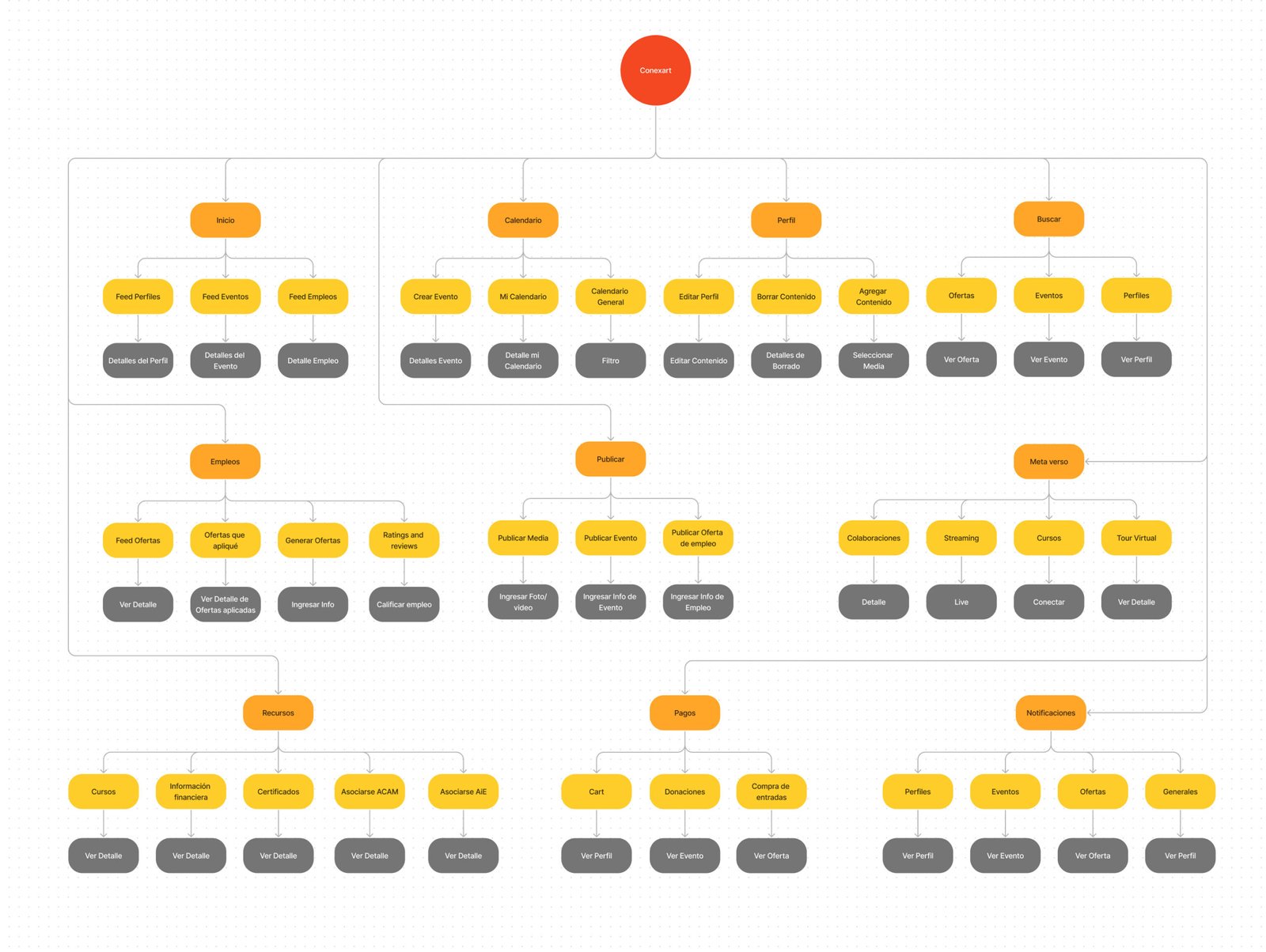
4. Desired Information Architecture (alpha)
We meticulously crafted a complete information architecture by Drawing on the insights from in-depth research, strategic interviews with the product owner, and detailed benchmark analysis. This architecture was enriched with all the desired features, ensuring a robust foundation tailored to fulfill our users’ comprehensive needs and preferences.
5. Conversation with the development team.
Before working on the wireframes, we checked the IA with the dev team. They talked about their concerns regarding the amount of content, and it would take a lot of money and budget, so the content in phase two was scratched, so we had to redo and simplify the project.

the process
Phase two
- Card Sorting & New Information architecture (beta)
- Userflows
- Wireframes
- Prototype
- Testing and refining
- Lessons learned
1. Card Sorting & New Information Architecture (beta)
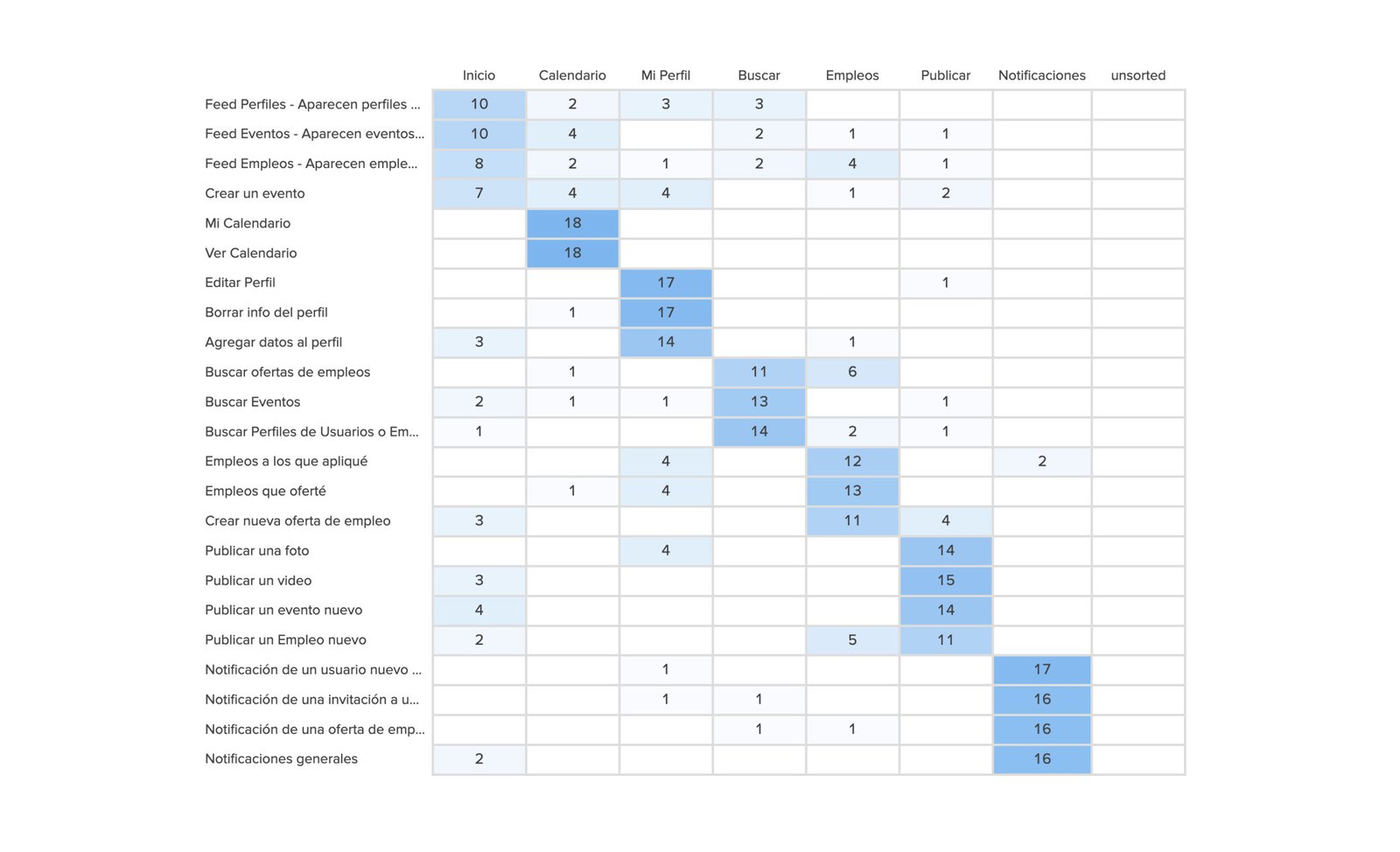
In this phase, I developed an initial information architecture “alpha” using insights from the interview. Subsequently, I conducted card sorting via the Optical Workshop tool. The results informed refinements, creating the “beta” version of the information architecture.
Card Sorting Matrix Results
Utilizing the card sorting technique, we gathered valuable insights from participants, helping us discern patterns and preferences. This methodological approach facilitated the identification of a potential initial structure, providing a foundational blueprint for our content organization and user navigation.
New IA
After talking with the dev team, they told us a lot of features listed on the phase one desired IA weren’t possible, so we updated it to this final one.
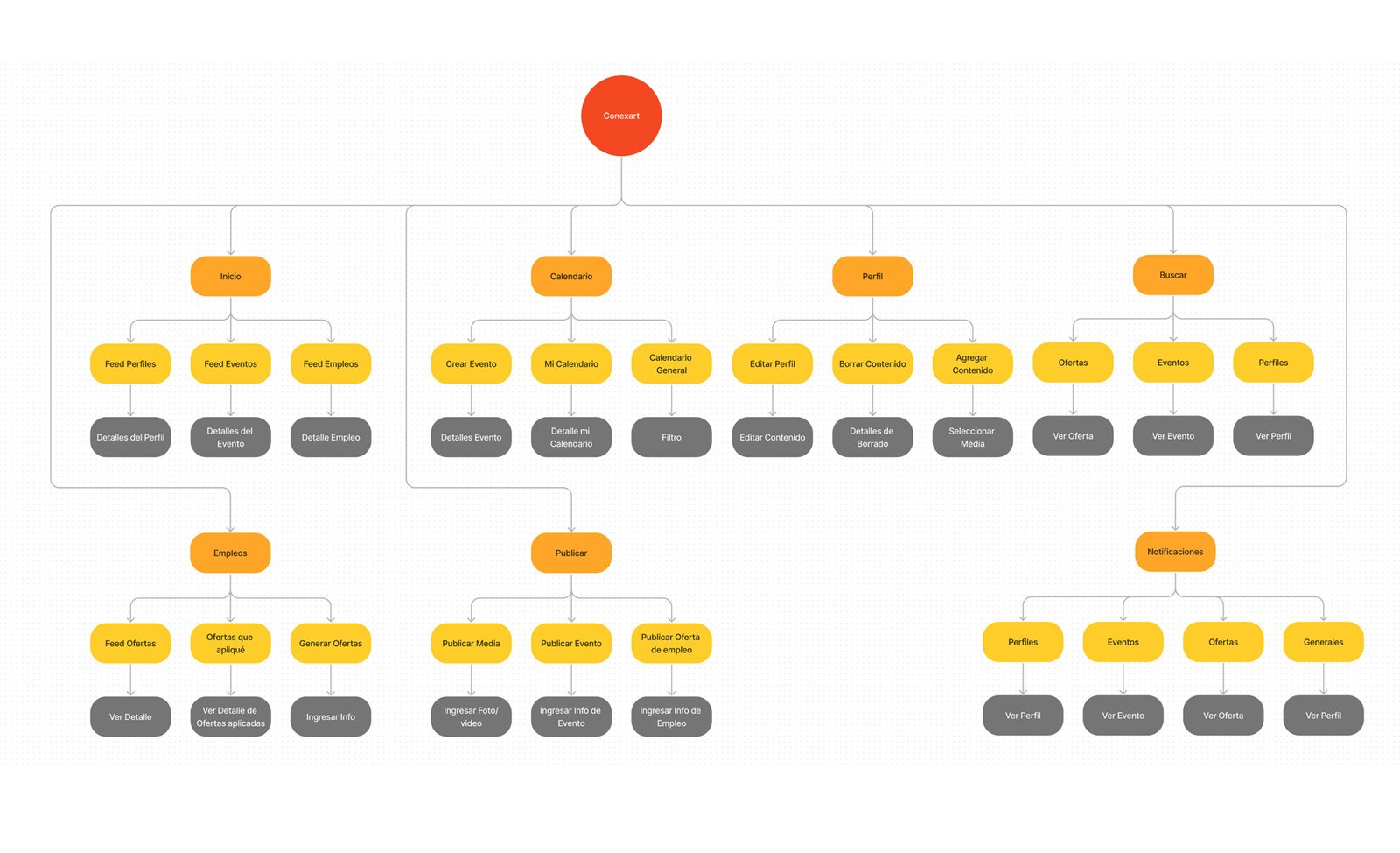
2. Userflows
This initial user flow depicts a comprehensive navigational blueprint, allowing seamless access to all areas of the app through the newly structured information architecture.
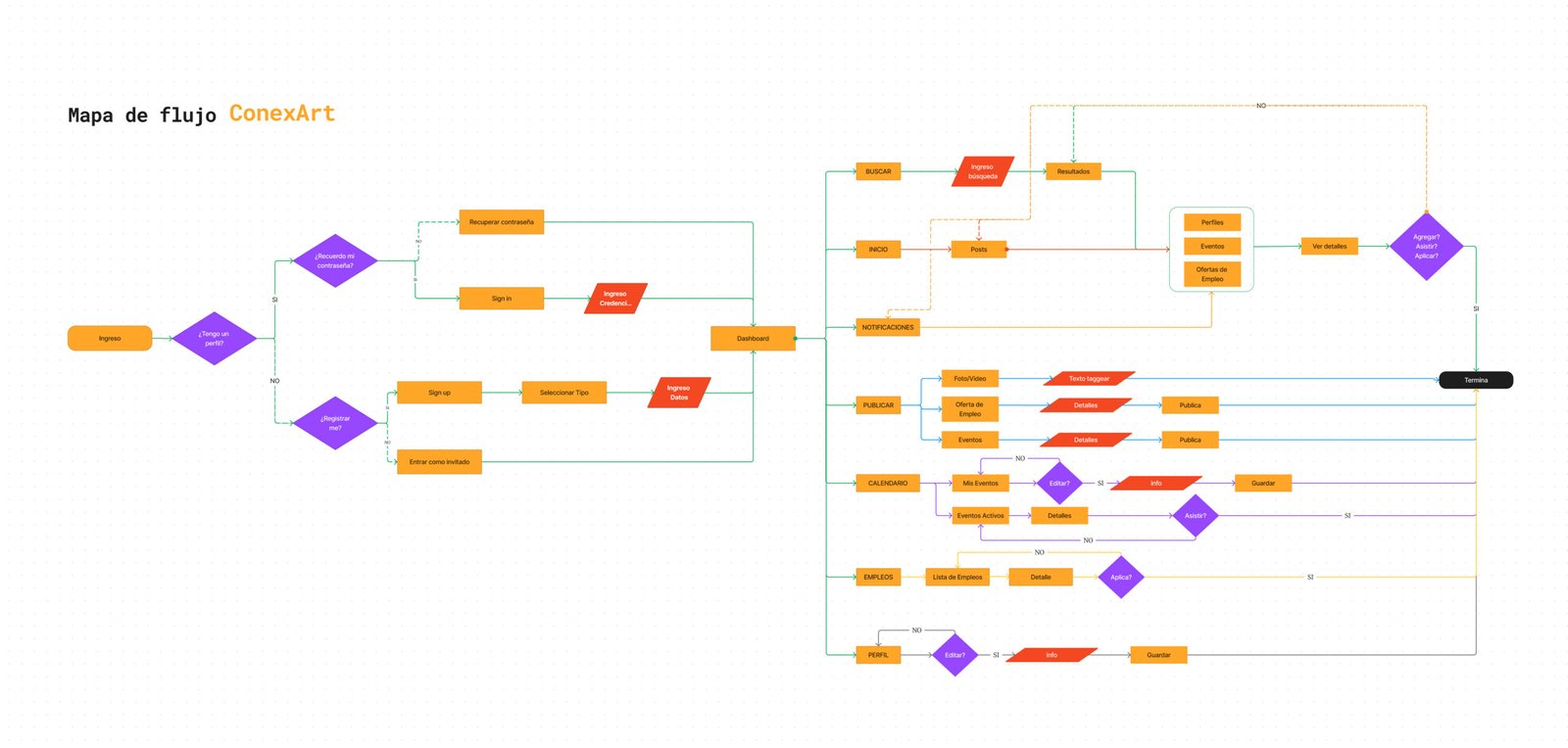
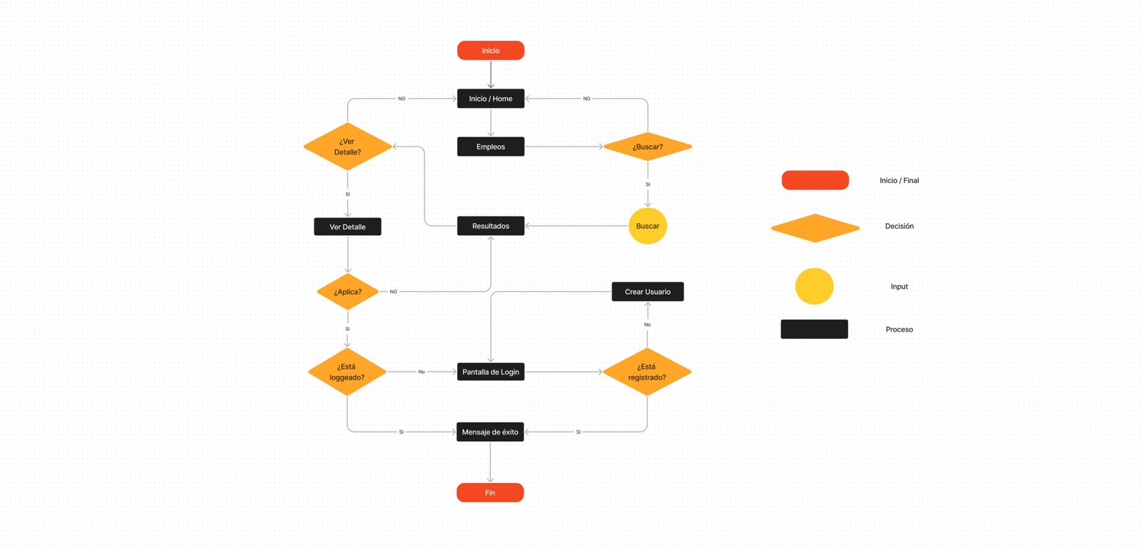
This second user flow is tailored for job-seeking users. It guides them from utilizing the search bar to discover opportunities to apply for positions that pique their interest with a streamlined, intuitive process.
3. Medium Fidelity Wireframes
The wireframes I designed are the blueprint for our digital interface, capturing every user interaction and visual layout. As our design’s skeletal structure, they detail the user’s journey, ensuring intuitive navigation. Each screen is thoughtfully laid out, balancing aesthetics with functionality. Through feedback and iterations, these wireframes were refined to prioritize user needs, acting as a strategic guide for an engaging and seamless user experience.
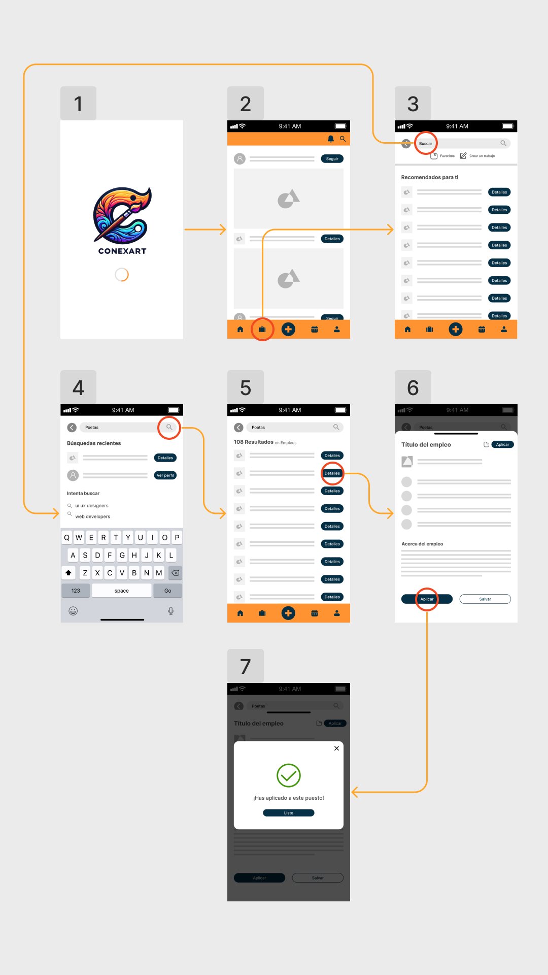
4. The Prototype
The initial prototype was crafted to serve as a clear demonstration of the user’s journey. It outlines the intuitive steps and interactions a user would experience while searching for a job, emphasizing a straightforward and user-friendly flow.
5. Testing and Refining
5
Remote tests over a zoom call
4
In-person sessions
Objective
Measure the success rate of the flow to find a job.
User
I performed these tests in real future users such as musicians and artists in general.
Think aloud
Testers were required to speak during the test.
Process recorded
I've recorded the video calls and I took notes on the on-site tests.
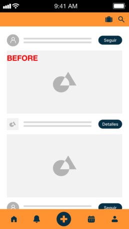
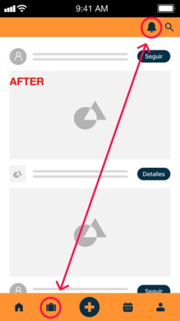
A recurrent pattern emerged: many users initially sought a job application feature on the bottom bar. However, the jobs icon was placed on the top bar, leading to confusion and hesitancy.
Armed with this insight, I made a strategic design decision: I relocated the jobs icon to a more intuitive position, placing it as the second option on the bottom bar. The results were palpable. In a subsequent round of testing, this tweak alone bolstered the success rate by a significant 30%.
6. Lessons Learned
Balancing Comprehensive Features with Simplicity
Striking a balance between a comprehensive feature set and a simple, user-friendly design is vital, especially under tight deadlines.
Iterative Design and Rapid Prototyping
Embracing an agile approach and being open to iterative improvements based on feedback can significantly enhance the development process.
Market Gaps
onducting thorough market research and identifying unmet needs can provide a competitive edge and create unique selling points.
Lessons learned
1. Understanding User Needs is Crucial
- Insight: Deep user research and interviews were essential in understanding the challenges artists faced during the pandemic, such as job losses and mental health issues.
- Lesson: Prioritizing user needs and understanding their unique challenges can lead to more effective and empathetic product design.
2. Flexibility in Design and Business Model
- Insight: Adjusting the payment and registration model to lower upfront costs led to a significant increase in user registration.
- Lesson: Being adaptable in both design and business strategy is key to meeting user expectations and improving engagement.
3. The Importance of Collaborative Teamwork
- Insight: Collaboration across different roles, including UX designers, developers, and project managers, was fundamental for the consistent and intuitive design of Conexart.
- Lesson: Effective teamwork and leveraging diverse expertise contribute to the success of complex projects.
4. Balancing Comprehensive Features with Simplicity
- Insight: While the app aimed to be feature-rich, there was also a need to simplify the MVP to meet tight deadlines.
- Lesson: Striking a balance between a comprehensive feature set and a simple, user-friendly design is vital, especially under tight deadlines.
5. Iterative Design and Rapid Prototyping
- Insight: The team used agile methodologies and iterative feedback loops for quick prototyping.
- Lesson: Embracing an agile approach and being open to iterative improvements based on feedback can significantly enhance the development process.
6. Identifying and Filling Market Gaps
- Insight: The benchmarking process revealed gaps in the market, such as the need for financial consultancy for artists and user collaboration features.
- Lesson: Conducting thorough market research and identifying unmet needs can provide a competitive edge and create unique selling points.
7. Prioritizing User Safety and Trust
- Insight: The importance of a fortified payment system was recognized as crucial for user trust.
- Lesson: Ensuring user safety, especially in online transactions, is essential in building trust and credibility.
Extra: Promo video for sponsorship
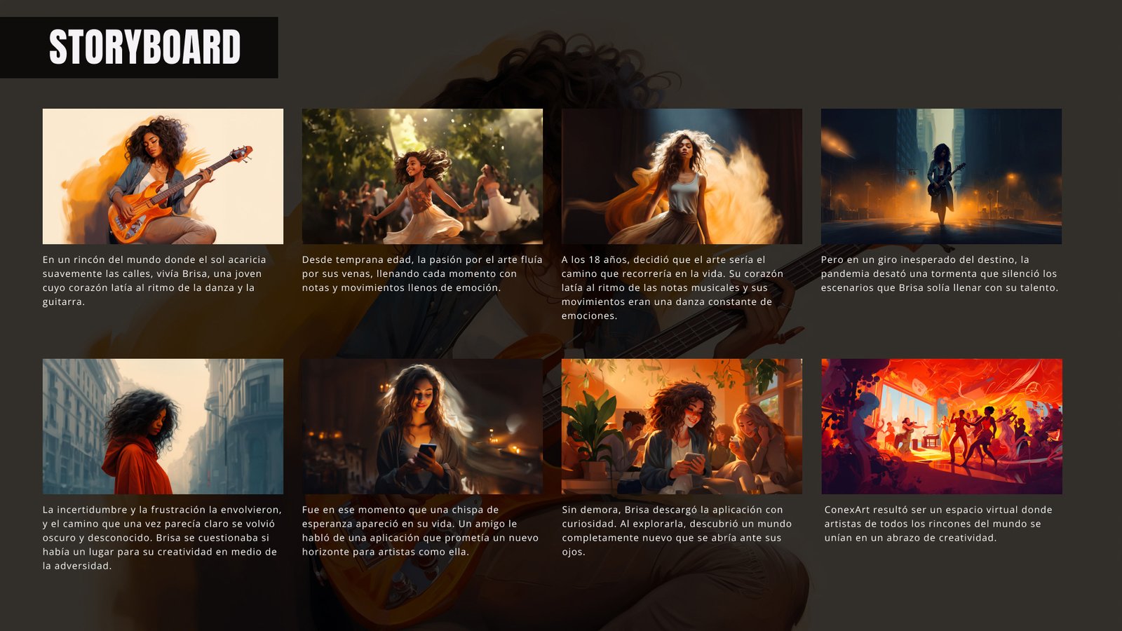
To resonate with the audience, the client entrusted me with crafting a video that narrates an artist’s journey. Given full creative freedom, I centered the story around the challenges faced by artists during the pandemic, many of whom lost their livelihoods. The narrative highlights how the Conexart app emerges as a beacon of hope for these artists, offering them new opportunities.
I diligently crafted all assets using Midjourney for this video, ensuring character consistency throughout. I lent my voice to the narration and expertly composed the accompanying music using Logic Pro.
Storyboard