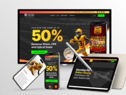
Master Affiliates
A High-Impact UX/UI Overhaul in Just 6 Weeks
Project Overview
B2B Website Redesign Focused on Conversions, a high impact UX/UI Website, Master Affiliates is a performance-driven affiliate marketing platform that connects businesses with top-tier affiliates to maximize revenue through strategic partnerships.
The previous website had a low conversion rate and failed to effectively communicate Master Affiliates’ value proposition to potential partners. The complex and unstructured content made it difficult for users to understand the platform’s benefits, leading to missed opportunities for engagement and sign-ups.
Adding to the challenge, we had only 6 weeks to redesign the entire website.
To increase conversions by implementing a modern UX/UI redesign and a refined content strategy that simplifies information enhances usability, and attracts new clients.
As the Lead UX/UI Designer, I was responsible for:
- Defining the UX strategy to improve user engagement.
- Redesigning the website structure, layout, and content hierarchy.
- Delivering final UI designs for development and ensuring design consistency.
- Leading a team of two UX/UI designers, who:
✅ Developed a UI Kit to ensure visual consistency.
✅ Created custom images and graphics using MidJourney.
✅ Designed mobile and tablet versions of the site. - Overseeing the design-to-development handoff and conducting QA to ensure a pixel-perfect implementation.

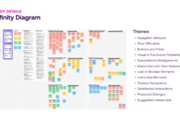
Research & Discovery
Receiving 140 visits per month, yet only 15 users clicked the JOIN NOW CTA, resulting in a high bounce rate of 89.3%.
Through Google Analytics data and stakeholder feedback, we uncovered:
✅ High Bounce Rate (89.3%) – Most visitors left without engaging.
✅ Overwhelming Content – Messaging lacked clarity, making it difficult to grasp the program’s value.
✅ Unclear CTAs – The JOIN NOW button was not prominent, leading to low interaction.
✅ Poor Mobile Experience – Navigation was frustrating, causing drop-offs.
These insights confirmed the need for a content-focused UX redesign to simplify navigation, improve messaging, and increase conversions.
To align with business goals, I conducted a Q&A session with the Affiliates Director to understand key pain points and gather insights. Two competitor websites were provided as benchmarks:
Commission Kings and RevMasters stood out for:
✅ Clear, benefit-driven messaging
✅ Simplified sign-up flows
✅ Engaging, easy-to-navigate dashboards
We refined content structure, UI approach, and navigation by analyzing these platforms to position Master Affiliates as a more user-friendly and conversion-focused platform.
With only 1 week for research, we focused on high-impact changes:
✅ Simplifying content to highlight key benefits.
✅ Enhancing CTA visibility for better conversions.
✅ Optimizing navigation to reduce friction.
✅ Ensuring a fully responsive design for seamless cross-device experiences.
By grounding our redesign in real user insights, we ensured a more intuitive and engaging experience.
UX Strategy & Wireframing
The redesign of Master Affiliates wasn’t just about visuals—it was about creating a user experience that was clear, focused, and built for conversion.

Identifying Structural Gaps
The previous website had a flat layout, vague call-to-actions, and a disjointed content flow. With repetitive messaging and unclear visual hierarchy, users often dropped off before understanding what the platform offered.
Navigation was inconsistent and the user journey lacked momentum—there was no clear direction pushing users toward conversion.

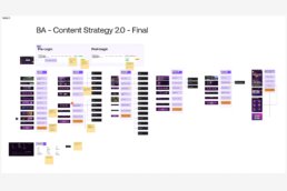
Strategic Reorganization: Sitemap Redesign
One of the first tasks was to restructure the site architecture. The original sitemap gave equal weight to primary and secondary content, and lacked a guided flow.
The revised sitemap streamlines navigation, removes redundancy, and introduces a clear flow from landing to conversion. We consolidated sections and moved less critical content (e.g., legal info) into the footer to keep the core experience focused.

UX Flow & Content Prioritization
We reimagined the site to follow a natural scroll-based narrative:
- Attract with a bold offer and strong visuals
- Convince with clear commission structures and benefits
- Reassure with testimonials and supporting content
- Convert with visible, high-impact CTAs placed throughout
Content was reorganized into modular blocks, each with one clear purpose—educate, build trust, or drive action.

Wireframing & Layout Strategy
Given the tight 6-week timeline, we skipped low-fidelity exploration tools and moved straight into structured layout design, starting with hand-drawn wireframes to align priorities quickly.
This early sketch helped define the core content flow:
- A bold hero section highlighting the key value proposition (XX% revenue share)
- A clear, high-contrast CTA placed early to drive conversions
- A visual slot for imagery or product mockups to reinforce the offer
- A dedicated, scannable Commission Structure section to build trust and support decision-making
From this foundation, we moved into responsive layouts in Figma.
UI Design & Implementation
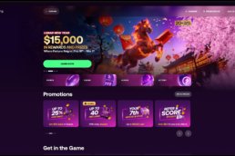
With the UX structure in place, the focus shifted to delivering a bold and modern visual identity that communicated value, trust, and energy.

Visual Direction
We established a sports-driven visual identity—confident, clean, and energetic. The UI leveraged:
- A dark, high-contrast background for dramatic impact
- Bold typography to highlight the 50% affiliate offer
- Carefully structured sections for visual rhythm
- Custom graphics and imagery that reflected the gaming and sportsbook ecosystem
This look & feel modernized the brand and positioned it competitively within the affiliate space.

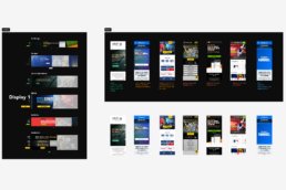
Design System
To ensure scalability and speed, we created a modular design system in Figma, which included:
- A reusable UI Kit with buttons, typography, and layout components
- Consistent spacing rules, color styles, and design tokens
- Scalable sections for commission structures, testimonials, and CTAs
This allowed the design team to work in sync while ensuring visual and functional consistency across breakpoints.

Responsive Execution
Layouts were designed responsively from the beginning. Each screen—desktop, tablet, and mobile—was adapted to maintain usability and clarity. We focused on:
- Adaptive grid behavior
- Tap-friendly touch targets and CTA placements
- Simplified navigation for mobile
- Reflowing commission tables for small screens
The mobile experience was not just a scaled-down version—it was intentionally crafted for performance and clarity.


Team Collaboration & Execution
I led a small but focused team of two UX/UI designers. Together, we:
- Created mobile and tablet versions
- Built and maintained the shared UI Kit
- Developed branded hero imagery and UI assets using MidJourney
I took ownership of the desktop layouts and provided direction and quality checks across all visual touchpoints. We worked in fast iterations with daily reviews to stay aligned and on schedule.

Asset Delivery & QA
Once the visual designs were finalized, I led the full handoff and implementation support process, working closely with developers to ensure everything was built to spec.
This included:
- Delivering fully organized and labeled Figma files
- Exporting all necessary assets and layout specifications
- Supporting the development team with behavior clarifications and responsive behavior notes
- Using Jira to document design tickets, assign tasks, and track progress across features
- Creating an Excel QA tracker to document each QA round, detail issues found across breakpoints, and assign them to specific developers for resolution
This structured and transparent approach helped us ensure consistency, avoid missed details, and streamline collaboration between design and engineering—especially critical under the pressure of a tight 6-week deadline.
Results & Reflection
The Master Affiliates redesign resulted in a streamlined, conversion-focused website delivered in just six weeks — with significant improvements in structure, clarity, and engagement across devices.


Results at a Glance
📊 Heatmaps & Behavioral Insights (via CRO)
- 60% of users focused on the hero section, showing strong engagement with the key value proposition and early CTA — exactly where we aimed to capture attention and drive conversions
- High interaction with the top navigation, especially FAQs and the contact email, suggesting users were actively seeking clarity and preferred direct access
- The contact email in the top-right corner received significant clicks — likely due to its simplicity and immediate reward (aligned with present-focus bias and response efficacy)
- The commission structure section also drew strong attention, confirming its importance as a decision-making anchor
Heatmap analysis showed users engaging with the exact areas we prioritized — hero messaging, commission details, and quick-contact options — validating our UX strategy and layout decisions.


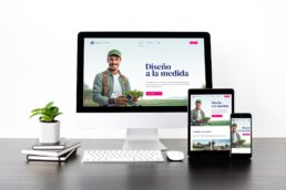
Final Visual Experience
The new Master Affiliates website was crafted to deliver clarity, confidence, and action. Every section was designed with purpose — from the bold hero statement that immediately communicates value, to the commission breakdown and testimonials that build trust.
Strong visual anchors like high-impact photography, structured content blocks, and bold CTAs helped guide user attention and create a professional, persuasive journey. The layout was built responsively to ensure consistency across desktop, tablet, and mobile, supporting accessibility and a seamless user experience.

Cross-Functional Collaboration
This success was made possible through strong coordination with a cross-functional team:
- The CRO provided behavioral insights that influenced the layout of CTA placement and UX writing.
- A copywriter and SEO specialist worked together to shape UX writing aligned with clarity, tone, and search performance.
- Project managers handled Jira task creation and helped manage QA cycles, one PM even participated in testing.
- I worked closely with developers from the start, ensuring feasibility, alignment on interactions, and timely handoff support.
This constant communication across disciplines allowed us to iterate quickly and make confident decisions throughout the process.
Collaboration under Pressure
This project reinforced the value of cross-functional collaboration and staying adaptable under pressure. Leading the design while aligning closely with business needs helped me stay focused on what truly drives user and business impact.
Aligning Design & Development
One key takeaway was around grid alignment. While we used a 12-column design system, the development team implemented layouts using percentage-based Flex and Grid systems, which led to implementation inconsistencies. In future projects, I’ll prioritize early alignment on layout logic to prevent issues and streamline development.
Wireframing for Speed and Clarity
Although the timeline was tight, wireframing early on allowed us to define structure, flow, and hierarchy quickly, enabling fast alignment with stakeholders and smoother transitions into UI design. It proved to be a crucial tool for maintaining momentum without sacrificing clarity.
Despite the challenges, I’m proud we delivered a high-impact, responsive experience—on time, and with a scalable foundation for growth.
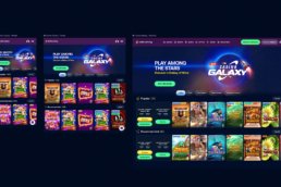
Before & After