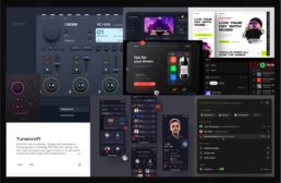
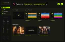
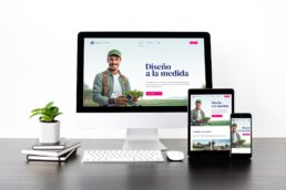
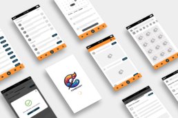
This case study focuses on the design of a user-friendly music UI for Easy Tunecraft — a platform created to simplify music-making for beginners and casual creators. The challenge was to craft an interface that feels approachable, intuitive, and creatively empowering without sacrificing functionality.
From user flow planning to clean layout decisions, the process emphasized usability, accessibility, and the emotional rhythm of digital music creation.
Overview
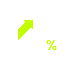
Increasing visits by 430% on the new landing page
1500+
With the new design the average of tunes crafted increased significantly.
UI Process
From a Moodboard to a Prototype
1. Introduction
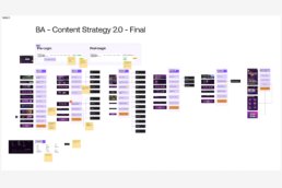
TuneCraft was designed with simplicity and user-friendliness. It allows anyone to dive into music composition regardless of musical background. This intuitive platform breaks down the barriers to music creation, making it accessible and enjoyable for all. Users can craft unique, royalty-free tunes perfect for various applications – from digital marketing to personal projects. Here is the UI Process.
We followed WCAG accessibility guidelines to ensure the interface was inclusive and legible across devices.
My Role
I led the design, user testing and development of this project from end to end. I collaborated with one product designer during the early ideation stage, one UX Designer, one Project Manager, and one Developer.
Problem
Agencies in the modern digital landscape face a significant challenge in sourcing royalty-free music for their video productions. The options often involve expensive licensing fees or limited options.
The client previously created an app for mobile but its lack of design and UX process resulted in an abandon rate of 75%.
Goal
I aim to boost user interest in the UI design I’ve developed, showcasing its unique, user-friendly features to enhance their experience with the tool.
2. Impact
Analytics indicated a remarkable 450% increase in visits, totaling 30,000 in the first three months alone. Furthermore, there was a substantial decrease in the abandonment rate, dropping from 75% to 37%. These figures reflect the team’s efforts’ success and underscore the new design’s positive impact on user experience and retention.
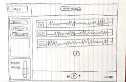
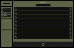
3. Early Ideation
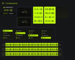
4. Style Guidelines
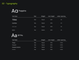
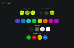
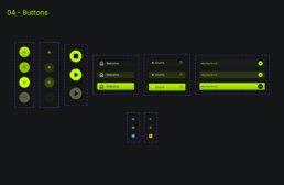
In crafting the style guidelines for TuneCraft, accessibility stands at the forefront of our design ethos. We strive to create an inclusive environment where all users can navigate and interact with the app comfortably and effectively. Our color palette is chosen to appeal aesthetically and accommodate various forms of color vision deficiencies. We ensure sufficient contrast between elements and backgrounds to aid readability and ease of use.
5. Final Designs
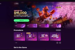
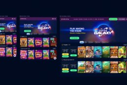
The previous design, primarily centered on mobile, fell short in adhering to design best practices. This oversight led to a visually unappealing interface that failed to resonate effectively with users. The design’s aesthetic appeal and functionality limitations highlighted the need for a more thoughtful and user-friendly approach.
Before
After
6. Prototype
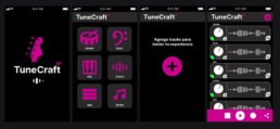
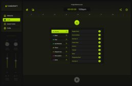
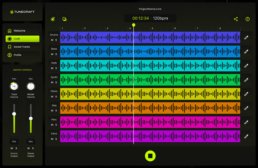
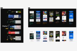
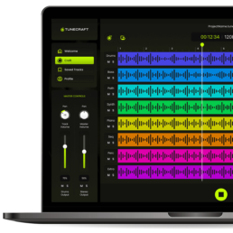
This prototype brings the wire flow to life, showcasing a dynamic and interactive representation of the user journey within TuneCraft. It illustrates the process from the landing page to a fully layered session, allowing users to actively engage with the interface by adding tracks. This interactive model is key to understanding the practicality and responsiveness of TuneCraft’s design, providing a real-world feel for the user experience.
7. Testing
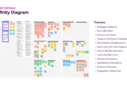
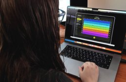
Four tests were conducted on-site, and four were carried out virtually. Each session was meticulously screen-recorded while participants employed the think-aloud protocol, verbalizing their thoughts as they navigated through the app.
The on-site tests provided me with a direct observation opportunity, enabling immediate engagement with the participants. Conversely, the virtual tests offered insights into how users interacted with the app in their natural environment. The combination of both testing environments, complemented by the think-aloud commentary, granted me a comprehensive understanding of the user experience. The feedback collected is now a cornerstone for iterative design enhancements, ensuring that TuneCraft is tailored to meet the users’ needs with precision and empathy.
8. Tunes
To optimize TuneCraft’s user experience, I spearheaded a series of rigorous testing sessions—four conducted on-site and four carried out virtually. Each session was meticulously screen-recorded while participants employed the think-aloud protocol, verbalizing their thoughts as they navigated through the app. This method yielded deep insights into user behavior, preferences, and usability challenges encountered during their interaction with TuneCraft.


