
Designing a User-Friendly UI for Music Creation
This case study focuses on the design of a user-friendly music UI for Easy Tunecraft — a platform created to simplify music-making for beginners and casual creators. The challenge was to craft an interface that feels approachable, intuitive, and creatively empowering without sacrificing functionality.
From user flow planning to clean layout decisions, the process emphasized usability, accessibility, and the emotional rhythm of digital music creation.
Overview
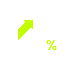
Increasing visits by 430% on the new landing page
1500+
With the new design the average of tunes crafted increased significantly.

Timeline
Feb - Oct 2022

Platform
Responsive Webapp

My Role
UI-UX Designer

Tool
Figma
UI Process
From a Moodboard to a Prototype
1. Introduction
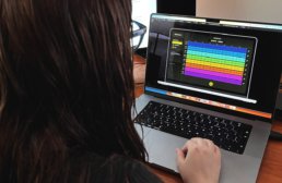
TuneCraft was designed with simplicity and user-friendliness. It allows anyone to dive into music composition regardless of musical background. This intuitive platform breaks down the barriers to music creation, making it accessible and enjoyable for all. Users can craft unique, royalty-free tunes perfect for various applications – from digital marketing to personal projects. Here is the UI Process.
We followed WCAG accessibility guidelines to ensure the interface was inclusive and legible across devices.
My Role
I led the design, user testing and development of this project from end to end. I collaborated with one product designer during the early ideation stage, one UX Designer, one Project Manager, and one Developer.
Problem
Agencies in the modern digital landscape face a significant challenge in sourcing royalty-free music for their video productions. The options often involve expensive licensing fees or limited options.
The client previously created an app for mobile but its lack of design and UX process resulted in an abandon rate of 75%.
Goal
I aim to boost user interest in the UI design I’ve developed, showcasing its unique, user-friendly features to enhance their experience with the tool.
2. Impact
Analytics indicated a remarkable 450% increase in visits, totaling 30,000 in the first three months alone. Furthermore, there was a substantial decrease in the abandonment rate, dropping from 75% to 37%. These figures reflect the team’s efforts’ success and underscore the new design’s positive impact on user experience and retention.
3. Early Ideation
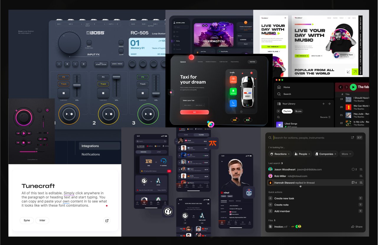
Moodboard
I have carefully curated a collection of images that encapsulate my vision for the app’s look and feel. This moodboard harmoniously blends sleek interfaces, intuitive layouts, and a color palette that reflects TuneCraft’s innovative and user-friendly ethos.
Low Fidelity Wireframe
This sketch is a first glance at the user interface design, mapping out the essential elements and their interaction. At this stage, the focus is on functionality and layout rather than visual details.

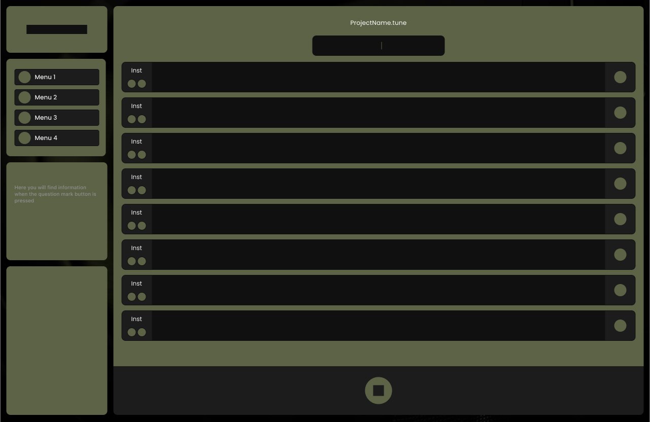
Medium Fidelity Wireframe
I developed a medium-fidelity wireframe, a vital step in the UI design process. This wireframe balances basic structure and more detailed elements, providing a clearer view of the layout and user interaction without the intricacies of high-fidelity designs.
4. Style Guidelines
In crafting the style guidelines for TuneCraft, accessibility stands at the forefront of our design ethos. We strive to create an inclusive environment where all users can navigate and interact with the app comfortably and effectively. Our color palette is chosen to appeal aesthetically and accommodate various forms of color vision deficiencies. We ensure sufficient contrast between elements and backgrounds to aid readability and ease of use.
5. Final Designs
The previous design, primarily centered on mobile, fell short in adhering to design best practices. This oversight led to a visually unappealing interface that failed to resonate effectively with users. The design’s aesthetic appeal and functionality limitations highlighted the need for a more thoughtful and user-friendly approach.
Before
After
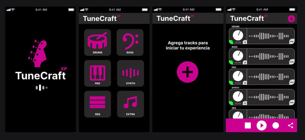
Loading Page
We wanted an elegant and clean landing page.

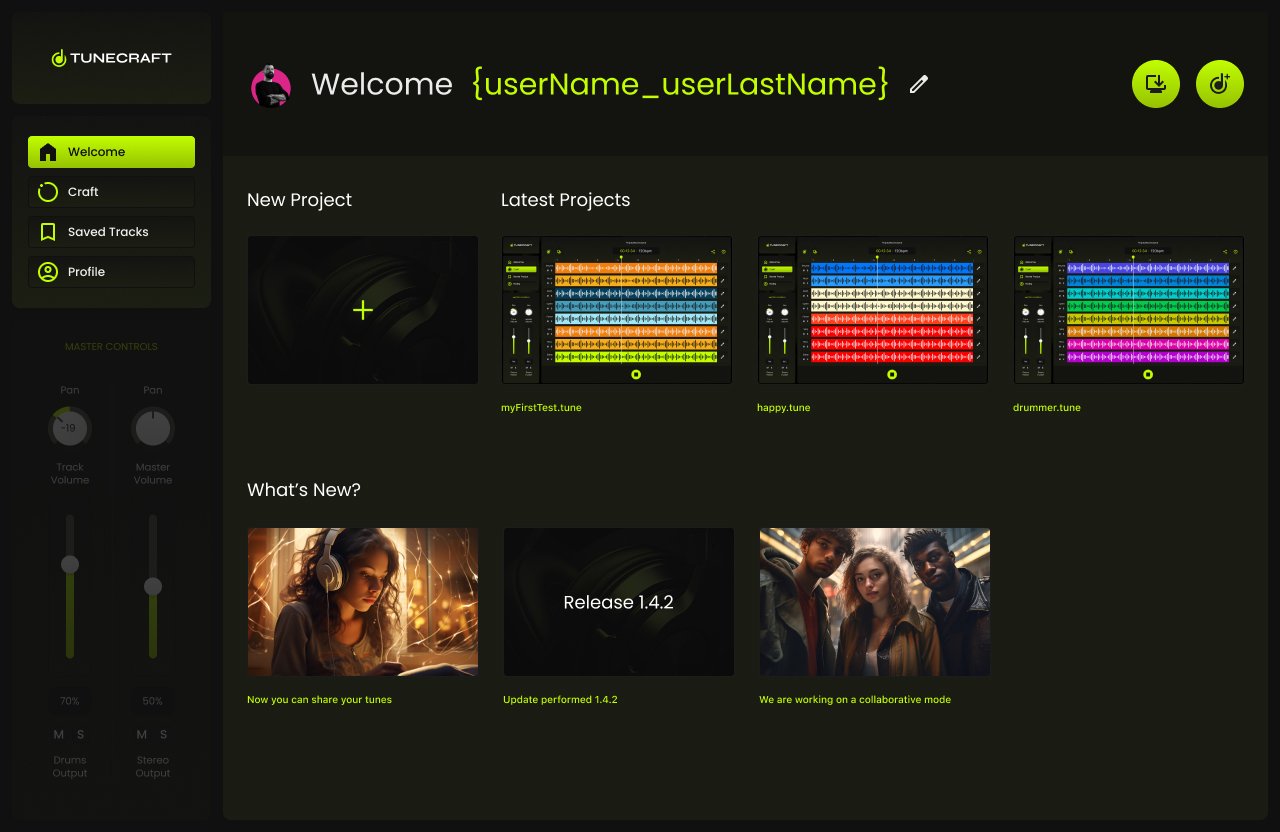
Welcome Page
On the Welcome Page, we created options in order to let the user create a new project or load the latest.
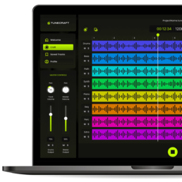
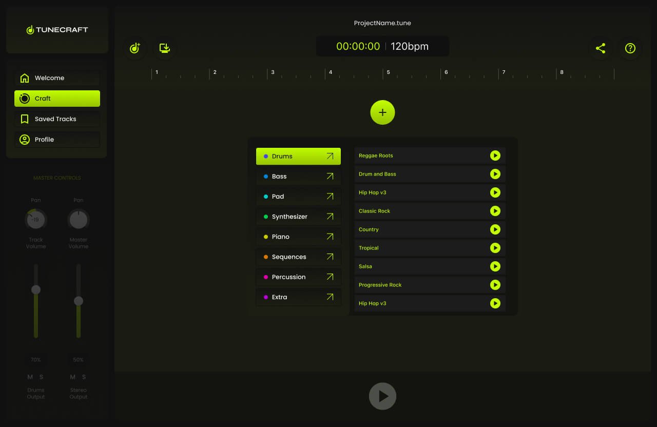
Adding First Track
Adding a track was designed as an easy process.
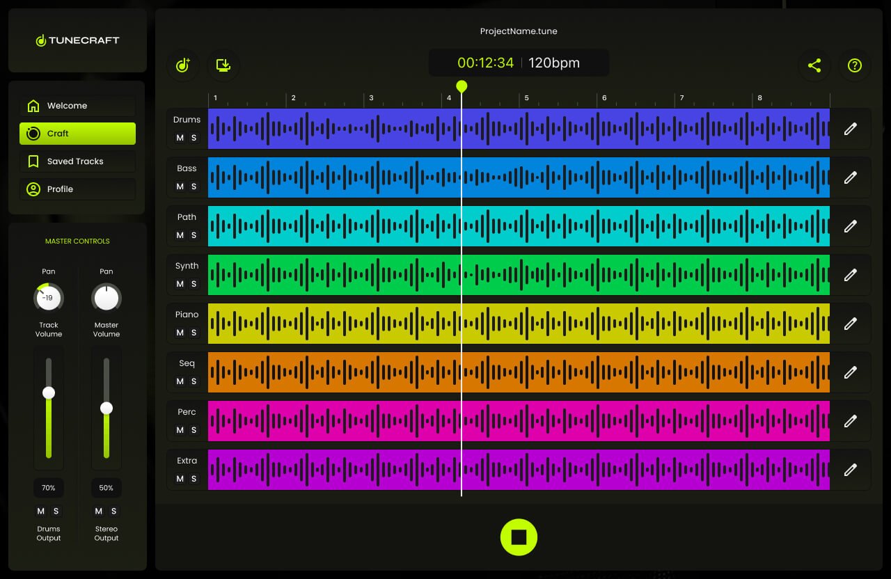
All tracks added
All the tracks were successfully added.
6. Prototype
This prototype brings the wire flow to life, showcasing a dynamic and interactive representation of the user journey within TuneCraft. It illustrates the process from the landing page to a fully layered session, allowing users to actively engage with the interface by adding tracks. This interactive model is key to understanding the practicality and responsiveness of TuneCraft’s design, providing a real-world feel for the user experience.
7. Testing
Four tests were conducted on-site, and four were carried out virtually. Each session was meticulously screen-recorded while participants employed the think-aloud protocol, verbalizing their thoughts as they navigated through the app.
The on-site tests provided me with a direct observation opportunity, enabling immediate engagement with the participants. Conversely, the virtual tests offered insights into how users interacted with the app in their natural environment. The combination of both testing environments, complemented by the think-aloud commentary, granted me a comprehensive understanding of the user experience. The feedback collected is now a cornerstone for iterative design enhancements, ensuring that TuneCraft is tailored to meet the users’ needs with precision and empathy.
8. Tunes
To optimize TuneCraft’s user experience, I spearheaded a series of rigorous testing sessions—four conducted on-site and four carried out virtually. Each session was meticulously screen-recorded while participants employed the think-aloud protocol, verbalizing their thoughts as they navigated through the app. This method yielded deep insights into user behavior, preferences, and usability challenges encountered during their interaction with TuneCraft.

Trópica Tica: Web product
Overview
Trópica Tica: website design
Space Lab hired me to be a UI consultant for one of their VIP new clients, Trópica Tica — a Costa Rican company offering landscaping services for industrial parks and free zones. The project focused on a responsive website design for a tropical brand that needed a modern, accessible, and digitally aligned presence. Their previous website did not meet WCAG minimum standards, so we set out to update their look and feel while improving usability and compliance with current digital trends.
I undertook a rigorous testing regimen for every color, ensuring as much as possible AA compliance under WCAG guidelines. I curated a color palette that wasn’t just compliant but also visually captivating. By employing well-thought-out color schemes and contrast ratios, I aimed to create a design catering to a broad spectrum of visual needs. This endeavor is a testament to my commitment to marrying aesthetic appeal with inclusivity and user-centric design.
Client: SpaceLab on behalf of Trópica Tica. Users: Trópica Tica's clients. Timeline: Aug 2023 - Nov 2023. My role: UI solo designer. Team: one UI Designer (me), one UX Designer, one SEO Analyst, and two developers. Tool: Figma.
Problem
Tropicatica was losing leads on its website because of its issues in the SEO and accessibility low standards. Space Lab contacted me for my design POV as a UI consultant. After analyzing the site, I noticed a lot of concerns regarding their digital presence since their site's primary color palette wasn't AA compliance.
Solution
I decided to focus my work on improving the accessibility of the site to make it AA-compliant. So, this was translated into an improved UI with a new accessible color palette, better contrast in the images, UX improvement in the form.
the work
Image creation in Midjourney
In creating my website design, I used Midjourney and Photoshop to cut costs and streamline the process. Midjourney’s AI helped generate unique images, eliminating the need for an expensive photographer and subsequent editing. I then used Photoshop to refine these images, ensuring they matched the website’s aesthetic and UX goals, resulting in a cost-effective, visually striking design.


the work
Accessible style guideline
I’ll show some of the work I did in a design style guideline I created to hand off the project to the developer in charge of this. Also, this will help the client to keep consistency with future updates.
- Color palette
- Typography
- Grids
- Spacings
- Buttons
- Shadows
- System feedback
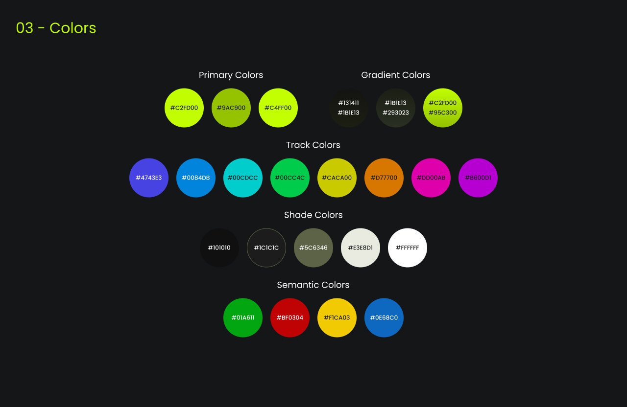
1. Color palette & accessibility
I prioritized accessibility in the Trópica Tica website design. I rigorously tested every color to ensure they met AA compliance under the WCAG guidelines and carefully curated a visually appealing color palette. I employed distinct color schemes and contrast ratios to cater to diverse visual needs. This work showcases my dedication to inclusivity, aesthetic appeal, and user-centric design.


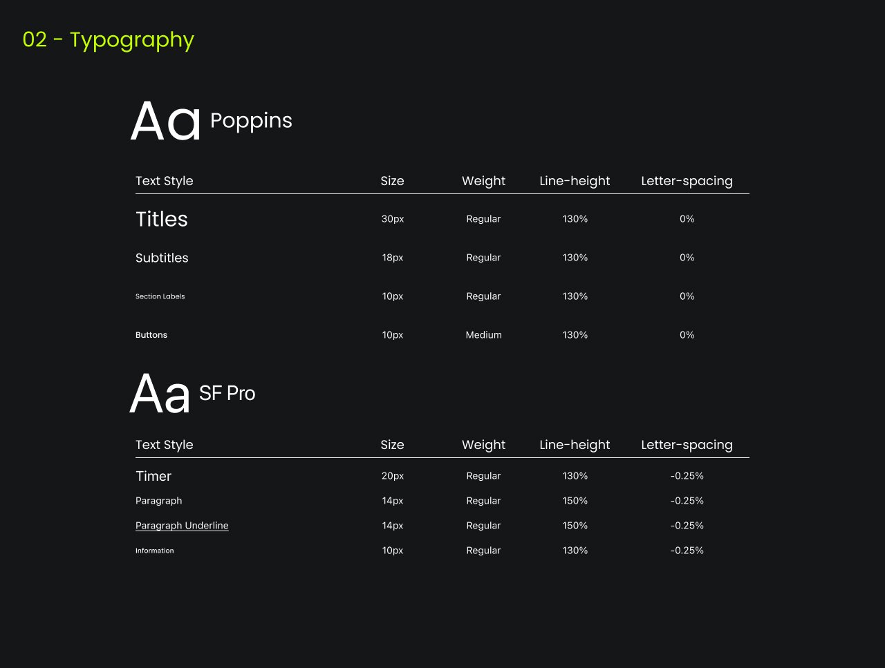
2. Typography
For this project, typography was pivotal in mirroring the leadership in landscaping services. I chose “DM Serif Display” for titles, leveraging its elegance and sophistication typical of serif fonts, creating a compelling visual hierarchy. For body copy, CTAs, and other content, the modern sans-serif “Inter” I used, ensuring readability and a contemporary balance. The careful pairing and sizing of these typefaces across devices provided an accessible and refined user experience.


3. Breakpoints
I ensured a seamless user experience across various devices. I established specific breakpoints tailored for desktops, tablets, and mobiles, optimizing the visual layout and interactions for each. This meticulous planning ensures that the content is both aesthetically pleasing and functionally intuitive on any device or screen size.

3. Grids
I employed a versatile approach tailored to each device type. On desktop, I utilized a 12-column grid, providing ample flexibility for layout configurations and content placement. For tablet views, an 8-column grid was implemented, striking a balance between structure and adaptability. Lastly, for mobile interfaces, a streamlined 4-column grid was chosen to ensure clarity and ease of navigation. This structured grid approach ensures a consistent and harmonious layout across all platforms.


4. Spacings
I adopted a modular approach rooted in a 4px base unit. This foundational unit offered a harmonious rhythm and consistency throughout the design. Whether margins, paddings, or element spacing, everything was scaled and determined using multiples of this 4px unit. This method not only ensured visual cohesiveness but also facilitated predictability and ease in the development phase, promoting a uniform user experience across all elements and sections.

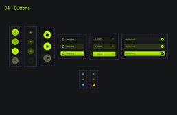
5. Buttons - Carbon Design
In refining the user interface, I have embraced the Carbon Design System for the button design. This choice aligns with the system’s strong reputation for intuitive and visually compelling interfaces. The button now exhibits a refined, modern aesthetic consistent with the established design language. Significantly, I modified the button’s color scheme to harmonize with my unique color palette, ensuring a seamless integration while adhering to Carbon’s standards of accessibility and usability.

6. Shadows
In the design process, shadows were crucial in adding depth and visual interest to the interface elements. I utilized the plugin “Beautiful Shadows.” It allowed me to craft subtle yet impactful shadow treatments, enhancing the overall UI’s depth and making elements more distinguishable. By leveraging this plugin, I ensured the interface had a modern, layered appearance, elevating the overall user experience.

7. System feedback
The system feedback was integral for intuitive user interaction in the design process. For text field inputs, I introduced icons to offer feedback, eliminating sole reliance on colors. This is especially beneficial for users with color vision deficiencies. Additionally, I included notes next to input fields, which appear when issues arise, giving users clear, actionable insights to address any discrepancies.

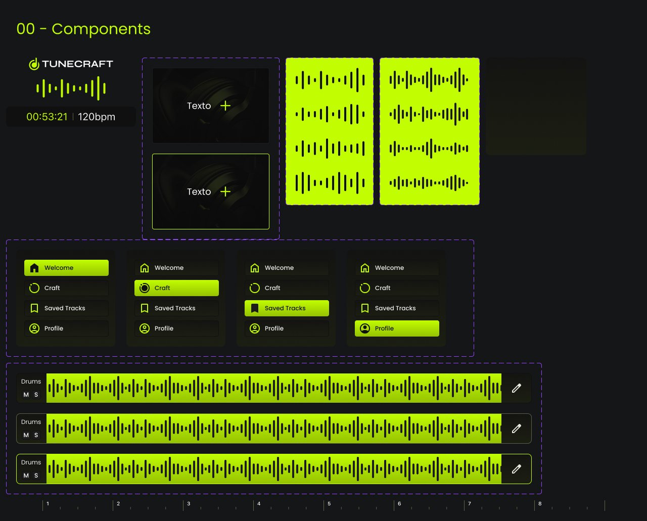
8. Components
During the design process, I meticulously crafted each component using Figma. Every element, from buttons to galleries, was developed with precision and consistency. I established a style guideline in Figma, which ensured both reusability across the project and a clear framework for potential future iterations. The detailed and organized components in my Figma file underscore the depth and thoroughness of my work.
The final design
Tropica Tica design
The handoff to the developer is a critical phase in ensuring the design’s integrity is maintained during the development process. After finalizing the designs in Figma, I prepared a comprehensive package for the developer in charge. This package included all the assets, style guidelines, interactive prototypes, and detailed specifications for each component, including dimensions, colors, typography, and spacing.
Using Figma’s collaboration features, I also set up interactive design views, enabling the developer to inspect elements, retrieve CSS values, and understand animations or transitions I envisioned. Throughout the handoff, I maintained open communication, addressing any queries and providing clarifications to ensure a smooth transition. The goal was to facilitate a seamless design integration into the development environment, minimizing discrepancies and ensuring the final product aligns closely with the original design vision.
Desktop view
The emphasis was on desktop since the data revealed that 77% of the site users come from this type of device. Still, that didn’t mean I missed the other breakpoints, but for purposes of my portfolio, I’m concentrating on this breakpoint.


Tablet and mobile
As I mentioned, the primary traffic of the site comes from the desktop breakpoint. Still, I wanted to show here the other 23% with examples. For mobile, it was 19%, and for tablet, 4% for tablet.

The handoff
Design ready for the developer
The handoff to the developer is critical in ensuring the design’s integrity is maintained during the development process. After finalizing the designs in Figma, I prepared a comprehensive package for the developer in charge. This package included all the assets, style guidelines, interactive prototypes, and detailed specifications for each component, including dimensions, colors, typography, and spacing.
Using Figma’s collaboration features, I also set up interactive design views, enabling the developer to inspect elements, retrieve CSS values, and understand animations or transitions I envisioned. Throughout the handoff, I maintained open communication, addressing any queries and providing clarifications to ensure a smooth transition. The goal was to facilitate a seamless design integration into the development environment, minimizing discrepancies and ensuring the final product aligns closely with the original design vision.


